
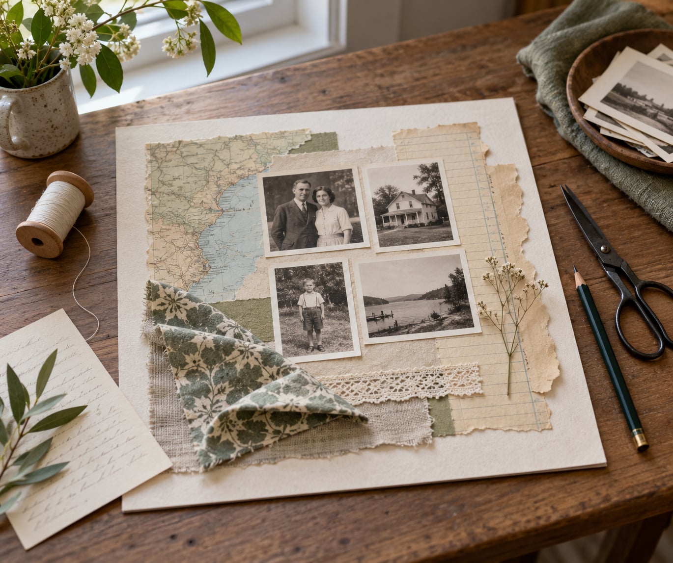
Learning how to make art about family history is mostly a decision, not a technique. You already have the photographs, letters and dates; what you need is one visual format carrying one specific story. Most people stall because they try to fit eight generations onto a single sheet. Pick a single person, place, journey or tradition, then build around it.
The whole process runs about eight steps and a complete beginner can finish a mixed-media piece in a weekend, with a week of interviews running alongside if you have older relatives willing to talk. Nothing needs to be technically accomplished. The craft is in choosing what to leave out, and in handling the originals properly.
One thing to sort out before you start: photographs that came out of a shoebox are usually acidic and brittle, and a Victorian dress hem or a signed letter will not survive glue. Everything you place in the artwork is a high-quality reproduction. The originals get their own acid-free sleeve and a proper box. That rule keeps the piece buildable and keeps the things that cannot be replaced safe.
Table of Contents
- What You Need to Make Art About Family History
- Source material
- Digitising kit
- Art supplies, matched to format
- The one-sentence decision
- Step-by-Step: Create a Personal Family History Artwork
- Choose a Focus for How to Make Art About Family History
- Gather and Research Family Stories
- Choose Symbols, Text, and Visual References
- Create a Small Composition or Thumbnail
- Build the Artwork Layer by Layer
- Add Texture and Personal Detail
- Refine, Present, and Protect the Finished Piece
- Common Mistakes and How to Fix Them
- Frequently Asked Questions
- What are the best formats for family history art?
- Do I need traditional art skills to make family history art?
- How do I stop a family history piece looking like clip art?
- How do I print a family tree from Ancestry or MyHeritage?
- What should I do with difficult or unknown family history?
- How much family history should one piece include?
What You Need to Make Art About Family History
Gather in four buckets: source material, digitising kit, art supplies, and a written decision about your subject. Laying all four out on one table takes an evening and saves every frustrating session that follows.
Source material
Photographs, negatives, letters, certificates, census pages, newspaper clippings, recipes written by hand, tickets, stamps, coins, jewellery, clothing, fabric offcuts, tools someone used for work. Pull anything with a date on it or a name on it, even if you think it is worthless. The boring administrative paper often carries the most specific detail, and detail is what makes an artwork feel researched rather than decorated.
Digitising kit
- A flatbed scanner or a camera and a copy stand. A phone on a stand with even daylight works fine for small items.
- Colour target card, so you can correct the grey and dull cast that old prints always pick up.
- Scanning resolution of 600 DPI at the printed size you intend. That is the standard archival figure and it leaves room to crop without softening.
- Image editing software for straightening, dust removal and a gentle levels pass. Keep the correction light.
- Archival sleeves: acid-free, lignin-free folders for prints, and polyester or polypropylene sleeves for documents.
Art supplies, matched to format
Map work needs heavyweight paper or canvas board and a fine liner. Portrait work needs good drawing paper, charcoal or soft pastel, and a fixative. Textile work needs washed fabric, an iron-on fusible backing and thread. Collage and assemblage need a solid support board, acrylic matte medium or gel medium, and archival glue rather than ordinary craft glue. Buy the surface first and match the media to it.
The one-sentence decision
Write down the story in a single sentence before you open any box of materials. “My grandmother crossed the Atlantic in 1948 with one suitcase” is a workable brief. “My family history” is not. This is the golden rule of genealogy applied to art: state the claim, then name where it came from.
Step-by-Step: Create a Personal Family History Artwork
A finished piece can be almost anything: a quilt panel, a layered collage, a painting, a memory-book page, a shadow-box assemblage, a screen-printed map, a stitched portrait. The steps below work across all of them, because the decisions are the same even when the materials are not.
Choose a Focus for How to Make Art About Family History
Narrow a big family history down to one subject you can hold in your head. Good candidates: a person, a place, a migration, a relationship, a tradition that repeated for generations, or one event everyone remembers differently.
Test two or three candidates before committing. Write each on a separate scrap, then ask three questions. Can I say it in one sentence? Do I have at least five visual sources for it? Would someone outside the family understand it without me explaining? If any answer is no, cut it. Three thumbnails are cheaper than one abandoned stretched canvas.
Watch for the subject that feels too easy. The grandmother everyone already talks about rarely surprises you. The job your great-grandfather did for thirty years, or the winter your family stayed in one house, usually holds something you have not looked at properly.
Gather and Research Family Stories
Put a recorder in front of the oldest relatives who will speak to you. Ten questions do most of the work: where you lived as a child, what the house looked like, who visited, what was kept in the cupboard, what you ate on a normal day, what job people did, what you wore, what you carried, what you were proud of, what you never said out loud.
Then check the dates. Cross-reference two independent sources for every fact you plan to put on the piece, and write down where each one came from in a simple provenance list. This matters even when nobody ever asks. A date without a source is a guess, and guesses get repeated until they turn into family legend.
If you want to work from an online tree, export or screenshot it and rebuild it in a program you control rather than printing straight from the browser window. Build the tree in a simple editor, print it in sections if it runs past one page, and paste it onto a firm board. Full descendant charts also print badly at any size, so crop to the generations your story actually uses.
Choose Symbols, Text, and Visual References
Turn the facts into a small visual vocabulary and stick to it. A repeated shape, a single recurring colour, one type of mark for water and one for distance. Repetition is what separates a piece from a pile of clippings.
Sources of material: place names and coastlines from maps, architectural details in old photographs, doorways, headstones, kitchen implements, clothing, fabric patterns, hand gestures, the way people stood in a portrait group. Family sayings belong here too. One line of handwriting carries more voice than a paragraph of captions.
Keep text minimal. Dates, a place, a name, one quote. Anything longer than a caption becomes a document sitting on top of artwork, and the eye stops reading. If you want the full story, put it on a label to one side rather than cramming it into the composition.
Create a Small Composition or Thumbnail

Work small. Take a sheet roughly postcard-sized and glue or tape in photocopies of your images. Move everything around for ten minutes, then stop fiddling.
Now look for three things: one clear focal point, edges that either overlap deliberately or sit clearly apart, and at least one deliberate empty space. Empty space is not wasted. It is what stops a family history collage turning into the clip-art chart that everybody recognises and nobody likes.
Success looks like this: you can describe the composition in one sentence and you know the order you will build it in. Write the order down. It saves you from the common mistake of gluing the biggest piece down first and discovering there is nowhere for the eye to go.
Build the Artwork Layer by Layer
Work from back to front, and treat each layer as one decision. A typical build for a mixed-media family history piece runs ground, text or map, images, drawn or stitched marks, then surface detail.
On the ground layer, block in colour zones with acrylic or gel medium rather than trying to make a finished image. Add the map, ledger paper or envelope fragments next, torn rather than cut, with a bit of the original edge left showing. Printed or transferred photographs go on top of that, and only the ones that earn their place.
Hand-drawn or stitched marks come last. A line in ink that follows a route, a stitched seam standing in for a border, a date lettered straight onto the surface. Not every layer needs to be glued down either: floating elements on spacers give depth without any risk of crushing the paper underneath.
If you are working in textiles, the same logic holds. Fuse a backing to washed fabric, appliqué or free-form stitch the images and marks, then quilt sparingly. Stitching the dates instead of printing them adds the one thing a print cannot: evidence of time spent.
Add Texture and Personal Detail
Texture is what carries the sense of age. Torn paper edges, the tooth of unprimed canvas, dry-brushed gesso, stitching, beading, sanded areas of gesso, sand in the paint, a wax layer, a torn lace edge taken from a hem you did not cut apart.
Handmade marks are the other half. Slightly irregular lettering, a visible pencil grid left in, a stitched name, the small inaccuracies that never happen with a machine.
Add personal detail sparingly and honestly. That is the part that cannot be bought: the recipe written in a familiar hand, a thumbprint turned into a repeating pattern, a handwriting sample reduced until it reads as texture. If you reproduce a signature, ask the family first. If someone has died, ask the people who loved them.
Refine, Present, and Protect the Finished Piece
Edit hard. Remove any element that repeats information another element already carries. A photo of a house plus a caption naming the address is one fact shown twice.
Then test readability: read any text from across the room, and check the piece squinted at, which is roughly how people see it on a wall. Add a title, and add a small line naming where the material came from and who told you the story. Provenance printed on the piece turns a decoration into a record.
For paper and mixed-media work, mount on acid-free, lignin-free board with archival hinges or corners rather than tape against the surface, and glaze with UV-filtering acrylic, which blocks more light than glass and will not break if a frame is dropped. Print reproductions as pigment-based giclée prints at 600 DPI or above so the surface is part of the artwork rather than something sitting on top of it.
Hang textiles flat rather than folded, out of direct sunlight, and give textiles and framed paper a spot away from radiators and exterior walls. For a wall gallery, hang the centre of the main piece around 57 to 60 inches off the floor and let the smaller pieces orbit it.
Common Mistakes and How to Fix Them
Starting with everyone. Eight generations of names in a grid is a database, not an artwork. Cut it back to the people and events on one branch that you can actually describe in a sentence. The rest can become a second piece later.
Glue, tape or staple the originals. Old photographs, silk, wool and iron gall ink documents all suffer permanently from adhesives, and pressure from a mount can split a photograph along its edge. Scan at 600 DPI, mount a reproduction, and store the original separately in an acid-free sleeve in a lignin-free folder.
Letting the composition get crowded. When everything competes, nothing is read. Take the piece at arm’s length, circle the elements you looked at first, and remove two. Keep the gaps.
Leaving out the source. A date with no attribution becomes a family fact within two years. Keep a provenance list while you work and put a condensed version on a label attached to the piece.
Writing too much on the piece. Captions at paragraph length stop being read. Keep text to dates, names, a place and one line of voice. Put the full account on a separate panel or on the back.
Overworking the detail. Once you have retouched an image six times, you have replaced evidence with your own preferences. Stop at the point where the material still looks like itself. Deliberate imperfection reads as honest; perfection reads as manufactured.
Picking a format that does not match your research. A migration story belongs in a map, a working life belongs in a portrait study, a lineage of textile belongs in stitching. If your sources will not fill the format, change the format rather than forcing it.
Skipping consent and care. Living relatives get asked before their photographs, words or health history go on a wall. And painful chapters get handled honestly: an unknown parent, an estrangement or an addiction can be shown as unknown or left out with a note explaining the gap. Inventing detail to fill a hole is the one mistake that undermines everything else you have done.
Frequently Asked Questions
What are the best formats for family history art?
The format should follow the shape of your research. A timeline suits a family that stayed in one place across generations. A map suits migration and travel. A portrait grid suits a group of people. A quilt panel or stitched panel suits inherited fabric and clothing. A shadow-box assemblage suits objects, not photographs. A family tree diagram suits connection and record-keeping, though it rarely makes the most striking wall piece on its own.
Do I need traditional art skills to make family history art?
You do not need drawing or painting ability. Transferring photographs, collaging printed reproductions, working with maps and hand-lettering dates are all learnable techniques that depend on judgement about placement rather than on technique. The strongest results usually come from restraint and accurate labelling, not from skill with a brush. Many of the most moving family history pieces are essentially well-organised archives with a visual system.
How do I stop a family history piece looking like clip art?
Clip-art family trees fail for three reasons: generic imagery, identical branch shapes and no source information. Fix those by using only your own photographs and documents, drawing your own connector lines and borders, and printing a short provenance line on the piece naming where each photograph came from and who told the story. Specific detail is what no template can fake.
How do I print a family tree from Ancestry or MyHeritage?
Export or screenshot the tree, then rebuild it in a word processor, spreadsheet or a simple graphics program where you control size and type. Print it in sections at 600 DPI, trim the joins, and mount the pieces onto a firm board. Wide descendant charts print badly at any size, so crop to the generations your story actually uses, and check the ink type so the print does not fade.
What should I do with difficult or unknown family history?
Leave the gap visible and label it. A line reading date and birthplace unknown tells the reader more than an invented detail, and it protects you from repeating a guess as fact. Ask living relatives before including health, estrangement or legal history on a piece meant for a public wall. Sensitive stories can be made as a private piece, or shared with a small group, rather than displayed widely.
How much family history should one piece include?
As much as one clear story can carry, usually five to fifteen people or events. Beyond that the eye cannot follow the relationships and the piece turns into a diagram. Keep the full tree as a companion piece on a wall nearby, and let the artwork do one job. Several focused pieces side by side often tell a family history better than one crowded sheet.
Start with the smallest possible commitment: write three candidate subjects on paper, choose one, and make three postcard-sized thumbnails this weekend. Pick the composition that someone outside your family could follow without you talking over it, gather the reproductions for just that story, and leave the originals in their folders. Everything else on this list follows from that decision.


