Most artist websites need four pages to work properly: a home page, a portfolio or gallery page, an about page, and a contact page. Add a shop page if you sell work, a journal page if you want search traffic and email subscribers, and the rest as your practice grows. This guide walks through twelve pages in the order most artists should build them.
I’ve watched a lot of artists stall at exactly this point. They know they need a site, they know roughly what it should say, and then they spend four months choosing a template instead of publishing anything. The fix is boring: pick the four core pages, put real work on them this week, and send the link to someone.
That matters more every year, because most people now arrive on your site from a phone, from an Instagram link or a curator’s email, and they decide in about ten seconds whether you are a serious practice or a hobby. The pages below are written for that reader.
Table of Contents
- What Pages Does an Artist Website Need at a Glance
- 1. Home Page
- What to put on your home page
- 2. About Page
- A structure you can fill in today
- 3. Portfolio Page
- What to include with every piece
- 4. Project or Series Pages
- 5. Services or Commissions Page
- 6. Shop or Sales Page
- 7. Contact Page
- What a good contact page includes
- 8. Exhibition or Press Page
- 9. Teaching or Workshops Page
- 10. Artist Statement or Process Page
- 11. FAQ Page
- 12. Privacy, Terms, and Shipping Page
- Frequently Asked Questions
- How many pages should an artist website have?
- Should I publish prices on my artwork?
- Is a single-page artist website enough?
- What should I write on my about page?
- Do I need a blog on my artist website?
- How do I choose a website platform for my art?
- Conclusion
What Pages Does an Artist Website Need at a Glance
Four pages are non-negotiable. Everything else on this list is conditional on what you sell, apply for, or teach. Use the priority column to decide what goes live this month.
| Page | Main job | Priority | Who needs it |
|---|---|---|---|
| Home page | Identify you, show your best work, send people somewhere useful | Essential | Every artist |
| Portfolio or gallery | Present the work properly, with medium, size and series | Essential | Every artist |
| About page | Explain your background and practice so visitors trust you | Essential | Every artist |
| Contact page | Turn interest into an inquiry with one click | Essential | Every artist |
| Shop or sales | Let collectors buy originals, prints or editions | If you sell | Sellers, printmakers, textile and ceramic artists |
| Journal or blog | Bring search traffic and give people a reason to subscribe | If you want growth | Artists building an audience or applying for grants |
| Project or series pages | Give a body of work room to explain itself | Add second | Artists with ongoing series |
| Services or commissions | Set expectations before you start a conversation | Add second | Commission, mural, textile and workshop artists |
| Exhibitions or CV | Document your history for curators and grant panels | Add second | Applicants, residents, gallery-represented artists |
| Press | Collect coverage and offer a downloadable press kit | Add later | Artists with press, podcast or publication features |
| Teaching or workshops | Sell classes, demos and group sessions | If you teach | Teachers, guild leaders, art schools, libraries |
| Artist statement or process | Show materials, method and ideas behind the work | Optional | Conceptual, installation and textile artists |
| FAQ | Answer repeat questions once, and answer them for search | Add later | Anyone taking commissions or shipping work |
| Privacy, terms, shipping | Handle sales, returns and image rights properly | Essential if you sell | Anyone with a shop or a contact form collecting details |
1. Home Page
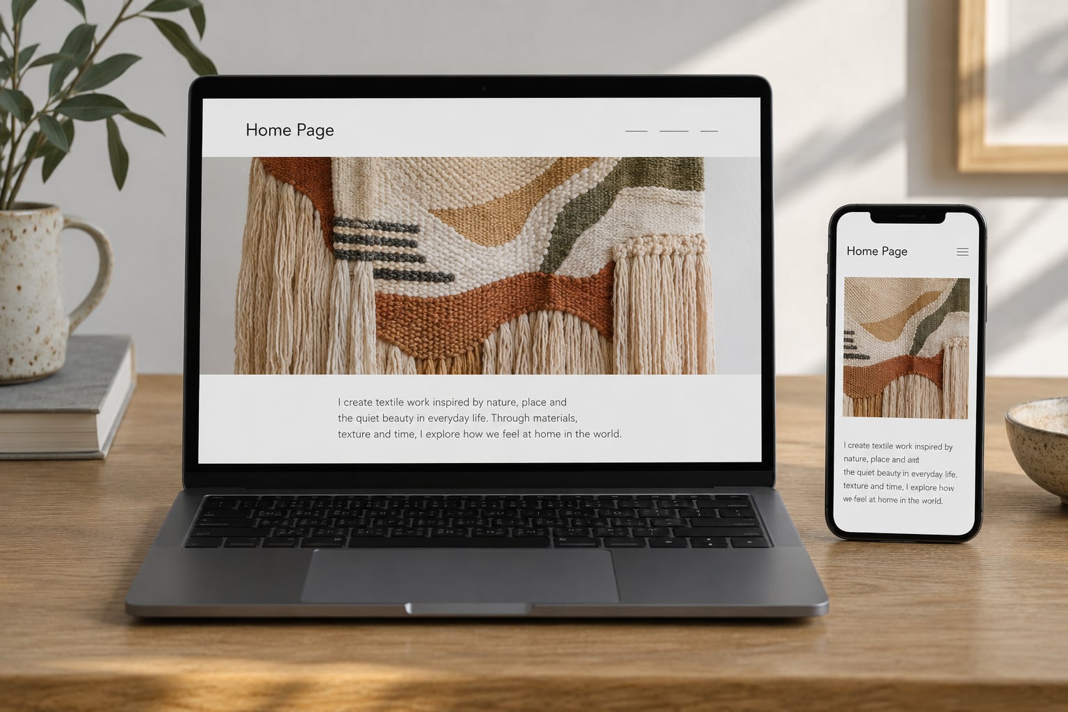
The home page answers one question in about ten seconds: who are you and what do you make? Everything else is optional. If a visitor cannot tell in ten seconds that you make hand-dyed textiles in Asheville, your home page has failed. When artists ask what pages does an artist website need first, this is nearly always the answer.
Keep it to four things: your name and what you do in one line, three to six pieces of your strongest work, a short paragraph that reads like a person wrote it, and a single call to action. One. Viewers who have to choose between “View work” and “Commission me” and “Read the journal” will pick none of them.
The most common complaint from people who land on an artist’s site is a portfolio link that goes nowhere. Make sure your main navigation sits at the top, stays visible, and holds four to six items. Not nine.
What to put on your home page
- One line naming your practice, for example “Hand-dyed textile artist working in natural indigo.”
- Three to six images, all from the same body of work so the page reads as one idea.
- Two or three sentences about where you work and what you are focused on right now.
- One button or link, pointed at your portfolio, your shop, or your contact page.
2. About Page
The about page is where a curious viewer becomes a confident one. Galleries, curators and residency panels read it before anything else, and it is consistently described by artists as the page they find hardest to write. Most of them are trying to summarise a whole career in three paragraphs.
Don’t. Write about four short blocks instead: where you are and what you make, how you got there, what questions your work is exploring, and one human detail that has nothing to do with art awards. A line about the dog who supervises the dye garden does more for your credibility than a third award.
Include your location and whether you take commissions or accept submissions. Many applications ask for both, and an artist who makes either fact hard to find loses the application before anyone looks at the work.
A structure you can fill in today
- Paragraph one: where you live and work, and the materials you use.
- Paragraph two: your training, self-taught years, or the work that changed how you make things.
- Paragraph three: what you are trying to say, in plain language rather than theory.
- Paragraph four: exhibitions, collections, grants or teaching, kept to two or three lines.
- Closing: how to reach you, plus one link back to the portfolio.
3. Portfolio Page
The portfolio page shows the work and gives it enough information to be taken seriously. For textile and mixed media artists this matters twice over, because buyers want to know the fibre content and the dimensions before they will even message you.
Curate hard. Five to eight pieces you would happily show in person beat twenty-five average images every time. Present them as a small body of work rather than a full retrospective, because a visitor who sees one coherent idea is far more likely to keep looking.
Every image needs the same detail block: title, medium, dimensions, year, series name if it belongs to one, and whether it is available, sold, or on hold. Consistency does more work here than clever layout.
What to include with every piece
- Title and year.
- Medium, written out fully, for example hand-dyed linen, wool and cotton.
- Finished dimensions, including the frame or hanging method if there is one.
- Series name and the other pieces in it, so the work has context.
- A short note on materials or technique if anything about the piece surprised you.
On price: most fine artists keep prices off the site and direct people to inquire by email, which is standard gallery practice and gives you a conversation before a transaction. If you sell prints or editions openly, list those plainly. Be consistent, and make sure whichever policy you pick is stated once and not contradicted on another page.
4. Project or Series Pages
When you have an ongoing series, give it its own page instead of scattering the pieces across one long gallery. A viewer who reads two paragraphs about why a body of work exists will engage with every piece on that page far more than with a grid of thumbnails.
Cover four things: the concept in two or three plain sentences, the materials and process, the context or research behind it, and the individual pieces with their detail blocks. Add studio photographs of work in progress. They add depth to a portfolio and prove the piece was made by a person, not assembled.
A good series page reads like a short essay you can look at. One weaver I know opens hers with the dye garden where the work started, then moves to the loom, then to the finished pieces, and the whole thing takes under four minutes to scroll.
5. Services or Commissions Page
A services page does the work of qualifying inquiries before they reach your inbox. It tells a client what you make, roughly what a project involves, and what you need from them, which means the messages you get are the ones worth answering.
For commission artists, be specific about the stages: enquiry, design conversation, deposit, work in progress, final handover. Include what information the client should send in their first message, such as dimensions, location, deadline and intended use. That one line removes half of your back-and-forth emails.
State the obvious boundaries too. Turnaround ranges, whether you ship internationally, whether you work in a particular style, and what happens if the brief changes halfway through. This is the page where saying no early saves you weeks.
6. Shop or Sales Page
If you sell anything, you need a page that answers how to buy. That covers originals held for sale, prints and editions with their paper and edition size, framing options, and how a collector pays. If you take payment through a third-party platform, say so plainly and link to it.
Many artists run the shop and the portfolio on the same site, and that works well. You can lead with the work and put buying behind each piece, or lead with the work and keep a separate store section. What does not work is hiding the shop so thoroughly that a collector assumes everything is sold.
Decide deliberately whether prices are visible. Open pricing saves qualified buyers time and filters out tire-kickers. Hidden pricing creates conversation but only if the contact route is obvious and fast. Pick one, apply it across every piece, and never leave a visitor guessing which policy applies.
7. Contact Page
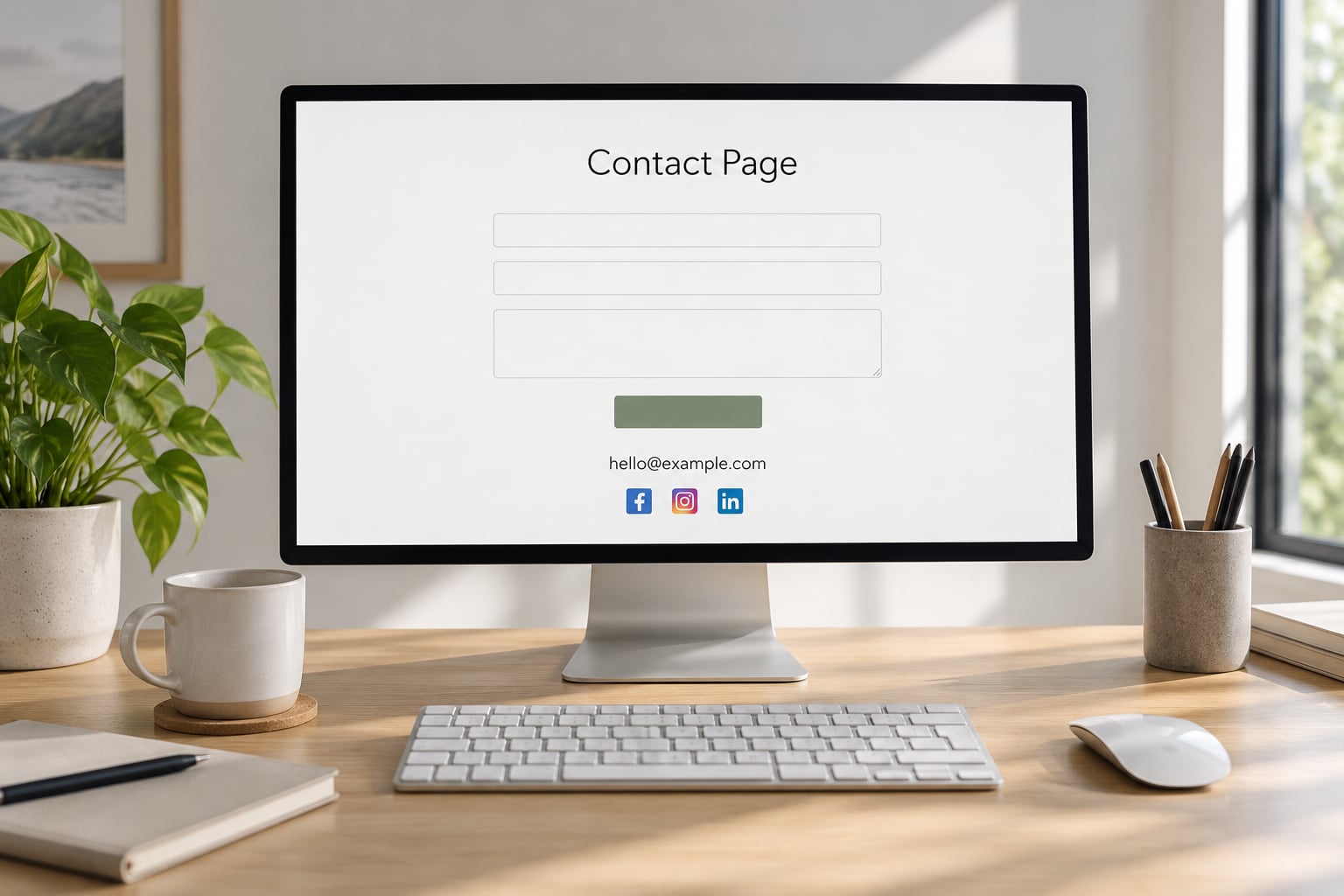
The contact page exists to remove effort. A visitor who has to hunt for an email address, decide between a form and a phone number, and then start typing will simply leave. Give them one obvious way in and one backup.
Keep the form short: name, email, and a message box. Ask for more than that and completion rates drop. Then put your direct email address in plain text beneath the form, because some people would rather attach a reference image than paste a paragraph into a small field.
Repeat your contact details in the footer of every page, not just this one. Artists mention this constantly in artist communities, and it is the single cheapest improvement available. Add your Instagram and, if you use one, a secondary account specific to the practice.
What a good contact page includes
- A short form with name, email, message, and an optional file attachment.
- Your email address as clickable text, never as an image.
- Whether you respond within a given number of days.
- Studio or business location, and whether you take appointments.
- Links to your main social account and any secondary account.
8. Exhibition or Press Page
This is the page that does the quiet work of making you look established, and it is the one artists most often forget. It can be a single page or two, and it should list exhibitions, awards, collections, publications and features in reverse chronological order.
Keep it scannable. Group by year, keep each entry to one line, and show the venue, the city and the dates. A curator should be able to read your entire exhibition history in under a minute and never have to ask you for a CV.
Add a press section to the same page or a linked one. Collect every article, podcast appearance or interview with the publication name, the headline, a link, and the date. If you have been featured more than once, add a downloadable press kit with a short bio, three to five high-resolution images, and your exhibition list. It saves you an afternoon every time a writer gets in touch.
9. Teaching or Workshops Page
If you teach, this page can pay for the rest of your site. Workshops, classes, guild demonstrations and one-to-one sessions all need the same core information, and none of it is complicated: what the session covers, how long it runs, what level it suits, what materials are included, how many people can join, and where it happens.
Name your audiences directly. Art schools, libraries, guilds, corporate teams and private students all want different things, and saying which ones you work with does half the selling for you.
Add proof: a photo of a workshop in progress, past participant feedback, or the institutions you have taught for. If you sell recorded courses, this is also where a small library of lessons can sit, quietly attracting search traffic while you look for studio bookings.
10. Artist Statement or Process Page
An artist statement is not a longer about page, and mixing the two is the usual mistake. The about page says who you are and what you have done. The statement says what you are thinking about and why the work looks the way it does.
Write it in plain language. If a sentence needs a lecturer to unpack, rewrite it. Two or three short paragraphs on the questions driving your work is plenty, and it works best when it sits next to images of the materials and the making.
A process page is the practical sibling: how a piece actually gets made, from sketch to finished object. Photographed steps, tool lists, dye recipes, timeframes. For craft practices especially, this is the page that gets shared and sent to a curious visitor who is not ready to buy.
11. FAQ Page
An FAQ page sounds redundant when your site is five pages long. It earns its place the moment you take commissions, ship work, or run classes, because it answers the same twelve questions by email every single month.
Write the questions in the words your visitors actually use, then answer them properly in two or three sentences. Commission process and timeline, what happens after someone enquires, whether you ship internationally, care instructions for fibre work, print and edition details, and how long you usually take to reply.
It is also one of the few pages on your site that can bring in people from search who never typed your name. Questions about care and shipping get asked constantly, and a clear answer page can catch that traffic for years.
12. Privacy, Terms, and Shipping Page
These are the boring pages that keep you out of trouble once money or personal details are involved. If you have a contact form, you are collecting names and email addresses, so a short privacy statement about what you do with them belongs on the site.
If you sell, add a terms page covering reproduction rights, returns, cancellations and commission policies, plus a shipping page covering how work is packed, insured, tracked and delivered. Note anything a buyer should know before they commit, such as colour variation in hand-dyed pieces or framing being quoted separately.
Keep these pages short and readable. A gallerist reading yours will care that the policy is clear, not that it covers every edge case. A copyright line on your images and a note that your work may not be reproduced without permission usually covers the rest.
Frequently Asked Questions
How many pages should an artist website have?
Four to start: a home page, a portfolio or gallery page, an about page, and a contact page. That set covers what a gallery, curator or hiring manager needs to evaluate you. Once those are live and decent, add the ones your practice actually needs, such as a shop page if you sell, a journal page if you want search traffic, and a services page if you take commissions. Twelve pages is a comfortable ceiling, not a target.
Should I publish prices on my artwork?
It depends on what you sell, as long as you are consistent. For originals shown to galleries and collectors, most artists hide prices and invite enquiries by email, which creates a conversation before a transaction. For prints and editions, visible pricing saves qualified buyers time and filters out casual browsers. Whatever you choose, state it in one place and apply it to every piece, because inconsistent pricing is what makes visitors distrust a site.
Is a single-page artist website enough?
It works if you serve one audience and one goal. A single page is fine for a small body of work, a teaching offer, or a site that exists purely to receive enquiries from Instagram. Add pages as soon as you have two distinct audiences or two distinct goals, such as selling work and applying to residencies. The practical dividing line is whether your menu would need more than four or six items to stay clear.
What should I write on my about page?
Four short blocks: where you live and work and what materials you use, how you got there, the questions your work is exploring, and one human detail that has nothing to do with awards. Close with your location, whether you take commissions, and one link back to your portfolio. Two hundred to three hundred words is plenty. Artists who struggle here usually try to summarise a whole career instead of describing a practice.
Do I need a blog on my artist website?
Only if you want the site to bring people in rather than just hold your work. A journal page is your best lever for search traffic, because visitors search questions about materials, techniques and care, not only your name. It also gives people a reason to give you their email address. If you have no interest in writing, leave it out and put that effort into a stronger portfolio and a projects page instead.
How do I choose a website platform for my art?
Start with what you need to do, not with features. Most artists need good full-screen image display, simple editing, a working contact form, and reliable mobile rendering, because most visitors arrive from a phone via a social link. Hosted builders such as Squarespace, Wix, Adobe Portfolio and Cargo get you there fastest with no maintenance. WordPress and similar self-hosted options cost more time and give you more control. Free options are fine for testing but not for a site you will keep for years.
Conclusion
Start with four pages: a home page, a portfolio page, an about page and a contact page. Get them live before they are perfect, because a small finished site beats a large one that never ships. Then add in this order, whichever applies to you: project or series pages, services or commissions, shop, exhibitions and CV, journal, press, teaching, statement, FAQ and legal pages.
The order matters less than shipping. An artist with a plain site and eight strong images will do better than an artist with a beautiful half-built one.