Adding alt text to artwork images takes about two minutes per image, and the job is smaller than most artists expect. Alt text is a short description stored with the image that screen readers read aloud, so a visitor who cannot see your painting still learns what it shows. On WordPress, Squarespace, Wix, Etsy and Adobe apps the field is already waiting in your image settings, which means the how to add alt text to artwork images process is mostly deciding what is worth saying.
The part that trips people up is not the button. It is writing the sentence without slipping into art-world voice or guessing at meaning you have not confirmed. This guide walks through what to gather, how to draft, and how to test the result so it actually reads well out loud.
Table of Contents
- What You Need
- Step-by-Step
- Review the Artwork and Gather Accurate Details
- Write a Focused First Draft
- Remove Repetition, Unsupported Claims, and SEO Clutter
- Add the Description to the Image
- Preview the Page Like a Screen Reader User
- Test and Update the Description
- Common Mistakes
- Frequently Asked Questions
- How long should alt text be for an artwork image?
- Should I add alt text to every image on my art website?
- Does artwork alt text need to include the medium or artist’s name?
- How should I describe words or labels that appear inside an artwork?
- When is a caption or long description better than alt text?
- Conclusion
What You Need
Gather five things before you open your website editor. The first is the final image file, the exact version you published, because descriptions written from a phone snapshot of a work usually miss details the real image shows.
Second, the artwork’s title, medium and dimensions. A piece called Low Tide No. 4 in acrylic and gesso on birch panel, 24 by 30 inches, gives you three usable facts in one line.
Third, a short concept note or the paragraph from your artist statement. You do not need the whole statement, only enough to know whether the title is literal or a reference.
Fourth, and this one surprises people, a way to check your work after publishing: a keyboard, a free accessibility checker, or a screen reader on your phone.
Fifth, access to whatever publishes your images, with an Alt Text or Alternative Text field available in the image settings.
One warning before you start: a filename is not alt text. tide-study-04-final-v2.jpg tells a screen reader user nothing useful, and neither does an empty field. Field names differ by platform, but the function is the same everywhere.
These fields get confused constantly, so it is worth separating them before you type anything:
| Field | Who sees it | Job |
|---|---|---|
| Alt text | Assistive tech, or anyone if the image fails to load | Describe the visual content in one sentence |
| Caption | Everyone, printed on the page | Add context, price, edition size, a story |
| Title | Everyone, as a heading or hover text | Name the work or the page |
| Filename | No one, in normal use | Identify the file to your computer and the web server |
| Long description | Everyone, as linked text or a hidden panel | Carry detail too long for one sentence |
That table resolves most of the anxiety in the r/ArtistLounge threads on this topic. You are not writing catalogue copy. You are writing one plain sentence about what is in the picture.
Step-by-Step
Review the Artwork and Gather Accurate Details
Look at the artwork and record only what you can verify by looking. Subject, medium, composition, color, texture, and how those things relate to each other.
Take a mixed-media example. Suppose the piece is a stretched canvas with torn map fragments, rust-colored acrylic washes, and a stitched red thread running diagonally across the lower third. You can write: torn map pieces layered on canvas, washed in rust tones, with a line of red stitching running across the lower third.
That sentence is safe because every claim in it is visible. Now notice what you left out. You did not say the stitching symbolizes a journey, that the maps reference a family homeland, or that the rust palette conveys memory. Those are interpretations, and they need supporting context you can point to, not intuition.
The same restraint applies to people and identity. If a figure appears in the work, describe position, pose and clothing. Do not assign nationality, emotion or story unless the artist or a reliable source states it. Guessing can be more harmful than saying nothing.
Write a Focused First Draft
Turn your notes into one sentence that names the work and carries its most important visual information. Start with the medium or the subject, not with a filler phrase.
Drop image of and picture of. A screen reader has already announced that an image is coming, so those words make a listener wait for information that already arrived. A screen reader also frequently reads the letter after a period, so avoid abbreviations like etc. or No. inside the sentence.
For a textile piece, the draft might read: hand-stitched appliqué quilt in indigo and rust, showing a row of overlapping hills beneath a pale sky. Roughly 100 characters, one breath, no art jargon, and a blind reader can picture it.
You can tell a draft is working when it conveys the work’s appearance to someone who cannot see it. If you cannot picture it yourself from the sentence, the sentence is still too thin.
Remove Repetition, Unsupported Claims, and SEO Clutter
Read your draft twice. The second pass is where the good descriptions separate from the bad ones.
First, cut anything the surrounding page already says. If the heading above the image reads Low Tide No. 4, acrylic on panel, your alt text does not need to repeat the medium again. Redundant alt text interrupts the flow of a screen reader and adds nothing.
Second, remove evaluative words. Stunning, profound, haunting, beautiful: these are judgments, and they tell a listener nothing they can see. The colour of a sky is verifiable. Whether it is stunning is not.
Third, strip out search-engine clutter. Before: abstract landscape acrylic painting bold blue art wall decor modern contemporary art print. After: abstract acrylic painting with wide horizontal bands of blue and grey brushed across the canvas. The second version helps search engines more, because it is a real description, and it helps a screen reader user far more.
Keep the distinctions that matter visually. Orientation, relative position, scale and count are worth keeping because they are exactly what a listener cannot reconstruct without help.
Add the Description to the Image
Every mainstream platform stores this in the image settings, and the field is usually called Alt Text or Alternative Text. The exact route depends on your software, and the names shift with major interface updates, so check the current version if a step looks unfamiliar.
In WordPress, open the page or post, click the image, then use the Block settings panel or the Image panel in the sidebar. In the Alternative text box, paste the finished sentence and update the block. In the media library, the same field sits in the Attachment Details box on the right.
In Squarespace, click the image, choose Edit, and the Alt Text field appears directly beneath the image link and caption fields. In Wix, click the image, then use the Settings panel and the Description field, which is the field Wix maps to alt text.
On Etsy, open Shop Manager, go to Listings, click the pencil icon on the listing, and the alt text box sits with the other listing images. The field accepts 250 characters, though around 125 is the more useful target. If the box is missing, Etsy is sometimes generating the text for you, which is a known source of odd descriptions worth editing by hand.
In Adobe Photoshop and InDesign, the control is under Object, then Object Export Options, where you choose Custom as the Alt Text Source and type your sentence. Canvas works similarly, with alt text under the image menu when the element is selected.
To add alt text to artwork images properly, upload the image, open its edit screen, enter the finished description in the alt field, and save. Then confirm nothing else got pasted into the wrong box. Filenames, captions, titles and alt text are four separate fields, and none of them is a substitute for another.
Preview the Page Like a Screen Reader User
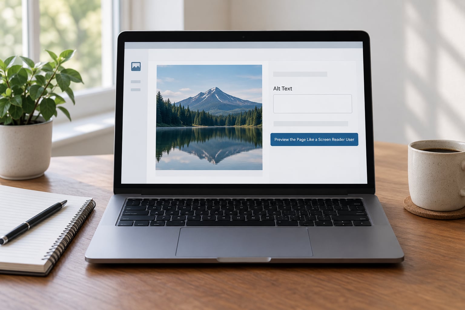
Put the mouse down and use the keyboard. Tab through the page and listen to what gets announced, especially around images and links.
You are checking five things: that the reading order makes sense, that each image is announced at a sensible point, that link text says where the link goes, that no two images in a row have identical descriptions, and that no filename is being read aloud because a field was left blank or filled with the wrong content.
Alt text should supplement a useful caption, not repeat it. If your caption already reads Hand-stitched indigo quilt, 60 by 72 inches, $420, the alt text describes the hills, the sky and the stitching. Different jobs, same image.
The success test is simple. Read only the alt text, out loud, with the image turned away. If it still tells you something true about the work, it passes.
Test and Update the Description
Run the page through a free accessibility checker after publishing. These tools catch blank fields, filenames being used as descriptions, and duplicate alt text across a gallery, though they cannot judge whether a description is actually accurate. That last check is yours.
Test on both desktop and mobile layouts. On a phone, a screen reader reads from a different starting point, and a long description pushed far down a gallery grid can end up announced long before the image it belongs to.
Revisit your alt text at four moments: after you replace an image, after you change the crop so the composition reads differently, after you correct factual details about the work, and when the image’s purpose changes, such as reusing a detail shot as a link or a thumbnail.
For larger catalogues, set aside one session to retro-fit images already published. Sellers on r/EtsySellers describe this as a recurring chore, and it is the single highest-value batch job on this list. Accessibility guidance moves slowly, but the interfaces that carry your alt text in 2026 do not.
Common Mistakes
Most bad art alt text comes from one of ten habits. Each has a quick fix.
Starting with image of or picture of. Delete both. The screen reader already said it is an image.
Stuffing keywords. Remove any word you would not say out loud in a gallery. Descriptions that read like a tag list slow everyone down.
Writing interpretation as fact. If you cannot point to a source for the symbolism, describe the colour, shape and placement instead.
Treating every detail as equally important. Ask what a listener needs to picture the work, then cut the rest. Length is not thoroughness.
Using the title as alt text. A title identifies the work. The alt text describes what is in it. A title alone leaves a listener with nothing.
Duplicating the adjacent copy. If the paragraph above already says medium, size and price, do not say it again in the alt field.
Writing a caption by mistake. If your sentence would still help with the image removed, it is alt text. If it only makes sense next to the image, it is a caption.
Leaving the field blank. A blank field makes some screen readers read the filename instead. That is worse than a plain description.
Describing the same image differently in different places. Keep one wording for a given work across your site, your shop and your social posts so it stays consistent for repeat visitors.
Confusing a decorative image with a missing one. A border, a texture swatch or a divider carries no information, so it should be marked decorative or left empty on purpose. A blank field and a deliberate empty one look identical in the editor and behave differently on the page.
One habit makes the rest easier: pick a house style and use it everywhere on the site. Many studios settle on medium, subject, then composition and colour, in that order, capped at about 125 characters. Consistency means you can write the tenth description as fast as the first.
Frequently Asked Questions
How long should alt text be for an artwork image?
Aim for roughly 125 characters, which usually lands between 10 and 20 words and fits in one breath. If the work needs more than that, keep the sentence short and put the detail in a caption or a long description. Etsy’s field accepts 250 characters, but the extra room is not a reason to use it.
Should I add alt text to every image on my art website?
Add it to every image that carries meaning, which is nearly all of your artwork, process shots and product mockups. Decorative elements such as dividers, textures and background patterns should be marked decorative instead, so screen readers skip them. Decorative images need to be marked, not simply left blank.
Does artwork alt text need to include the medium or artist’s name?
The medium is usually worth including because it is visible and tells a listener a lot about the work. The artist’s name is only needed when the page does not already identify it nearby. Repeating a name that sits right above the image creates redundancy a screen reader user has to listen past.
How should I describe words or labels that appear inside an artwork?
Transcribe the visible text, because it is often the point of the work. Say where it sits and what it is, for example a black hand-lettered word centred in white space. If the text is a signature or watermark that appears in every image, describe it once and then leave it out of the rest.
When is a caption or long description better than alt text?
A caption is better when the detail is interesting but not essential to seeing the work, such as edition size, price or the story behind a piece. A long description is better for complex works, grids of many pieces, or anything a single sentence cannot carry. Alt text should point to it in those cases.
Conclusion
Start with one image. Open its settings, find the Alt Text or Alternative Text field, and write a single sentence built from what you can actually see in the work, then read it aloud without the image in front of you.
That first pass takes two minutes and it sets the pattern for the rest of your catalogue. Clear, factual alt text gives blind and low-vision visitors real access to your work, and it stays a description rather than becoming keyword copy or an interpretation the artist never made.