To edit art photos for accurate color, you neutralize the white balance in the RAW file against a reference you shot in the same light, set your black and white points, match the result to the physical piece, and export into the color space your destination actually reads. Most of the accuracy is won or lost at the shoot and in the first two sliders, not in a long chain of touch-ups.
Here is the whole workflow in six steps.
- Shoot RAW with a gray card or color checker in the first frame, under one even light source.
- Open the RAW file in Camera Raw or Lightroom, set the Color Space to the wide-gamut working space, and never overwrite your original.
- Use the white balance eyedropper on the neutral patch to kill the color cast.
- Set the black and white points, then check the histogram for clipped canvas weave and blown highlights.
- Put the corrected image next to the real artwork and fine-tune hue and saturation per material.
- Export sRGB for web and marketplaces, the lab’s profile for print, and embed the ICC profile.
If you only remember one thing: shoot the reference frame. Without a neutral patch in the same light, you are guessing at the cast, and no amount of slider work fixes a guess well.
Table of Contents
- What You Need
- A monitor you can trust, in a neutral room
- Editing software that reads RAW
- A neutral reference in the same light
- The best file you have
- A pre-shoot checklist
- Step-by-Step: How to Edit Art Photos for Accurate Color
- 1. Prepare the file and working color space
- 2. Set the white balance and overall color cast
- 3. Correct exposure and tonal range without flattening texture
- 4. Adjust saturation, vibrance, and selective color
- Per-material notes
- 5. Check color against the physical artwork and reference objects
- When accurate is not the goal
- 6. Sharpen, resize, and export the final image
- Common Mistakes
- Frequently Asked Questions
- How do I get color accurate photos of my art?
- Is there a free AI tool for color correction of photos?
- How can I calibrate the colors in a photo?
- What is the 60/30/10 rule in photography?
- What color space should I export artwork photos in?
- Do I need a color checker to photograph my art?
- Conclusion
What You Need
Accuracy in an art photo is a chain. Every link can introduce a shift, and the fix is much cheaper before the file is open than after.
A monitor you can trust, in a neutral room
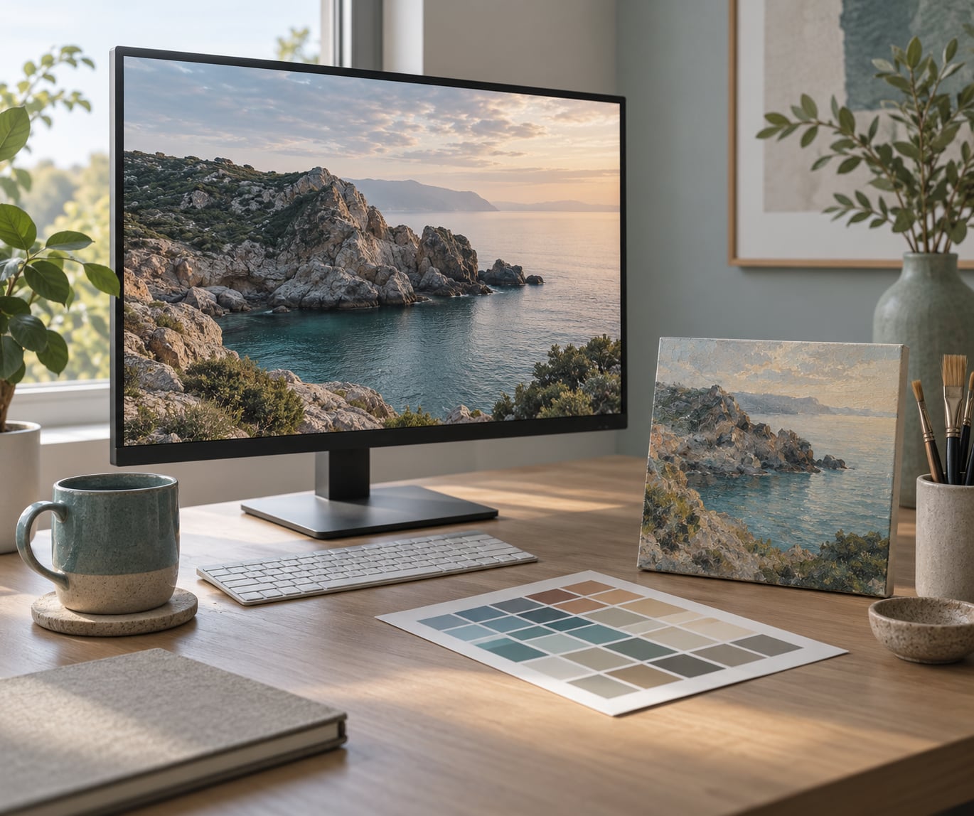
A color-managed monitor set to sRGB, brightness around 100 to 120 cd/m2, in a room without heavy color from walls or furniture. If your screen is a glossy laptop panel in a sunlit room, every judgment you make downstream is unreliable, so treat that as a working setup with limits rather than pretending it is calibrated.
Hardware colorimeters from brands like Datacolor and Calibrite measure your display and write a profile. Plenty of artists never buy one and still get very close, because the artwork itself is the reference, but a colorimeter removes a whole layer of doubt when you are pricing giclee prints.
Editing software that reads RAW
Adobe Camera Raw and Lightroom Classic are the most common path, and the menu names in this guide follow them. Affinity Photo handles RAW and the same ideas, GIMP is free and genuinely capable for color work, and Capture One is popular with studio photographers. Whatever you use, the sequence below is the same: white balance, then tone, then selective color, then export.
A neutral reference in the same light
This is the item people skip. An 18% gray card gives you a neutral patch to click. A color checker chart gives you that plus a set of known color patches you can build a custom camera profile from, which is the more rigorous route when you shoot a whole series under the same setup.
You do not need to buy either one. A clean white sheet of printer paper or a piece of unprinted white card in the first frame works as a rough reference, and I have corrected plenty of listing photos that way. It is less precise than a gray card, and it is much better than nothing.
The best file you have
RAW if your camera writes it, the highest-quality JPEG the camera can produce if it does not, and a working copy that you never overwrite. Work non-destructively through adjustment layers or a RAW smart object in Photoshop so you can undo a single change at the end rather than restart the file.
A pre-shoot checklist
Color accuracy is mostly decided before you press the shutter, so this short list saves more time than any edit.
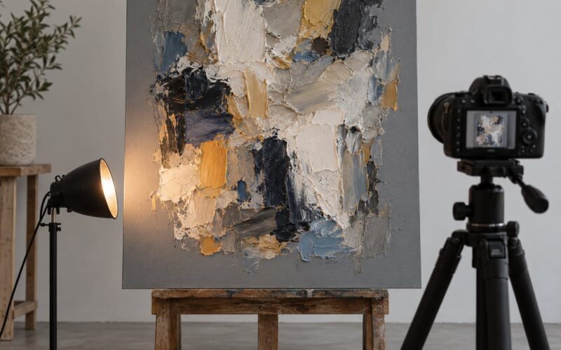
- Turn off every light except your one main source. Mixed household lighting is the single most common cause of a cast that will not clean up.
- Aim the light at a shallow angle to the surface rather than straight on, which is what produces glare on varnish and gloss acrylic.
- Shoot RAW, ISO 100, and a mid aperture around f/8 for a consistent result across a series.
- Use a tripod or brace the camera so nothing shifts between the reference frame and the artwork frame.
- Put the gray card or chart in the first frame of each lighting setup, in the same light as the piece, and leave it out of the delivered image.
- Fill the frame with the artwork, with even margins, so you are not correcting a photo taken at an angle.
Two shots of the same piece in the same light will still differ slightly, so keep one look across the set. A custom white balance set from the first frame of a lighting setup can be reused for the rest of the session, and naming it after the setup makes that habit stick.
| Reference tool | What it gives you | Where it fits |
|---|---|---|
| 18% gray card | One neutral patch for white balance and an exposure check | Single pieces, quick jobs, no purchases required beyond a card |
| White paper or card | A rough neutral patch | Free fallback when you shoot at home |
| Color checker chart | Neutral patch plus known color patches for a custom profile | Shooting a whole series under identical light, or work you will print and sell |
| Hardware colorimeter | A profile for your display, not for the artwork | When print sales are the goal and you want the screen to stop lying |
| Software only | Corrected RAW math plus your eyes against the real piece | Plenty of artists get accurate results this way and never touch a colorimeter |
One honest limit worth stating up front: no edit fully recovers color that was captured under bad light. Mixed household lighting, a warm bulb next to a window, records a cast and a color shift in the same frame, and the correction pulls you close rather than all the way back.
Step-by-Step: How to Edit Art Photos for Accurate Color
Set up your environment first, then work top to bottom. The order matters because each stage assumes the one before it is correct.
1. Prepare the file and working color space
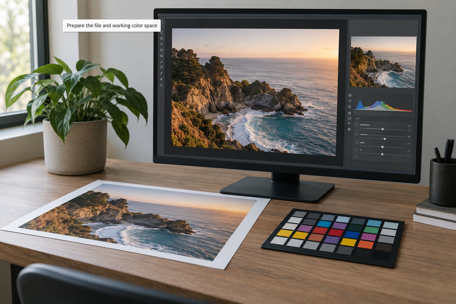
Open the RAW file. In Camera Raw and Lightroom, set Profile to your wide-gamut working space, which is Adobe RGB or ProPhoto RGB, then set the process version to the latest your version offers. Working wide means the colors you push later stay inside the space instead of clipping at the edges.
Make your first real edit in 16-bit where the software allows it. An 8-bit pipeline throws away a third of your tonal range, and with woven canvas or a deep glazed frame, that is range you will want back.
Keep the original untouched. Duplicate the layer in Photoshop, or work from the RAW with adjustment layers. If your app offers a snapshot or preset, save one called something like Studio_D65_Overcast so the whole series of a piece shares one look.
Before anything else, view at 100% zoom with color-correct display settings on. Pixel-level inspection at a fit-to-screen zoom is how people miss a thin magenta line along a canvas edge.
2. Set the white balance and overall color cast
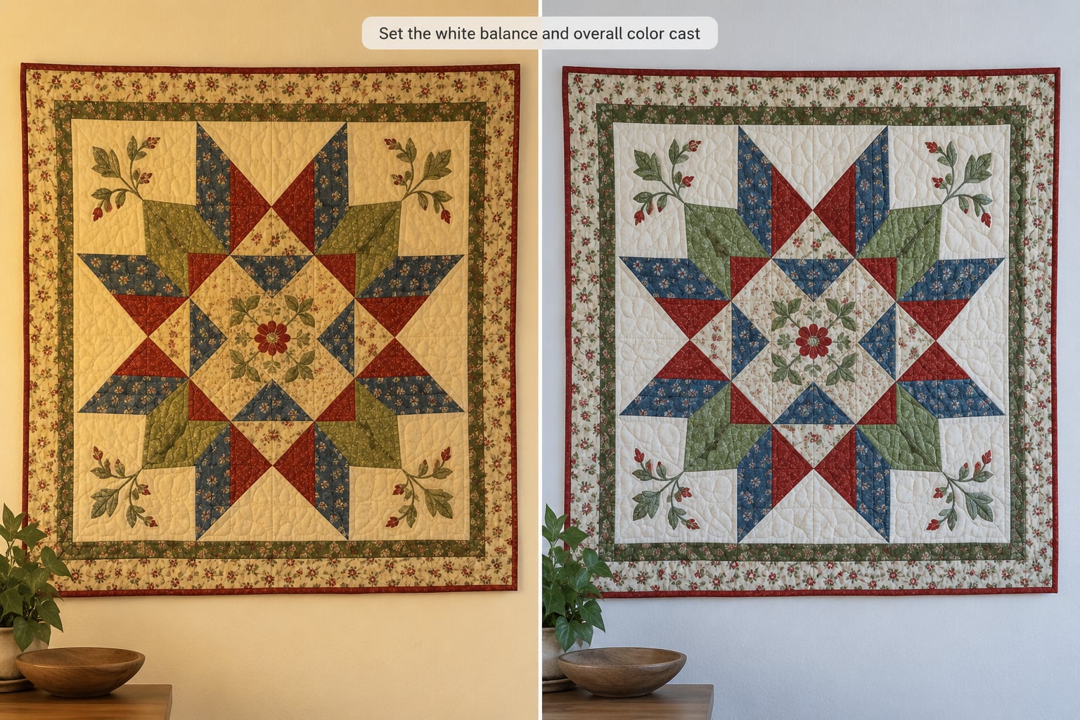
Accurate color depends on getting the neutral right first. Open the White Balance panel, set the Temperature slider roughly where it was shot, then click the eyedropper and sample the neutral patch from the reference frame.
The path in Camera Raw and Lightroom is Basic panel, or the dedicated White Balance panel, then the eyedropper on the right. The software reads the patch, solves the scene’s white balance, and removes the warm, cool, green, or magenta cast in one move. Nudge the Tint slider if the patch still leans green or magenta after the eyedropper lands.
Turn off the As Shot white balance setting. Automatic white balance in a room with mixed bulbs will confidently pick the average of two wrong light sources, which is worse than no correction at all.
If you shot no reference, work from a known area instead: the white of the canvas edge, the paper border, an unprinted page held next to the piece, or a bright neutral in the background. Push the temperature until that area reads white to you, then pull saturation back if the whole frame looks candy-colored.
3. Correct exposure and tonal range without flattening texture
Work from the histogram panel. Slide the black point until the deepest shadow sits just off the left wall, and the white point until the brightest highlight just touches the right, then stop. The moment you push either one flush, texture disappears and the edit cannot be recovered.
Zoom to 100% and check the surfaces that carry the character of the piece. Woven canvas should still show threads in the midtones. Brush marks in thick oil should keep their ridges. Wood grain, paper tooth, and pencil texture should each read as texture, not as a flat area with a color on it.
Canvas weave and a matte paint surface are the usual victims. The camera resolves them a touch flatter than the eye does, and the fix is a small local contrast lift or a gentle clarity pass on a masked layer, not a global sharpening slider.
If a framed piece sits in its frame for the shot, expect a soft vignette from uneven light. Correct it with a radial adjustment rather than pulling the corners down in the global exposure, which darkens the whole image for a problem that exists in one corner.
4. Adjust saturation, vibrance, and selective color
Global saturation is the fastest way to make an art photo look wrong. Most corrected paintings come out slightly lifeless, and the reflex is to crank saturation, which pushes saturated pigments like cadmium yellow and phthalo blue into neon territory and breaks the relationship between the colors.
Use vibrance instead. It lifts muted areas and protects the already-saturated ones, so a soft pastel sky gains depth without the deep blues turning electric. Work in small increments and zoom out to 50% between changes, because your eye adapts to whatever is on screen.
When one pigment is genuinely off, isolate it. In Camera Raw and Lightroom, the Color Mixer panel targets a hue range and leaves the rest alone. In Photoshop, a Hue, Saturation, Lightness adjustment layer with a mask or a Color Range selection does the same job. Yellow paint that reads mustard, a magenta that skews purple, a green earth pigment that goes army green: each gets a small targeted move.
Per-material notes
- Oil and acrylic. Glossy varnish produces specular hotspots that read as blown white. Drop highlights before you touch saturation, and mask any hotspot with a soft brush so the sheen stays a sheen.
- Watercolor and gouache. Paper tone shifts the whole image. Correct the paper white first, then judge the pigments, because every wash on the sheet sits on that tone.
- Colored pencil and pastel. These are dry, high-matte media with a fine grain that cameras render flat. A restrained texture or clarity pass on a masked layer brings the tooth back without smearing the edges.
- Graphite and line art. The tonal range is narrow and entirely neutral. Get the paper white right and leave it there; heavy color work on graphite is almost always a mistake.
- Textile and fiber art. Yarn has real specular sheen in fibers, and shadows between stitches go very dark. Lift shadows slightly, hold the deepest gaps, and correct the wool or cotton hue with a narrow mask rather than globally.
Masking is the skill that separates a decent edit from a good one. Anything already accurate should be protected, and a mask is how you protect it.
5. Check color against the physical artwork and reference objects
Put the piece and the screen side by side, under the same light, at the same size if you can manage it. Squint at both, or blur your eyes, because squinting removes fine detail and leaves you comparing overall color, which is the actual test. Step back a few feet and ask whether the photo reads warmer, cooler, greener, or pinker than the object.
The most honest check is daylight-balanced viewing. Take the piece and the screen to a north-facing window, or to a light box set to roughly 5000 to 6500K, and compare there. Warm interior light will make both the object and the photo look yellowish, and you will wrongly push the edit blue to compensate.
Check the neutrals first. Any white or gray in the piece is your control, and once those are right, the chromatic relationships usually fall into place on their own. Then check the largest color field, then the smallest accent, since the eye is worst at judging an isolated small color against a background of other hues.
View the file on a second device as well, ideally a phone or tablet, since that is where most of your viewers will see it. If the colors hold up on a cheap uncalibrated screen, they will hold up on a good one.
If it still looks wrong after this, the cause is usually capture, not edit. Mixed light, a cast frame, or a shot taken at a steep angle will not resolve with more sliders, and re-shooting is the honest answer.
Artists shooting at home without a studio setup face one more limit. A phone camera is entirely workable for an even, well-lit piece, but it applies its own processing and will not give you a neutral patch to sample, so work from a locked-down color profile version, correct against the physical piece, and expect to make two or three small moves rather than one.
When accurate is not the goal
Some places deserve an accurate edit and some do not. A reproduction print, a gallery submission, and a listing that a buyer will compare to the physical object all need the color to match. A mood post, a workshop announcement, or a thumbnail scrolling past in a feed does not, and a slightly richer, slightly warmer version serves the audience better than laboratory neutral.
Where the piece itself is the subject, keep the paint behaving like paint. Pushing a muted ochre to a clean golden yellow may measure closer to a reference and still be the wrong picture.
6. Sharpen, resize, and export the final image
Sharpen last, lightly, and only for the output size. Use output sharpening rather than a generic filter, and check the result at 100% on canvas weave and pencil lines, where an aggressive radius shows up first. Over-sharpened fiber art develops white halos along every yarn edge.
Resize to the destination. Portfolio sites and print labs want pixel dimensions that match the final print at 300 pixels per inch, so a 16 by 20 inch print needs roughly 4800 by 6000 pixels. Social and listing platforms want the long edge around 2000 to 3000 pixels, and many will re-encode the file regardless.
| Color space | Where it belongs | How to export it |
|---|---|---|
| sRGB | Websites, social platforms, most marketplaces, client email | Convert to sRGB in the export dialog and embed the profile |
| Adobe RGB | Some print labs, wide-gamut displays, gallery printers who ask for it | Only when the lab specifies it, and tell them it is embedded |
| ProPhoto RGB | Archival masters and large prints where you control the whole chain | Keep as a working or master file, not for direct web posting |
Embed the profile unless you have a specific reason not to. A tagged file tells the receiving application what the colors mean, which prevents the washed-out, shifted look you get when an untagged wide-gamut file lands on an sRGB-only screen.
Save the editable file with layers, masks, and the RAW original, and back it up. Name files so you can find them later, something like Piece_Title_web_sRGB rather than a string of numbers.
Common Mistakes
| Symptom | Likely cause | Fix |
|---|---|---|
| Everything looks yellow or warm | Warm household bulbs, or auto white balance averaging a mixed room | Reshoot or sample a true neutral patch; drop temperature until the whites read white |
| Everything looks blue or cold | Over-correction, or a reference photographed in shade | Use the eyedropper on a real neutral and stop moving the tint slider by eye |
| Whites look gray or dull | White point set too low, or a file converted from ProPhoto with no destination space | Raise the white point to the right edge, then convert into sRGB on export |
| Shadows are washed out | Black point pushed too far left in a single step | Bring the black point back a touch and add a small local contrast mask |
| Blown white patches on varnished work | Specular glare under direct light | Lower highlights, clone or mask the hotspot, and change the light angle next time |
| Colors look neon | Global saturation pushed to fix a dull edit | Reset saturation and use vibrance or masked hue ranges instead |
| Colors look accurate but lifeless | Overshot the white balance or crushed shadows | Add vibrance in small steps, checking at 50% zoom between each |
| Framing edges disagree with the piece | Cast frame or mat reflecting color into the image | Correct with a masked adjustment on the frame area only |
Judging accuracy from the monitor alone is the mistake that runs under all the others. Your screen has an opinion, and a laptop panel in a warm room has a strong one, so always confirm against the physical artwork or a print under neutral light.
Editing heavily compressed files costs you more than it looks like. A small JPEG from a messaging app has already thrown away fine color and tonal detail, so work from the original or a full-resolution export.
Adjusting everything at once is the other big one. Each slider changes what the next one looks like, so make one change, look, and only then move on. A snapshot after each stage also makes the edit reproducible for the rest of the series.
Finally, do not chase perfect accuracy when perfect accuracy is not the goal. A stylized marketplace thumbnail, a mood post, and a piece where the paint is the point do not need laboratory accuracy, and over-correcting toward technical neutral can drain exactly the character you wanted to show.
Frequently Asked Questions
How do I get color accurate photos of my art?
You get color accurate photos by shooting RAW, putting a neutral reference such as a gray card or color checker in the first frame, and lighting the piece with one even source. In Camera Raw or Lightroom, sample the neutral patch with the white balance eyedropper, set your black and white points, then compare the corrected image against the real piece under daylight-balanced light.
Is there a free AI tool for color correction of photos?
Free AI color tools can pull a cast out of a photo, but they cannot know what the artwork actually looks like, and several shift skin tones and saturated pigments on the way. For art, a reference shot plus a neutral eyedropper in Camera Raw, GIMP, or Affinity Photo is more reliable and costs nothing. Treat AI as a quick first pass, not as the final correction.
How can I calibrate the colors in a photo?
Calibrating colors in a photo means solving the white balance first, then the tone, then individual hues. Set Temperature and Tint, sample a known neutral with the eyedropper, adjust the black and white points while watching the histogram, and correct remaining shifts with masked hue and saturation adjustments. Verify by comparing the result with the physical artwork under neutral light.
What is the 60/30/10 rule in photography?
The 60/30/10 rule describes subject placement in a frame: roughly 60% of the image for the main subject, 30% for a secondary element, and 10% for an accent. It is a composition guideline for photographers, not a color tool. For artwork photography, a simpler rule works better: fill the frame with the piece and keep one even light source on it.
What color space should I export artwork photos in?
Export sRGB for websites, social platforms, marketplaces, and email, and embed the ICC profile so the receiving application reads the colors correctly. Use Adobe RGB or ProPhoto RGB only when a print lab asks for that specific space, and keep those versions as working masters rather than posting them. If you are unsure, sRGB is the safe answer.
Do I need a color checker to photograph my art?
No. A gray card or even a clean white sheet of printer paper in the first frame gives you a neutral patch to correct from, and plenty of artists get accurate listing photos that way. A color checker earns its place when you shoot a whole series under identical light, or when you build a custom camera profile for work you will print and sell.
Conclusion
Start where the accuracy is decided: at the shoot. One even light, a RAW file, and a neutral patch in the first frame give you something real to correct from. Then neutralize the white balance with the eyedropper, set the black and white points while watching the texture, make small masked corrections per material, and check the result against the physical piece before you export.
Keep every change small and reversible, save your editable file, and export sRGB with an embedded profile for listings, portfolio sites, and social, keeping a wider-gamut master for print labs that ask for one. If you are setting this workflow up in 2026, do the monitor and lighting first, then the capture habit, and the editing will follow almost automatically.