When people ask why do my fabric colors look muddy together, the cause is almost always perceptual rather than a flaw in any single bolt of fabric. Mud shows up when too many hues sit at similar mid-values, when complementary colors land side by side, or when competing prints crowd out any quiet ground. It gets fixed at the palette level, before you cut anything.
That last part matters more than it sounds. A muddy palette is expensive to discover after a quilt top is sewn and cheap to catch with a five-minute test at the cutting table. A mystery fat-quarter bundle can look lively in the bag and then go flat the moment it hits the design wall. Everything reads as brown, and the print causing it is rarely the one you suspect.
So here is the short answer, the six reasons muddy fabric colors happen, and the fixes for each.
Table of Contents
- What Makes Fabric Colors Look Muddy Together?
- Why do my fabric colors look muddy together in small areas but fine in large ones?
- How Fabric Undertones Create Muddy Color Combinations
- Why Similar Values Make Colors Look Muddy
- Why Fabric Color Mixing Is Not the Same as Paint Mixing
- How to Fix Muddy Fabric Colors in Quilts and Textile Art
- How to Test Fabric Colors Before You Start a Project
- What Lighting and Photography Can Do to Fabric Color
- Why Do My Fabric Colors Look Muddy Together? Quick Troubleshooting Guide
- Frequently Asked Questions
- What are muddy colors?
- What colors should you not mix in a quilt?
- How do I avoid muddy colors when painting fabric?
- Is muddy the same as muted?
- How do I know if a color palette works before I cut fabric?
- My quilt top already looks brown. Can I fix it?
What Makes Fabric Colors Look Muddy Together?
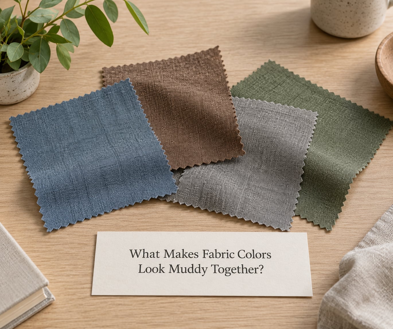
Muddy means the colors have lost their separate identities. Each fabric is still doing its own thing, but side by side they average out into something closer to mud than to any of the colors you picked. Muted is a completely different result, and confusing the two leads people to “fix” a palette that was working.
| What you see | Muddy | Muted |
|---|---|---|
| Cause | Too many competing hues, weak value contrast, or complements next to each other | A deliberate, restricted palette, often a monochromatic or analogous one |
| Chroma | Low, and dropping further as you add fabric | Low but consistent and intentional |
| What the eye does | Reads the group as one gray-brown mass | Reads each color clearly, just quietly |
| Intent | Nobody planned it | The maker chose every low-chroma color on purpose |
| Fix | Remove fabric, or extend the value range | Nothing. Add a single higher-chroma accent if you want more life |
If the colors are all deliberately low-chroma and you can still name each one, that is muted, and nothing is broken. Muddy and muted are not the same thing, and telling them apart is most of the diagnosis.
Why do my fabric colors look muddy together in small areas but fine in large ones?
Because of optical mixing, which is the single most useful idea in this whole topic. Your eye does not need physical contact to blend colors. When two mid-value colors sit beside each other, even across a seam, your visual system partially averages them and reports a blend that is not present in either fabric. Shrink the pieces and the average dominates. Blow them up into large fields and each one gets enough area to be read on its own.
That is why the same bundle can look lively as a stack of fat quarters and tired as a sawtooth row. Scale changes the balance between individual color and averaged color.
How Fabric Undertones Create Muddy Color Combinations
Undertone is the temperature hiding underneath a hue, and it is the reason a group of prints reads as brown when no single print is brown. A blue with a green or purple undertone and a blue with an orange or pink undertone are both blue to you. Side by side, the eye neutralizes the difference and calls it gray.
Check the undertone in daylight, not under a warm bulb, and look at the parts of the print with the least pattern in them. Then lay the suspect fabrics next to a known solid of the same family. If the print’s background shifts warm when the solid is next to it, the undertones are fighting.
Warm and cool colors do clash, but not automatically. Warm next to cool gives energy when the two are far apart in value and gives mud when they are not. Fix the value first, and the temperature fight usually disappears on its own.
Why Similar Values Make Colors Look Muddy
Value is how light or dark a color is, and it matters more than hue. Two fabrics can be completely different colors, a strong teal and a warm coral, and still read as the same thing if both sit at medium value. Nothing separates them, so the eye averages them.
The working rule is one light, one medium, one dark in every group of three. Give the palette at least one genuinely light fabric and at least one genuinely dark one, and the colors start behaving as individuals again.
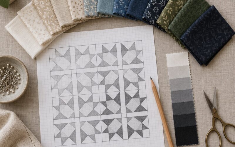
You can check this without any color theory. Take a photo of your layout and open it in any editor that has a black and white or grayscale option. If everything turns into the same middle gray, the layout is flat no matter what the colors are. That test catches more problems for me than any other one I know.
Why Fabric Color Mixing Is Not the Same as Paint Mixing
Paint mixes because you physically stir two pigments together. Fabric placed next to fabric does not mix at all, and neither does fabric stacked on top of fabric unless the layers are translucent. What happens instead is optical mixing, described above, where the eye reports a color that is not physically there.
There is one real physical mix in textile work: overlapping translucent cloth. Voile, organza, chiffon, gauze, and hand-dyed cotton batting all let light through, and two overlapped colors make a third. That is additive mixing, the same logic as red plus green making yellow in light. It can be deliberate and gorgeous in layered appliqué or sheer work, and it is where surprise mud shows up if you are not expecting a new hue to appear.
Dyeing is a separate set of causes entirely. Over-diluted dye, too much water, and fabric that was not washed or pre-treated before dyeing all produce thin, watery, dead color that looks muddy on its own, no palette involved. If you are hand-dyeing, the fix is on the dye side: mix to the strength you want, use the dilution the dye recommends, and prep the cloth first.
How to Fix Muddy Fabric Colors in Quilts and Textile Art
Almost every successful rescue is subtraction. The instinct is to add something brighter, and that is exactly what deepens the mud.
- Remove one fabric. Take the least essential print out and look again. If it improves, the fabric was the problem, not the concept.
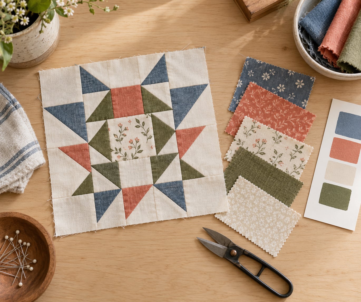
- Add one neutral. Cream, oatmeal, greige, soft white, or a low-volume background gives the eye somewhere to rest and lets the colors keep their identity.
- Extend the value range. Introduce one fabric that is clearly lighter or clearly darker than everything you already have.
- Separate the complements. If a red and a green, or an orange and a blue, are sitting next to each other, put a light neutral between them or change one to its far value.
- Pull the busy fabric down in area. The loudest print usually wants to be the smallest piece, not the background.
- Repeat your colors. Repeating a good fabric in several places builds a color story; using every fabric once is what makes a pile look like a pile.
If the fabric is already bought, this is the version that works. Sort every piece by hue family, then throw out one whole family, usually the one with the fewest pieces. You will end up with two or three families and a much calmer top. Cutting three fabrics from one bundle uses less yardage and usually looks better than cutting all fourteen.
Thread and batting count as palette members too. A thread that does not appear anywhere in the top still shows up as a fine line all over it, and batting shows as the light value of the finished piece. Choose them with the same care as the face fabric.
How to Test Fabric Colors Before You Start a Project
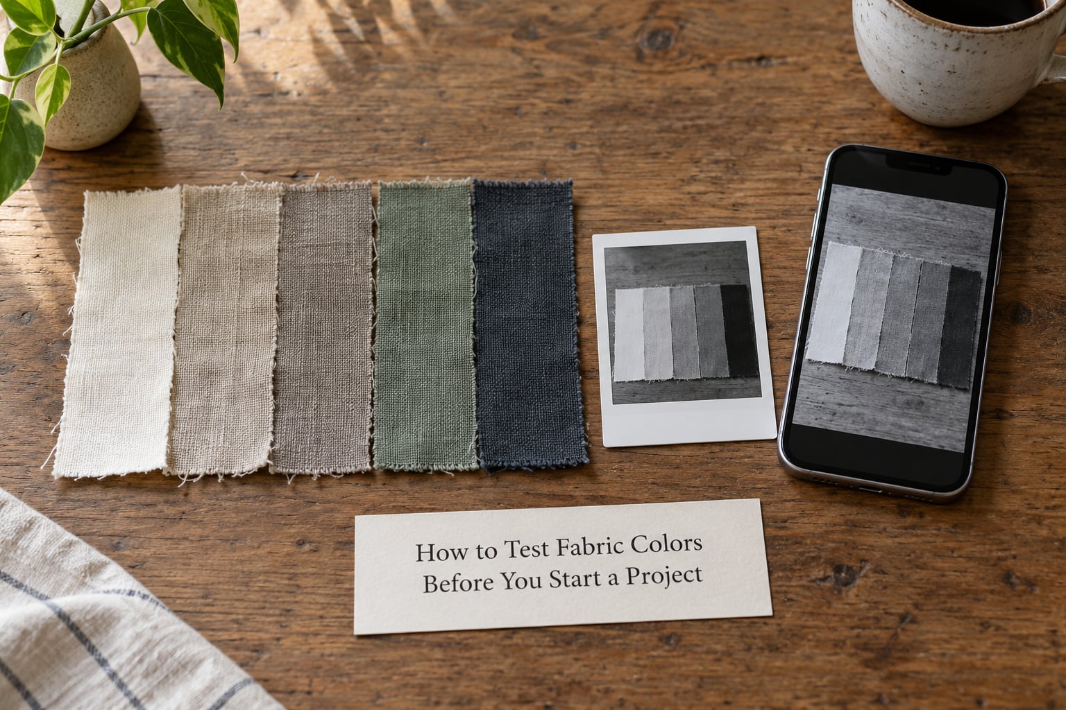
These five tests take under five minutes together, and the order matters because the first one rules out the most problems.
- Squint test. Blur your eyes until the shapes dissolve and only a wash of color remains. If the whole thing turns into one brownish cloud, you have your answer.
- Step-back test. Walk three to four feet away from your layout and look at it. Palettes that look questionable up close usually look worse from there, because the averaging effect takes over completely.
- Grayscale photo test. Photograph the layout in daylight and convert it to black and white. Everything landing on the same gray means no value contrast.
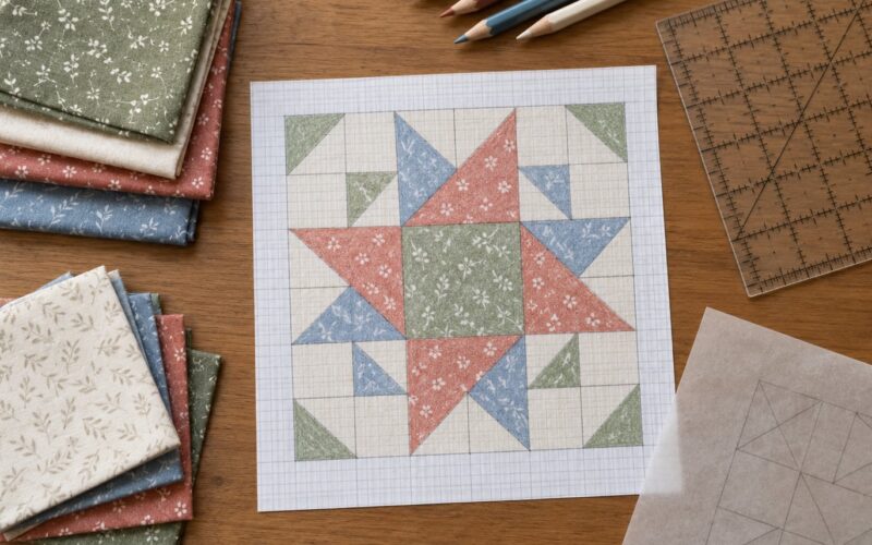
- Monochrome swatch test. Cut 2-inch squares of each fabric, group them by hue family, and pin the groups in a row. The family that looks like every other family is the one to cut or push back.
- Remove-one test. Take one fabric off the layout and photograph it. Then the next. The one that makes the biggest difference is the one causing the mud.
Run the tests in daylight near a window and then under the light you will actually hang the piece in. Warm bulbs push everything toward brown, and that alone has made plenty of good palettes look muddy at 9pm.
What Lighting and Photography Can Do to Fabric Color
Fabric color is a measurement of reflected light, so the light decides what you see. Incandescent and warm LED bulbs add yellow, which pushes greens and blues toward gray. Overcast daylight gives the most accurate read, though it is bluish and can cool a warm palette. Midday sun is harsh and flattens texture.
Shadows do the most damage. A quilt photographed with half of it in shade will have two different versions of the same fabric, and the shaded half will look duller than the fabric actually is.
Cameras add their own version. Auto white balance shifts everything toward whatever the photo is mostly made of, so a photo of a brown-looking quilt comes out browner. If a color combination only looks bad in photos and fine in person, the palette is probably fine and the camera is the problem. Shoot in daylight with the white balance locked, and compare before you cut fabric you like.
Why Do My Fabric Colors Look Muddy Together? Quick Troubleshooting Guide
Most muddy fabric colors come down to four things. Match what you see to the fix.
| Symptom | Likely cause | Fastest fix |
|---|---|---|
| Everything looks brown or gray when you step back | Too many hues at similar mid-values | Remove one hue family and add one light neutral |
| One color that makes everything beside it worse | Its undertone fights the others | Take it out and use it only as a small accent |
| Colors vanish into each other at the seams | Optical mixing from equal values | Extend the range with one clearly lighter or darker fabric |
| The busy print is dominating everything | Print scale and area, not the palette | Use less of it and give a low-volume fabric the large areas |
| A new color appeared where two fabrics overlap | Translucent layers doing real additive mixing | Keep the overlap, treat it as a third color, or layer opaques |
| Hand-dyed fabric looks thin and lifeless on its own | Over-diluted dye or unprepped cloth | Fix the dilution and prep the fabric, then redye |
One more case worth naming: a layout that only looks muddy on the design wall but fine on a table. Walls get flat frontal light, and that kills texture and value differences. Angle the piece or prop it forward before you decide anything.
Frequently Asked Questions
What are muddy colors?
Muddy colors are low-chroma, grayish results that appear when too many hues sit at similar mid-values, when complementary colors are placed side by side, or when competing prints crowd out any neutral ground. Each fabric may be perfectly good on its own, and the problem only shows up when they are seen together. It is a palette-level issue, so it gets fixed by removing, substituting, or adding value contrast rather than by changing any single fabric.
What colors should you not mix in a quilt?
Avoid putting complementary colors directly side by side at the same value: red with green, orange with blue, purple with yellow, and their near-complements. Artists have long known these pairs go straight to mud, and no technique reliably fixes it. The pairing works fine when the two colors are far apart in value, so a deep red beside a pale sage is not the same as two mid-tone prints touching. The rule is not never, it is separate them with value or with a light neutral.
How do I avoid muddy colors when painting fabric?
Follow the three-color rule: if you are mixing more than three colors to reach a target, choose a different starting point instead. On fabric, the usual causes are over-dilution, too much water, and cloth that was not washed or pre-treated before you dyed it. Mix to the strength you actually want rather than thinning a strong mix with water at application time, and always test on a scrap of the same fabric first.
Is muddy the same as muted?
No, and the difference is the key to the whole problem. Muted is deliberate: you chose a restricted, low-chroma palette and every color in it reads clearly even though each one is quiet. Muddy is accidental: several colors have lost their identity and average into a gray-brown. If you can name each color in your palette, it is muted. If you cannot, it is muddy and it needs editing, not softening.
How do I know if a color palette works before I cut fabric?
Squint at the layout until the shapes blur, then step three or four feet back. Photograph it in daylight and view the photo in grayscale, which reveals whether everything sits at the same value. Then remove one fabric and compare. If the group reads as one warm or grayish cloud in the grayscale shot, the palette has no value contrast and adding a clearly lighter or darker fabric will fix it faster than anything else you could do.
My quilt top already looks brown. Can I fix it?
Yes, in most cases, without unpicking anything. The usual remedy is subtractive: take out the one hue family with the fewest pieces, add a light neutral to open up the field, and extend the value range with a fabric clearly lighter or darker than what you have. If the top is finished, the same edit can be made from the back by replacing small or low-visibility sections. If the muddiness came from a dyed or painted element rather than a palette, that element has to be redone.
Start with the grayscale photo. It takes a minute, it needs no color vocabulary, and it tells you in one look whether the problem is value. If everything is the same gray, add one light fabric and one dark fabric and recheck before you change anything else. Only after the values are separated is it worth arguing about hue, and usually the palette stops looking brown on its own at that point.