To create contrast in a quilt design, start with value rather than hue: place a light fabric beside a dark one, or a busy print beside a plain solid, and the eye separates the two shapes immediately. Value is simply how light or dark a color is, and it does more work in a quilt top than the color family itself. Most of the planning happens at a small scale, on a table, before any fabric gets cut. Budget an hour for the first pass and a sewing test block later if you want proof.
Beginners often lose a whole afternoon to a palette that looked lively in the store. The fabrics go home, spread out, and merge into one tone. That happens because the fabrics sat close together in value, not because the colors were wrong.
This guide walks through the studio process I use: sketch the composition, sort the fabric by value, pick one focal point, then add pattern, scale and texture contrast until the design reads from across the room. I also include three tests worth running before you cut, and the handful of mistakes that quietly flatten a quilt top.
Table of Contents
- What You Need to Create Contrast in a Quilt Design
- Step-by-Step: Building Contrast That Holds Up at Distance
- How to create contrast in a quilt design
- Use value and color contrast to establish hierarchy
- Add pattern, texture, and scale contrast
- Balance contrast with repetition and negative space
- Common mistakes to fix before you cut
- Frequently Asked Questions
- What is the easiest way to create contrast in a quilt design?
- How do color and value contrast work differently in quilting?
- How much contrast should a quilt have?
- Can a quilt design use contrast without using black or white?
- How can I make a busy quilt design feel more balanced?
- How do I test quilt contrast before sewing?
- Conclusion
What You Need to Create Contrast in a Quilt Design
You do not need much, and none of it is specialized. Gather these items before you sit down to design, and the decisions get faster.
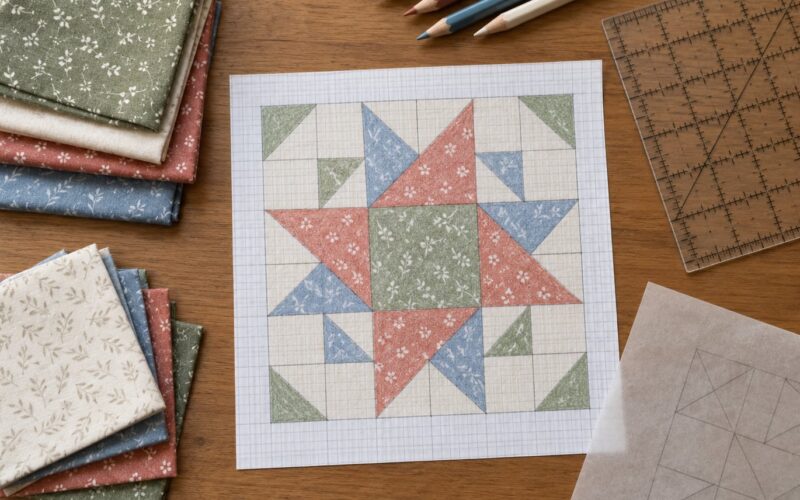
- A quilt design draft, graph paper, or a grid you draw yourself. A 6-inch grid matching your finished block size lets you see proportion before you cut fabric.
- Fabric swatches from your actual stash. Cut 2-inch squares or use fat quarters. Pinned swatches on a design wall show relationships a folded bolt never will.
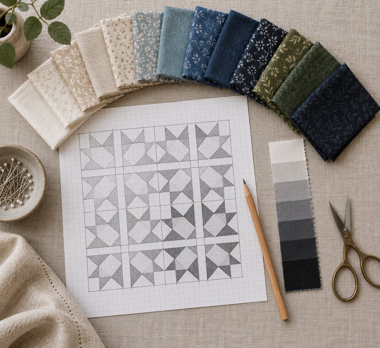
- A value scale, color cards, or a value finder. Value finder cards with grayscale fabric overlays are the cheapest tool that gives you an instant light-to-dark read.
- A pencil, eraser, and ruler. You will mark focal areas and quiet areas, and cross out anything that competes with your focus.
- Scissors and a small rotary cutter for cutting swatch squares and a test block quickly.
- Optional design software if you already work digitally. It is useful for a repeat layout, though paper and pinned squares work just as well.
One more thing helps more than any tool: a second pair of eyes. Someone who has not seen your fabric pull will spot the loudest print in the stack instantly, and loud prints are usually the reason a design goes flat.
Step-by-Step: Building Contrast That Holds Up at Distance
How to create contrast in a quilt design
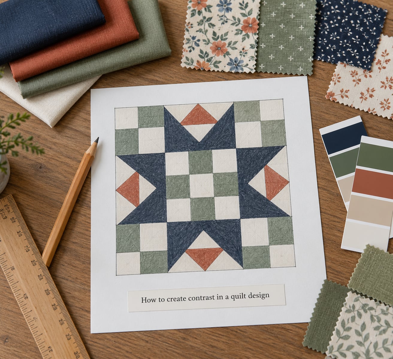
Start by deciding where the eye should land before you choose any colors. Draw a thumbnail roughly the size of your palm, mark that focal area, and draw a quiet area that supports it without pulling attention. Everything else in the design is judged against those two marks.
Then sort your fabrics by value into three piles: light, medium, dark. Lay each group in a row on the table so you can see the full spread at once. This is the single most useful hour you will spend on a quilt, and it takes about twenty minutes.
Here is how the main types of contrast work, so you can pick the ones your design actually needs:
| Contrast type | How you create it | What it does on the quilt | Best used for |
|---|---|---|---|
| Value | Light fabric against dark fabric | Defines shapes and makes the block pattern readable | Almost every quilt; the foundation layer |
| Hue | Opposite or near-opposite colors on the color wheel | Adds energy and warmth between two values | Cheerful, traditional, scrappy palettes |
| Intensity | One muted fabric beside one vivid fabric | Makes the vivid fabric glow and the quiet one recede | Featuring a single focal print |
| Scale | Large motifs beside small motifs | Creates depth, since large reads near and small reads far | Landscapes, pictorial work, modern quilts |
| Pattern density | A busy print beside a plain solid | Gives the eye a resting place and quiets a loud area | Calming down a print collection |
| Texture and line | Matte fabric beside a shiny one, straight seams beside curves | Adds interest without adding a new color | Monochromatic and minimal designs |
Value does most of the work, and the rest refine it. If you fix the value structure first, you can change hue later without the design collapsing.
Use value and color contrast to establish hierarchy
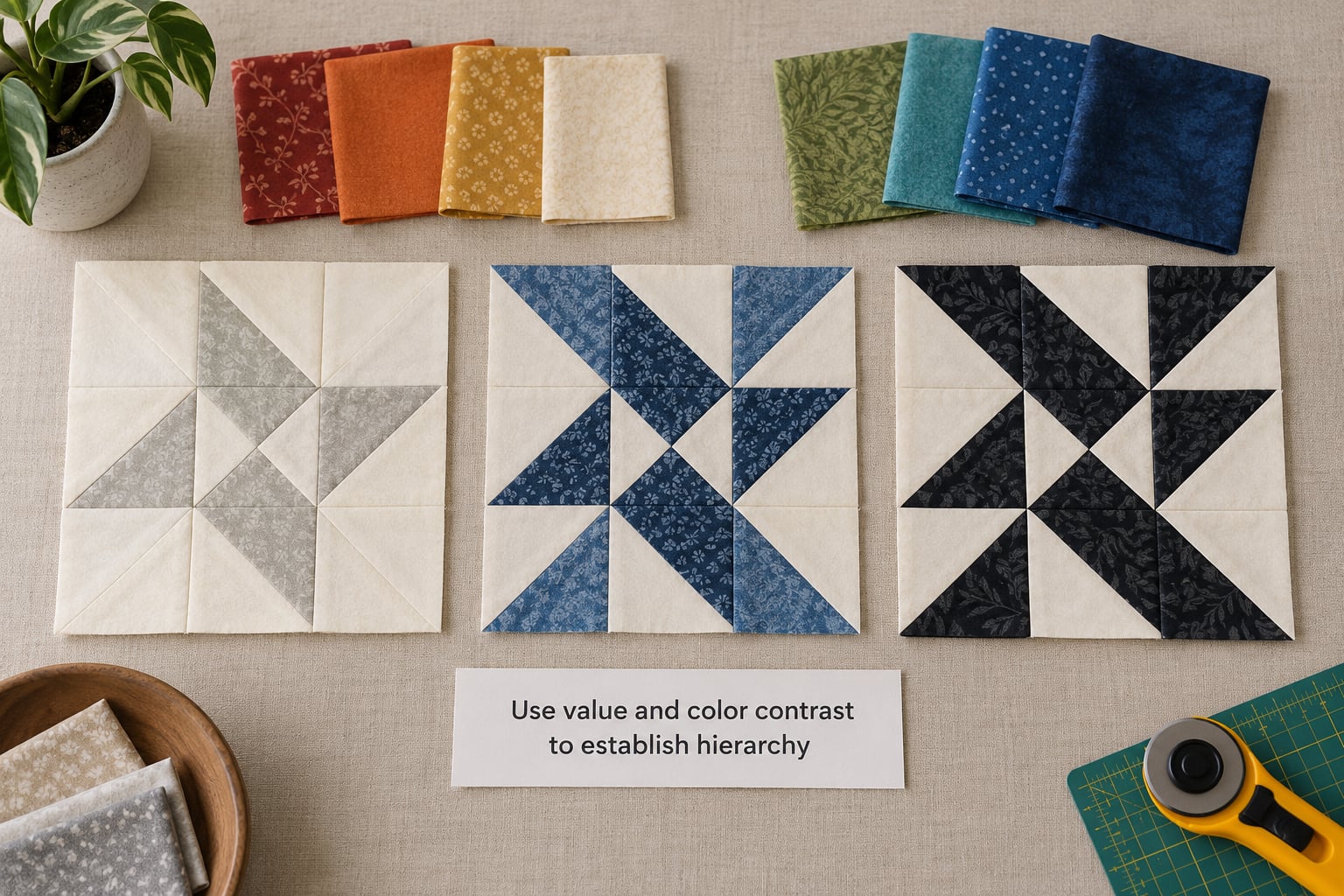
Color value is the lightness or darkness of a color, from near-white to near-black. Most good quilt palettes use at least three values, and a fourth adds depth without much extra work. A quilt built from all medium values turns muddy, no matter how beautiful the individual fabrics are.
Once you have light, medium and dark on the table, test them three ways:
- The squint test. Squint until the block blurs into soft shapes, then look again. Everything you can still see is working. If the whole thing turns into one gray blob, your values are too close.
- The grayscale photo. Photograph your fabric pull on your phone, apply a black-and-white filter, and look at it. Color disappears, so what is left is pure value. This is the fastest honest check and takes about a minute.
- The value finder. Hold a card or overlay over each fabric. Matching swatches to the card tells you how many value steps separate them, and you can group fabrics into piles before you design.
Hue sits on top of value. Complementary pairs give the strongest color jolt, analogous schemes feel calm and gentle, monochromatic or all-one-color quilts still work if the values span light to dark, and split-complementary keeps warmth without the shock of opposites.
Warm colors advance and cool colors recede, so place a warm focal fabric beside a cool background when you want the focus to come forward. Keep most areas quieter than your focal point, otherwise every fabric competes and none of them wins.
That table is worth reading twice, because it shows how little you actually need. A strong light-and-dark pair plus one patch of vivid color is usually enough to carry an entire quilt top.
Add pattern, texture, and scale contrast
Once value structure is set, vary the patterns. A large floral print sitting next to a tiny calico reads as two different worlds, which creates depth that hue alone cannot. Pair small prints with large motifs, and use solids as quiet ground between them.
A blender fabric contains colors from elsewhere in the palette and quietly bridges two fabrics that do not obviously go together. A low-volume fabric has a pale or faded pattern, which keeps a background calm while still giving you some color interest. Beginners get immediate results from a low-volume background behind a bright focal print.
Texture contrast works even when color is held to a single hue. Matte cotton beside a subtle sheen, or a smooth field beside a densely textured pieced area, gives the quilt something to say without introducing another color.
Watch pattern density as well as scale. Three large florals side by side can be calmer than one medium floral flanked by two small, busy prints, because the eye reads overall density rather than counting motifs.
Balance contrast with repetition and negative space
Contrast everywhere is not contrast. A quilt where every block shouts has no focal point, and the eye finds nothing to rest on. Blend some areas deliberately so that groups of similar fabrics contrast against each other as wholes, which is what makes scrappy and Irish chain quilts look intentional instead of random.
Use block anatomy as a lever. Star points need the strongest value jump against whatever sits directly outside them, or the star flattens. Sashing can either separate blocks or connect them, depending on whether its value differs from or matches the block borders. Backgrounds and borders swallow a good design more often than any other choice, so treat them as a color decision, not a leftover.
Repetition holds everything together. Repeat one color, one shape, or one motif across blocks and the eye reads a unified design even when the fabrics differ. Negative space, the quiet area you marked in your thumbnail, gives the repetition somewhere to rest.
Two things can dull contrast after quilting. Thread in a contrasting color draws visible lines across the quilt and flattens the value structure, and thick batting softens the texture that was adding interest. Test both on a sample square before committing to a full quilt.
Finish with a distance check. Tape your layout to a wall, step back across the room, and note what you see first. That first thing should be your focal point. If it is something else, change the value in that spot and look again.
Common mistakes to fix before you cut
Relying on hue alone. A bright orange next to a bright yellow looks lively on the table and merges into one shape across a quilt. Fix it by pushing the values apart, not by adding a third bright color.
Equal visual weight everywhere. Every block carrying the same contrast level means nothing wins. Lighten or darken the blocks around your focal area until one place clearly leads.
Too many competing patterns. Three different florals at the same scale fight each other. Set one as the feature print, place a solid or blender beside it, and let the rest drop back in value.
Ignoring value at viewing distance. Designing at arm’s length flatters everything. Stand back three metres or run the grayscale photo test before you approve a layout.
Never testing in context. A fabric that looks right alone can clash with the border or the backing. Sew one block, pin it to your intended background, and judge the pair.
Losing contrast after quilting. If the finished quilt reads flat, check the thread color first, then the batting loft. A tonal thread and a thinner batting usually restore what the top was showing.
Frequently Asked Questions
What is the easiest way to create contrast in a quilt design?
The fastest method is to sort your fabrics into light, medium and dark piles and put the darkest value next to the lightest one. That single pair gives you the value contrast your eye needs to read shapes, and hue can be adjusted afterwards. Before you commit, photograph the layout and apply a black-and-white filter, since color disappears and only value remains.
How do color and value contrast work differently in quilting?
Value contrast is about how light or dark a color is, and it defines shapes and patterns. Hue contrast is about which colors are opposite or near-opposite on the color wheel, and it adds energy and temperature. Value does the structural work, so two fabrics of different colors but the same lightness will still blend into one field.
How much contrast should a quilt have?
Enough that the design still reads when you squint or step back across the room, but not so much that every area competes for attention. Most quilts work well with three to five values spread from light to dark, plus one focal point with the strongest jump in contrast. Check it with a grayscale photo before you cut fabric.
Can a quilt design use contrast without using black or white?
Yes. Value contrast only requires that neighbouring fabrics differ in lightness, so a pale cream beside a deep navy works as well as white beside black. Beginners like black and white because the extremes are easy to judge, but a neutral or low-volume background in mid-range values gives a softer result without weakening the design.
How can I make a busy quilt design feel more balanced?
Group your fabrics so values stay close within each group, then let the groups contrast against each other and the background. This us-against-them approach is what makes scrappy quilts look planned. Add quiet areas with solids, blenders or negative space, and give your focal print a calm fabric directly beside it.
How do I test quilt contrast before sewing?
Run three quick checks. Squint at the layout until detail blurs and see what remains visible. Take a phone photo and view it with a black-and-white filter to remove color. Hold a value finder card or grayscale overlay over each fabric to confirm the light-to-dark spread, then sew one test block and pin it to your intended background.
Conclusion
Contrast in a quilt design is a value structure first and a color scheme second. Sort your fabric light to dark, mark one focal area, give it the strongest value jump, and let the rest of the top stay quieter than you would like it to be.
Do this first: draw a thumbnail the size of your palm, mark where the eye should land, then test your fabric pull with a squint and a grayscale phone photo. If the design still blurs into one gray shape, fix one value and look again before you cut anything.