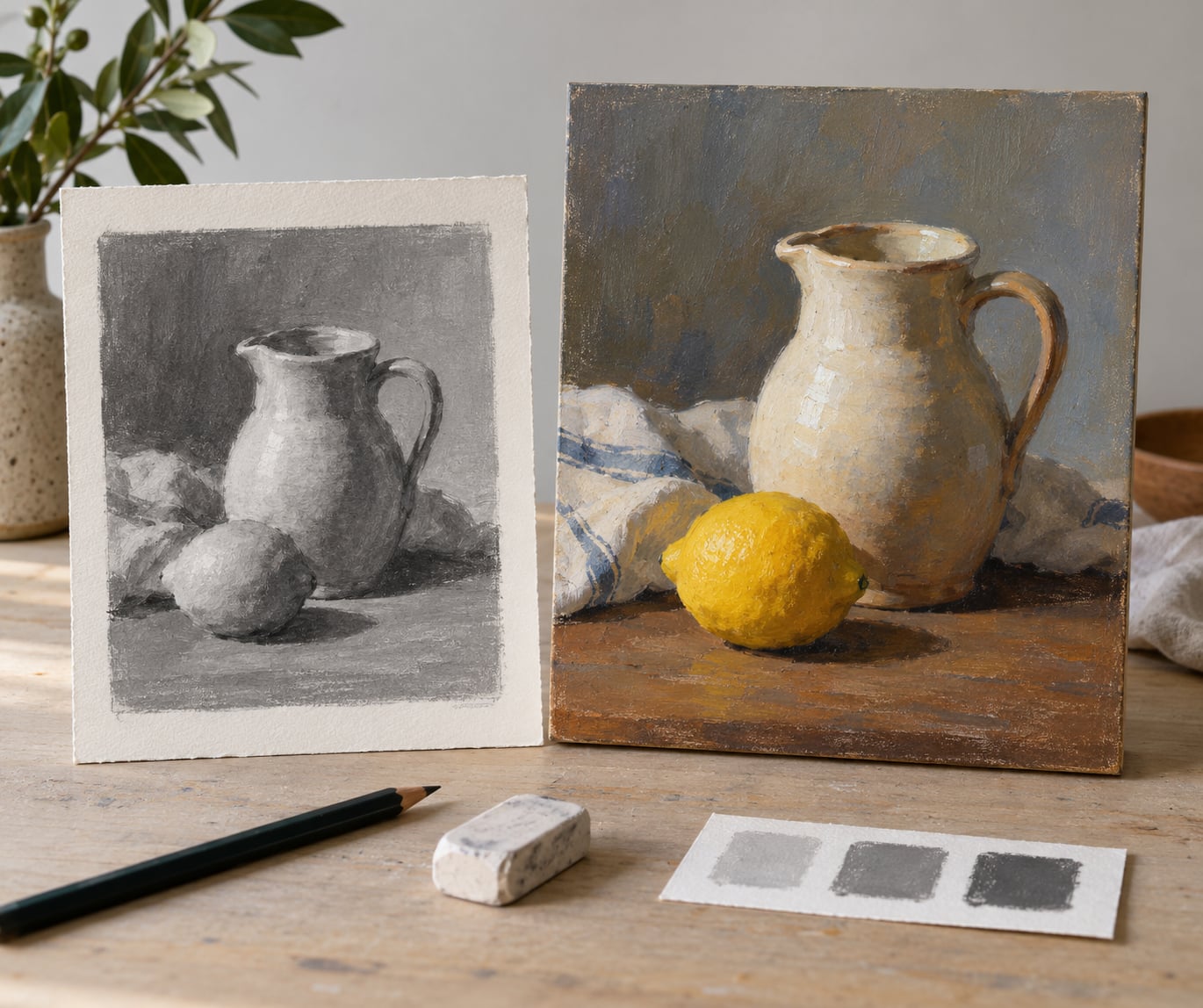
A value sketch is a small, fast drawing that reduces your subject to three or four values (light, mid, dark) so you can settle composition, focus and light before any paint touches the surface. Learning how to use a value sketch before painting takes about fifteen minutes a session and asks for no drawing talent beyond the ability to block a shape flat. The sketch is a map, not a drawing to be admired.
I went through a phase where every painting came out the same colour of wrong. Not bad, just flat, with a focal point that drifted somewhere near the horizon line and a foreground that competed with the subject. The fix was boring and unglamorous: fifteen minutes in greyscale, three values, no detail, before I loaded a brush. Same subject, same paint, completely different result.
Here is the whole method, from a blank sketchbook page to paint on canvas, with nothing skipped.
Table of Contents
- What You Need
- Step-by-Step: How to Use a Value Sketch Before Painting
- 1. Gather and Simplify Your Reference
- 2. Make a Light-Thumbnail Sketch
- 3. Map the Main Value Groups
- 4. Place the Light Source and Shadows
- 5. Check Contrast and Focal Emphasis
- 6. Test the Sketch at Painting Size
- 7. Transfer or Use the Sketch While Painting
- Common Mistakes and How to Fix Them
- Frequently Asked Questions
- Should I do a value sketch before every painting?
- How big should a value sketch be?
- Is a value sketch just a bad drawing?
- Should I draw on the canvas before painting on it?
- How do I know my values are working?
- How long does a value sketch take?
- Conclusion
What You Need
The whole kit fits in one pencil case. That is deliberate, because the step only works if it is fast and frictionless.
- Small paper. A 3×5 inch sketchbook or a quarter sheet of drawing paper. Keep it small. A big sheet turns a study into a project.
- A soft graphite pencil. A 6B holds a light touch and a dark one, which is exactly the range you need.
- Something to fill shapes flat. A grey marker, a soft brush and grey ink, or a diluted wash. Graphite alone smears and you will spend ten minutes fighting it.
- An eraser. You will lift values back to the white of the paper instead of drawing white later.
- A viewfinder. Any rectangular card with a rectangle cut out of it. A phone held at arm’s length works too.
- Your reference. A photo, your own drawing, or the scene in front of you.
- Optional: a value key. Three small swatches of light, mid and dark on a scrap of the same paper. It is the cheapest control tool in the studio and the one beginners skip most.
If you paint digitally, swap the pencil and marker for a layer filled with flat black, then bring the opacity down to about 10 percent and build values by layering.
Step-by-Step: How to Use a Value Sketch Before Painting
The goal of the sketch is not to look like anything. It is to answer three questions in order: where the big shapes sit, where the light comes from, and where the darkest dark goes. Everything after that is detail you can skip.
1. Gather and Simplify Your Reference
Look at your reference and squint until the edges blur. What is left is the information that matters: a sky, a mass of trees, a lit wall, a shadow shape on the ground.
Hold your viewfinder up and move it around until the frame contains the subject with a little breathing room at the edges. That cropped rectangle is your composition. Do not draw what is outside it.
Ask one question about the reference: where is the light coming from? If you cannot answer it in a sentence, your reference is not ready. Find another angle or wait for the light to do something clearer.
2. Make a Light-Thumbnail Sketch
With the pencil barely touching the paper, mark the horizon, the main forms and the direction your eye travels. Keep your arm moving and keep your wrist loose.
This first pass takes about two minutes and looks unfinished, which is the correct outcome. If you are adding windows, branches or facial features, you have stopped sketching and started illustrating. Stop and go back to big shapes.
Check the proportions against your reference now, not later. Compare the height of the main form against the total height of the frame, and the width of the foreground against the width of the picture. Eyeball measurement is usually enough.
3. Map the Main Value Groups
Now decide on your value range. Most subjects need three or four:
- Three values. Light, mid, dark, nothing between. Suits open outdoor light, a simple still life, and most beginners’ first attempts.
- Four values. Adds a second light or one extra shadow step. Better for portraits, overcast scenes, and interiors lit by a single window.
- Five values. A full ladder with soft transitions. For dramatic light, reflective objects, or small surfaces such as miniatures where every step shows.
Fill the largest light mass and the largest dark mass first, flat and fully, edge to edge. Middle values go in after. Beginners almost always reach for the dark pencil too soon and then discover there is nowhere darker to go, so keep the graphite light until the very end.
Leave the white of the paper as your lightest value instead of shading it in. It stays cleaner, and on a watercolour paper that white can stay untouched in the final painting.
4. Place the Light Source and Shadows
Mark the direction of the light with a small arrow at the edge of the paper. Everything after that follows from it.
Cast shadows are the shadow shapes thrown onto a surface, with hard edges near the object and softening as they travel. Core shadows sit on the dark side of a form and stay darker than anything around them. Reflected light bounces back up into those core shadows and is the reason shadow areas are not flat black.
In the sketch, indicate each with a single tone and leave the edges soft. If the light wraps all the way around your subject with no shadow side, you picked a flat reference photo. Go find one with direction.
5. Check Contrast and Focal Emphasis
Step back a foot and look at the sketch with your eyes half closed. You should see a few large shapes of clear difference, not a grey field.
Ask where your eye lands first. That is your focal point, and it should be where you planned it. If it lands on a background tree or an empty corner, darken the area you meant to be darkest, or lighten the one stealing attention. Strong contrast around the subject is what makes it step forward.
Depth follows from the same rule: values get lighter and softer as they move back, and edges lose sharpness. If your foreground and background sit at the same value, the whole picture flattens. This is the single most common thing a value sketch catches.
6. Test the Sketch at Painting Size
Redraw the sketch on paper cut to the exact proportion of your painting surface. A 3:4 sketch does not translate to a 1:3 panel, and everything you planned shifts when the ratio changes.
Keep it at the same small scale. Sketch at the same size and ratio as the final painting, which is the one piece of advice worth giving a beginner without conditions.
Simplify anything that is not supporting the design. Most beginners carry too many mid-value shapes. Merge them, delete them, or let one big shape swallow them.
7. Transfer or Use the Sketch While Painting
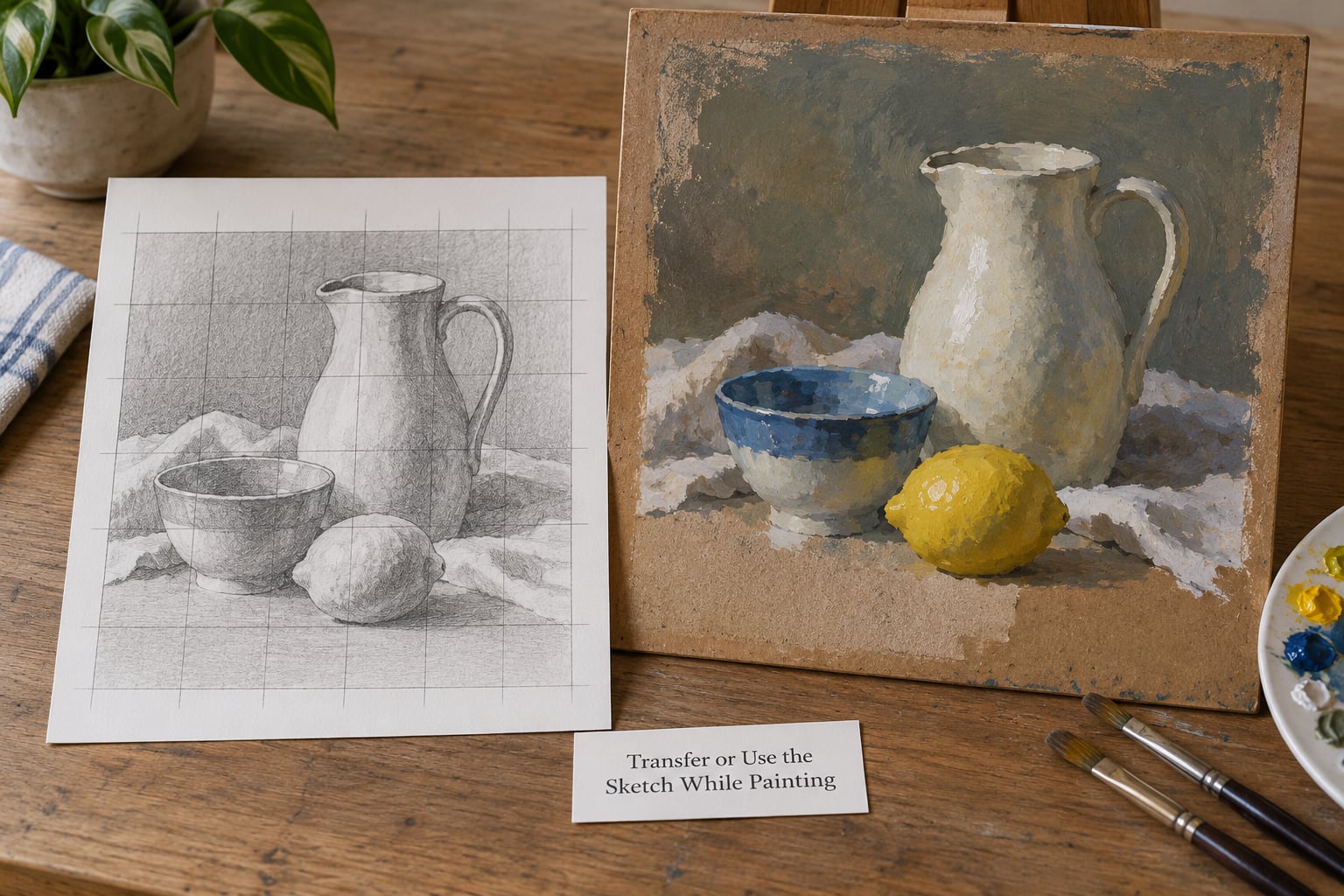
Pick the handoff method that matches how much structure you want to keep. This is the part of how to use a value sketch before painting that beginners skip, and it is where the sketch quietly turns into either a help or a burden.
- Keep it in view. Tape the sketch next to your easel and check values against it. Nothing transfers, so nothing to erase later. Most painters end up here.
- Grid transfer. Draw light grid lines on the sketch, draw the same grid on your surface, and mark each shape’s corners. It takes five minutes and puts the composition in place exactly. Keep the lines so light that a dark pass buries them.
- Transfer paper. Rub graphite on the back of the sketch, redraw only the main shapes on the front, and press onto your surface. Precise, but you will be tempted to draw edges, and hard edges kill a value approach.
- Project it. In a dark studio, shine the sketch through a small window or your phone screen. The values project as light and dark patches. Change nothing except the edges, or the whole surface ends up muddy.
- Rebuild it by hand. Copy the three big shapes onto your surface with a diluted grey wash, let it dry, then paint over it. This doubles as an underpainting and is the most useful habit for a beginner.
Whatever you choose, check your values mid-painting. Take a photo of the wet painting, open it in any phone editor, switch the image to greyscale, and look. Colour disappears and the structure is suddenly obvious. It catches a bad value structure faster than almost anything else you can try while the paint is still wet.
And if the painting drifts from the sketch, stop and ask which one is right. The reference changed, or you found something better. Either is a good reason to abandon the sketch, and a bad reason is that the paint got hard to control.
Common Mistakes and How to Fix Them
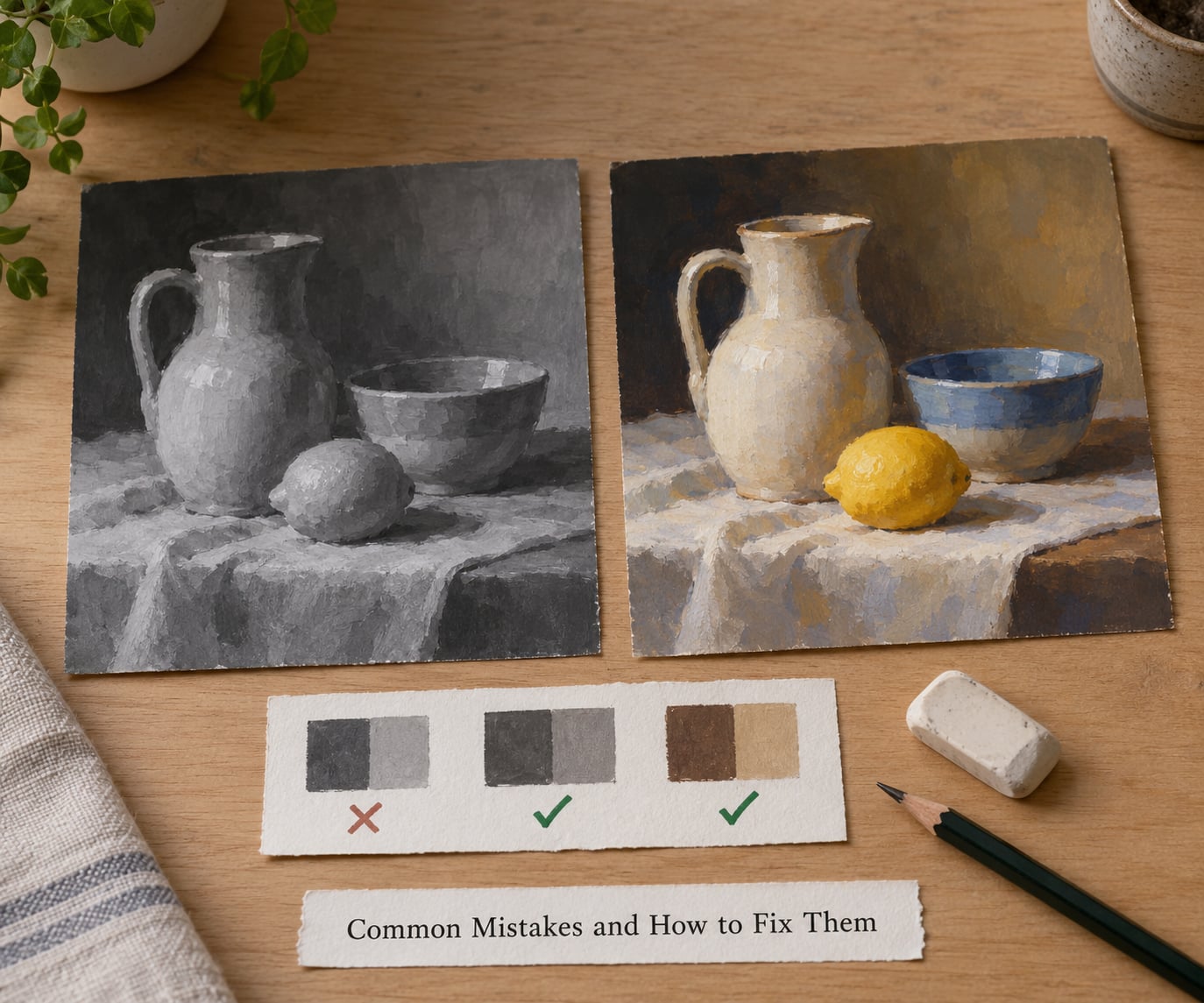
It turned into a finished drawing. You added detail, edges and rendering, and now you have a picture to copy instead of a plan. Fix: put a timer on for ten minutes and stop when it goes off, whatever state the page is in.
You went too dark too early. The first dark you make reads as the darkest value in the painting, so everything after it looks flat. Fix: make your darks by layering light passes rather than pressing hard, and reserve the real darkest mark for the final stage.
Hard outlines everywhere. Outlines describe edges. Values describe form and light. Fix: soften every interior boundary with your finger or an eraser, and reserve crisp edges for the one place your eye should land.
Too many greys. Six or seven halfway tones produce mush. Fix: pick three, paint over or erase the rest, and keep the middle one.
Two light sources. A lamp from the left and daylight from a window on the right will destroy any value plan. Fix: choose one and commit. If both exist in the reference, pick the one that serves the story.
The focal point arrives last. You painted the whole scene evenly, then added a dark accent at the end. Fix: put the darkest or strongest contrast next to the subject in the sketch and let everything else stay quieter.
The sketch is too large. A full-size sketch becomes a drawing you feel obliged to copy. Fix: thumbnail size, same ratio as the painting, and a viewfinder to enforce the crop.
You sketched objects one at a time. Isolated objects look like cut-outs. Fix: connect neighbouring shapes with a cast shadow, a value change or an overlapping edge so the picture reads as one arrangement of forms.
A few habits worth keeping. Five minutes is a legitimate time budget for a simple scene; if it takes thirty, you are drawing. Breaking a subject into simple shapes and checking proportions before rendering is the same habit photographers use, and painters lose nothing by doing it. Value sketching also works on its own as practice rather than preparation, which matters most at small scale, where a weak value is the first thing to disappear.
One last honest note: some subjects do not need a value sketch. When the composition is fixed by architecture, when you are painting from imagination, or when you have already memorised the scene, go straight in. The sketch is a tool, not a rule.
Frequently Asked Questions
Should I do a value sketch before every painting?
Before most paintings from a reference. That said, it is a tool rather than a rule. Skip it when the composition is already fixed by architecture, when you are working from imagination, or when you have already studied the scene closely enough to hold it in your head. Time spent on a sketch you do not need is time spent away from the paint.
How big should a value sketch be?
Small enough that you cannot add detail, which usually means thumbnail size around three by five inches. The one rule that matters more than size is proportion: cut or fold the sketchbook page to the exact ratio of your painting surface, such as 3:4 or 16:9. A sketch at a different ratio will not translate cleanly to the painting.
Is a value sketch just a bad drawing?
No. A value sketch has a different job. A drawing records detail, proportion and character. A value sketch answers three questions: where the big shapes sit, where the light comes from, and where the darkest dark goes. If you squint at it and see three clear tones, it is doing its job even though it looks rough.
Should I draw on the canvas before painting on it?
It works, and it doubles as an underpainting, but keep it light. Any hard outline or dark line will show through your paint and fight it. A diluted grey wash with three large shapes is enough to place the composition. Use a separate sheet if you want to keep your options open, since drawing on the surface commits you immediately.
How do I know my values are working?
Squint at the sketch or painting until the detail softens, then check that a few large shapes read as clearly different tones. Then take a photo and switch it to greyscale on your phone, which strips the colour away and exposes weak areas immediately. If the greyscale version reads clearly, your values are working.
How long does a value sketch take?
Five to fifteen minutes for most subjects. A simple scene with one light source can be mapped in five. A complex interior with several light sources may take fifteen. If you are past twenty minutes you are adding detail, so stop there and move on to the painting.
Conclusion
A value sketch settles in fifteen minutes what colour alone cannot: where the light falls, which shape comes forward, and where the darkest note belongs. Everything after it is execution.
Start with the smallest possible version. That is how to use a value sketch before painting without overthinking it: pick one subject, crop it to your painting’s ratio, give yourself fifteen minutes, and reduce it to three or four values with no drawing at all. Then take a photo of your painting in progress, switch it to greyscale, and see whether your subject still reads. That check alone will teach you more than a week of painting without one.