Complementary colors sit directly opposite each other on the color wheel, and placing them side by side gives you the strongest contrast a collage can offer. If you have been wondering how to use complementary colors in collage without everything turning into a loud checkerboard, the fix is area control: give one color roughly three times the surface space of the other and let the smaller one carry the energy. It is a ten-minute color test followed by one focused session of cutting and layering.
Complementary colors in collage: two hues positioned directly across from each other on the color wheel, which makes each one read brighter and more intense beside the other.
The pairing solves two problems at once. A surface that felt flat and colorless gains depth, and a piece with no clear focus gains a focal point almost by accident, because whichever color occupies less area becomes the accent by default.
Table of Contents
- What You Need
- Step-by-Step
- How to use complementary colors in collage
- Choose a dominant color and its complement
- Test value, saturation, and texture
- Build a collage composition around the contrast
- Refine the balance and finish the collage
- Common Mistakes
- Frequently Asked Questions
- What are complementary colors in a collage?
- Should complementary colors be used in equal amounts?
- Can I use muted or pastel colors in a complementary collage?
- How do I choose complementary colors when working with photographs?
- What is the best color scheme for a beginner collage?
- How do I stop complementary colors from looking too harsh?
- Conclusion
What You Need
Everything below is either already in a collage kit or cheap to pick up. Keep the first list small; the second list is what takes a scheme from workable to finished.
Essential:
- A color wheel, printed or on a phone. This is the only tool that reliably tells you where the opposite sits.
- A surface: card, heavy paper, primed board, or the page of an art journal.
- Paper scraps in a range of hues and values. Pull more than you think you need, because you will discard half of it during the color sort.
- Scissors, a craft knife, and a cutting mat for clean edges on larger shapes.
- Adhesive: a glue stick or PVA for paper, gel or matte medium if you are layering heavily.
- A neutral test surface, plain white or gray card, for judging colors before they touch the actual piece.
Optional but useful:
- Matte medium or gel medium to seal layers and let you move pieces after they touch down.
- Tinted paper, tissue, foil, or sand for texture contrast against smooth printed scraps.
- A small piece of translucent or vellum-type material to sit between layers and soften the pairing.
- A pencil and ruler to sketch your layout before any adhesive goes down.
- Fabric scraps if you are working in textile collage, where color behaves very differently from paper.
Scrap-bag collage is fine here. Working from a limited pile of recycled paper is the normal condition for most collage artists, not a compromise, and a restricted palette is often what forces a clear hierarchy.
Step-by-Step
Work in this order and stop each stage long enough to look at what you have. Most disappointing complementary collages fail at the testing stage, then get glued down anyway.
How to use complementary colors in collage
Use them by separating area from intensity: the larger color becomes the ground, the smaller becomes the accent, and the contrast between them creates the focal point. Complementary hues sit directly opposite each other on the color wheel, so the eye reads them as an intensification of one another, which is why both look more saturated next to each other than either does alone on a neutral surface.
That optical push is also the trap. Because the pairing is so stimulating, any third element that competes will turn the piece into noise. Most of the craft of using complementary colors in collage is deciding what to leave out.
A useful mental model: one color is the room, the other is the voice. When both are shouting at the same volume, the viewer has nowhere to rest.
Choose a dominant color and its complement
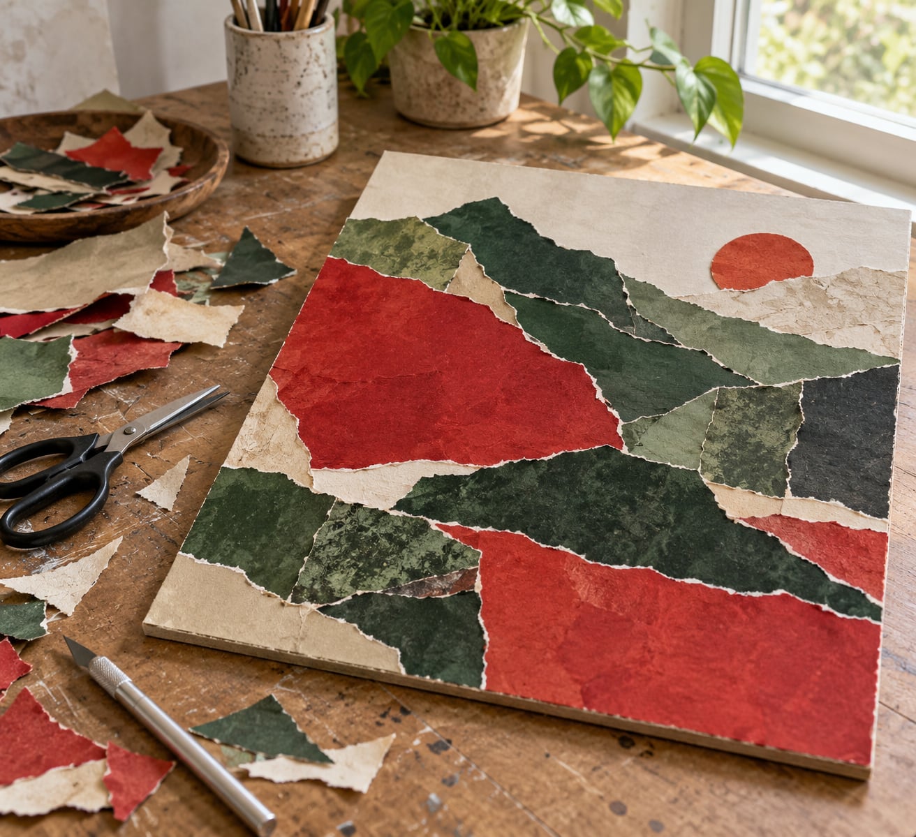
Pick one dominant hue first, then find its direct opposite, and give the dominant roughly 70 to 75 percent of the area with the complement taking the remainder. The common version of this is the 70/30 rule, and the graphic-design cousin is 60/30/10, where a small third accent sits on top of a dominant and a secondary. For collage, 70/30 is usually enough; a third color earns its place only when the subject needs it.
These are the six pairs you will meet most often on a twelve-hue wheel, with a split-complementary swap for each one. Split-complementary replaces the direct opposite with the two colors flanking it, which keeps the contrast but takes the edge off.
| Pair | Typical mood | Split-complementary swap |
|---|---|---|
| Red and green | Bold, festive, high energy | Red with blue-green and yellow-green |
| Blue and orange | Warm against cool, luminous | Blue with red-orange and yellow-orange |
| Yellow and purple | Bright, youthful, graphic | Yellow with red-violet and blue-violet |
| Red-orange and blue-green | Hot, tropical, slightly acid | Red-orange with yellow-green and blue |
| Yellow-orange and blue-violet | Sunlit, atmospheric | Yellow-orange with red and blue-violet |
| Yellow-green and red-violet | Soft, springlike, muted | Yellow-green with red and blue-violet |
If your scrap pile has only half the pair, work with what you have rather than buying new paper. Tinting a sheet toward the missing hue is straightforward: dilute a wash of the complement with a lot of water and paint it onto lighter stock, or glaze a transparent ink over white paper and let it dry twice for depth.
Test value, saturation, and texture
Judge the pair on three separate axes, because two colors can be opposite in hue and still disappoint. Hue is the color family. Value is how light or dark it is. Saturation is how intense it is, from a dulled earth tone to a full-strength dye. Only hue makes a pair complementary; value and saturation decide whether the finished collage reads as calm or as garish.
Cut a small square of each and lay them side by side on neutral card. Squint until you cannot read the shapes, then look again. If the two squares merge into one indistinct blob, their values are too close and the collage will look flat no matter how accurate the pairing is.
Materials behave differently in the same pair. Printed magazine paper runs more saturated than hand-colored paper. Fabric has its own value shifts across a print, and a busy floral in your complement will out-shout a flat paper even when the colors match. Photographs shift further still, which is why a printed image usually needs tinting or a layer of white before it will sit inside a paper scheme.
Texture counts as part of the test. Smooth against torn, matte against glossy, flat against fibrous: that difference carries as much visual energy as a hue change, so choose which material carries the accent color before you commit to the layout.
Build a collage composition around the contrast
Distribute the two colors in four roles rather than spreading them evenly: a base, supporting shapes, small accents, and one focal point. Most successful complementary collages read as a dominant field with a handful of decisive hits of the opposite hue, not as a fifty-fifty conversation.
Start with the base. A large torn or cut shape in the dominant hue covers most of the surface and sets the temperature. Then place supporting shapes in the complement at a medium scale, overlapping the base edges rather than floating inside it, so the two colors touch along a shared seam and each one borrows intensity from the other.
Add accents sparingly. A few narrow strips or small shapes of the complement, roughly a tenth of the surface, give the eye somewhere specific to land. That is the focal point: one place where the accent is densest, surrounded by enough dominant area that it still reads as the exception.
Layer deliberately. Adhesive applied to the back of a piece lets you place it in one position; medium applied to the surface lets you slide it, which is how you tune visual weight without adding another color.
Refine the balance and finish the collage
Step back about a foot, soften your eyes, and check where your gaze lands first and last. If it lands on the accent and then scatters, adjust proportions rather than colors: trim a supporting shape, grow the base by a few centimeters, or move the accent closer to a third rather than dead center.
Look for one small unifying detail. A repeat of the accent hue in a thin line, a stitched edge, or a single mark placed over the seam between two areas ties the composition together without introducing a competing color.
Finish based on how the piece will be handled. A page-bound collage wants matte medium brushed thin, which keeps the paper matte and stops gloss from competing with your color plan. A piece you want to frame or handle benefits from a few thin coats of gel medium, which deepen the colors slightly and seal the edges against fraying.
Wait for the adhesive to fully cure before framing or pressing. Compositional decisions made while glue is still moving rarely survive.
Common Mistakes
1. Using both colors in equal amounts. Fifty-fifty gives both colors the same visual weight and cancels the focal point. Fix: cut the dominant back to roughly 70 percent of the area, or double the size of one accent shape.
2. Mixing the two complements together. This is the single most common failure in the genre. Complementary pigments neutralize each other and turn brown the moment they are blended. Fix: keep them physically separate and let the boundary between them do the work. Where you need a bridging tone, use white, gray, or a third earth pigment deliberately, not as an accident of overmixing.
3. No focal point. Two high-contrast colors at equal strength leave the viewer nowhere to rest. Fix: pick one element before you glue and give it the densest concentration of the accent hue.
4. Values too close together. If both colors sit at the same lightness, the pair reads dull even though it is technically correct. Fix: swap one square for a lighter tint or a darker shade of the same hue.
5. Full saturation across the whole surface. This is what produces the children’s-craft look that people mean when they say complementary color is childish. Fix: knock back the larger area. Mix the dominant hue with white or a little gray until it sits quieter, then reserve full strength for a small area only.
6. Ignoring material contrast. Two glossy printed scraps of the same pair will fight more than a matte and a torn paper would. Fix: vary surface quality as well as hue, and give the accent color to the smoothest, cleanest material.
A few habits shorten most of this. Test every pair on neutral card before it touches the real surface. Work at small scale first: three paper swatches take five minutes and routinely save a full afternoon of gluing. And choose the accent color after the layout is drawn, not before, so it lands where the composition needs weight rather than where the paper happened to be.
Frequently Asked Questions
What are complementary colors in a collage?
Complementary colors are pairs of hues sitting directly opposite each other on the color wheel: red and green, blue and orange, yellow and purple. Placed side by side they create maximum contrast, so each color looks brighter and more saturated than it would on its own. In collage the pairing also solves two common problems at once, because a flat surface gains depth and a piece with no focus gains an accent area.
Should complementary colors be used in equal amounts?
No. Equal amounts give both colors the same visual weight, which cancels the focal point and tends to read as loud or garish. Aim for roughly 70 percent of the surface in the dominant hue and 30 percent in the complement, or about 60/30/10 if you add a small third accent. The ratio is a guide rather than a law, but moving away from an even split is the fastest way to make a complementary collage feel deliberate.
Can I use muted or pastel colors in a complementary collage?
Yes, and the result is usually calmer and more sophisticated than full-strength hues. Softening one or both colors with white, gray or a little of their own shade reduces the aggressive push of the pairing while keeping the opposite relationship intact on the wheel. Keep the value difference between the two, because a muted pair with equal lightness will still look washed out. Save your brightest material for the focal point.
How do I choose complementary colors when working with photographs?
Treat each photograph as an existing palette rather than a source of exact hues. Look at the dominant color in the image, find its opposite on the color wheel, and build the surrounding paper from that partner hue. Because photographic colors shift with lighting and reproduction, test a small printed crop on neutral card before committing. Tinting a print with a transparent wash of the complement is often easier than hunting for paper that matches.
What is the best color scheme for a beginner collage?
Start with a split-complementary scheme: one dominant hue plus the two colors flanking its direct opposite. You keep most of the contrast that makes complementary color work, but the extra hue softens the clash, so mistakes are far less obvious. Blue and orange is a forgiving first pairing because the warm and cool difference stays legible even in low-chroma paper. Whichever scheme you pick, work small and test on neutral card first.
How do I stop complementary colors from looking too harsh?
Reduce the area of the intense color rather than diluting both equally. Knock the dominant hue back with white or a little gray until it reads quiet, then reserve full saturation for a small accent shape near your focal point. Adding a translucent or tissue layer between the two colors also mutes the boundary where they meet. Most importantly, keep a neutral somewhere in the composition so the eye has somewhere to rest between the two opposites.
Conclusion
Start with a color test, not a collage. Cut two small squares from your scrap pile, put them on neutral card, and decide which one is the dominant. Everything after that follows from the 70/30 split you settle on.
Once you know your pair, make a small study rather than committing a full sheet. Testing the same complementary pairing in paper, then fabric, then a photograph will teach you more about your own materials than any theory page can, and it takes less time than one re-gluing session. That is the whole answer to how to use complementary colors in collage: pick the pair, test it small, then control the area rather than the intensity.