An artwork materials caption is a short factual record of what a piece is made of and how it measures: medium, support, dimensions, year and edition number, written in a fixed field order so the work can be identified, catalogued and sold. Most artists can paint a great piece and then describe it as “acrylic on canvas” for a month without knowing that the field order or the dimension convention was wrong.
That single line does more work than most people expect. Anyone searching how to write artwork materials captions is usually hunting for a format that satisfies a gallery, a framer, an insurer and a shop database at once, and the format is simpler than the search results make it sound. Ten minutes per piece once you have the habit, and the hard part is knowing which words belong in the line.
The line is different from a title (the name), a description (the story) and an artist statement (the intent). Written properly, it lets a gallery, framer, insurer or collector identify the piece without guessing.
Table of Contents
- What You Need
- Step-by-Step: Create an Accurate Artwork Materials Caption
- 1. Gather the Basic Artwork Information
- 2. Name the Materials Precisely
- 3. Include the Support and Construction
- 4. Add Dimensions in the Right Order
- 5. Write the Caption in a Clear Order
- 6. Check for Accuracy and Consistency
- Common Mistakes and Fixes
- Frequently Asked Questions
- How long should an artwork materials caption be?
- What is the difference between materials and supplies in an artwork caption?
- How do I write a materials caption for a mixed-media artwork?
- Should an artwork caption include the support or surface?
- How should artwork dimensions be written?
- Can the same artwork caption be used for a gallery label and online portfolio?
- Conclusion
What You Need
Every materials caption carries the same ten elements, in the same order, whether it sits on a gallery wall tag or a shop listing. Here they are.
- Artist name, as you sign it
- Title, in italics, exactly as written on the work
- Year of execution
- Medium line, the core of the caption
- Specific materials and pigments
- Support, the surface the work sits on
- Dimensions, with units
- Edition number, for editions
- Signature and inscription location
- Status or price, where the venue asks for it
The source for those ten items is almost always sitting in your studio: the back of the canvas, the packaging from your materials, a photo of the stretchers, or the invoice from the supplier. Pull the facts from those records before you write anything, because memory is where wrong pigment names and wrong dimensions come from.
You will also want a consistent reference for the field order. Pick one the first time, write it down, and use it for every piece in the same series.
Step-by-Step: Create an Accurate Artwork Materials Caption
1. Gather the Basic Artwork Information
Start with the facts that never change: title, year, and what you know for certain about the base material. Check the stretcher or panel for a stamped size, check the tube for the binder type, and check your phone photos for the date you finished.
If you cannot confirm the year, write the range or the year you completed it rather than a guess. A caption dated a year early creates a small error that follows the work for years.
2. Name the Materials Precisely
Replace vague words with the specific one. “Mixed media” is acceptable only when you also list what is in it; “paint” becomes oil, acrylic, watercolour, gouache or egg tempera; “collage” becomes the papers, textiles and objects you actually adhered.
For pigments, use the colour index name rather than the tube label alone. Cadmium red, quinacridone magenta, ultramarine, phthalo blue and titanium white tell a reader exactly what they will see. A brand name is useful in the studio record but rarely belongs on a gallery label.
| Medium | How to write it | What not to write |
|---|---|---|
| Oil | Oil on linen | Oil paint, oil on material |
| Acrylic | Acrylic on birch panel | Acrylics on canvas, colourful |
| Watercolour | Watercolour on 300 gsm cotton rag paper | Watercolour painting |
| Gouache | Gouache and ink on paper | Opaque watercolour |
| Pastel | Pastel and charcoal on toned paper | Soft pastel drawing |
| Graphite and ink | Graphite and India ink on paper | Pencil drawing |
| Printmaking | Etching in edition of 30 | Print, original print |
| Screenprint | Screenprint, edition of 50, signed in pencil | Silkscreen art |
| Collage | Collage with found paper and thread on board | Assemblage, mixed media |
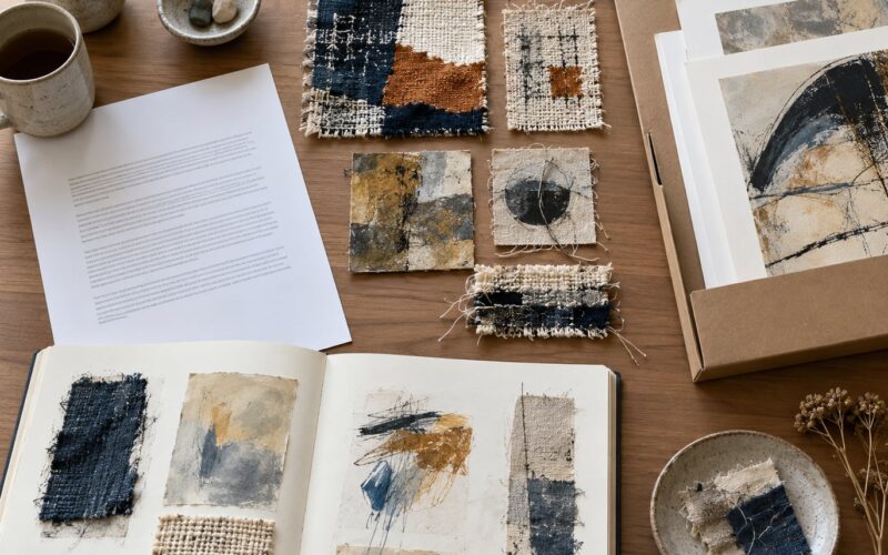
| Textile and fibre | Hand-dyed cotton, machine stitching and appliqué | Fibre art, textile piece |
| Photography | Archival pigment print on cotton rag paper | Photo, print |
| Digital | Digital pigment print, edition 2 of 10 | Digital art, AI art |
A useful test: could someone else buy the same materials from your description? If not, you have named a colour instead of a material.
3. Include the Support and Construction
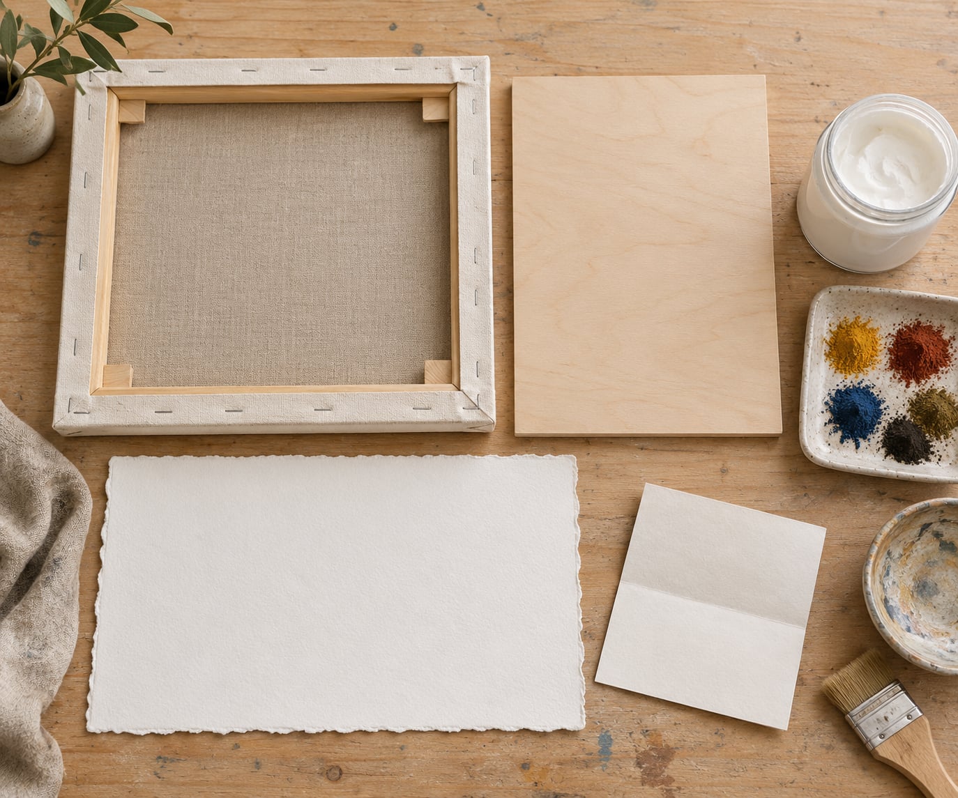
Support is what the paint sits on: linen, cotton duck, birch panel, MDF, board, aluminium, copper, paper. Ground is the primer layer on top of it: gesso, chalk ground, glue size, acrylic primer. The two are swapped constantly, so state each one separately and only name the ground when it matters.
Layered work needs construction rather than a single noun. A collage on cradled panel with rusted metal reads differently from a print on paper, and a stitched piece needs its technique named, not just its fibres.
4. Add Dimensions in the Right Order
For artwork, list height first, then width, then depth. The National Gallery in London, the National Gallery of Art in Washington and the Louvre all follow this order, and so do most gallery submission forms and gallery entry systems.
Photography and digital work reverse it: width, then height, because that is the graphics and screen convention. State the unit once and keep it consistent across a whole series. Many framers’ and mats’ websites publish dimensions backwards, so verify against your own measurement rather than copying a supplier listing.
Measure the artwork itself, not the frame, unless the frame is integral to the piece. If you want both, give them separately: image 20 x 16 in (51 x 41 cm), framed 26 x 22 in.
5. Write the Caption in a Clear Order
Build the line in this sequence: artist, title, year, medium, support, dimensions, edition, signature. The finished line should read in one pass with no dashes or symbols to decode.
Salt Marsh, 2026. Oil on linen, 40 x 30 in (102 x 76 cm).
Tidal Study II, 2026. Watercolour and gouache on 300 gsm cotton rag paper, 15 x 11 in (38 x 28 cm).
Screenprint, edition of 50, signed and numbered in pencil, 16 x 20 in (41 x 51 cm).
Hand-stitched indigo cotton, appliqué and couching on linen, 30 x 24 in (76 x 61 cm).
Weak lines and their corrections, side by side:
| Weak caption | Corrected medium line |
|---|---|
| Acrylics on canvas, very colourful | Acrylic on stretched cotton duck canvas |
| Oil painting, big one | Oil on linen |
| Made with gesso and paint | Gesso ground, acrylic on birch panel |
| Print, 30 by 40 cm | Lithograph in edition of 30, 30 x 40 cm (height x width) |
| Mixed media collage with lots of textures | Collage with torn found paper, thread and sand on board |
Keep the whole caption short. A wall tag needs roughly 25 to 40 words; an interpretive panel can run 50 to 150; an online listing has no hard limit but should still front-load the material facts before the sales pitch.
6. Check for Accuracy and Consistency
Read the caption back against your records line by line. Confirm every pigment name, every dimension and the date. Check that the title is italicised, that units appear once, that edition notation follows the standard forms (3/50, A/P, E.A.), and that any signature note says where it sits, such as “signed and dated verso”.
Then compare against the last five captions you wrote. If the field order has drifted, fix it now rather than shipping a series that cannot be searched as a set. Freshness matters too: if your supplier or frame size changed since 2026, update the standing records rather than editing each piece by hand.
Common Mistakes and Fixes
Describing colour instead of material. “Very colourful” tells a reader nothing they can reproduce. Name the pigment or the material family instead.
Writing marketing copy inside the caption. Words like stunning, vibrant or one of a kind belong in the description, not the medium line. A caption that sounds like an advertisement is harder for a curator, a restorer or a database to use.
Swapping support and ground. Gesso is a ground, not a support. Canvas is a support. Write them as separate items when you need both.
Reversing the dimensions. Height comes first for artwork, width first for photography and screen images, and the unit goes in once. Check the convention of the venue you are submitting to rather than assuming.
Over-listing brand names. Tube labels change and rebrands happen. Pigment and binder names survive; use brands only where the platform asks for them, such as an online shop materials field.
Over-long captions on labels. A crowded tag gets read from arm’s length or not at all. Keep the tombstone line factual and push context into a panel or a linked page.
One habit that fixes most of this at once: keep a single inventory record per piece and generate every caption from it. Labels, listings, submission forms and insurance paperwork then agree with each other automatically, which is exactly what a gallery checks first when something goes wrong.
Frequently Asked Questions
How long should an artwork materials caption be?
A wall tag or tombstone label needs about 25 to 40 words: artist, title, year, medium line, support and dimensions. An interpretive panel can run 50 to 150 words. Online listings have no fixed limit, but the material facts belong in the first sentence so scanners and database feeds pick them up.
What is the difference between materials and supplies in an artwork caption?
Materials are what remain in the finished work: pigment, binder, support, ground. Supplies are what you used and then removed or discarded: palette, brushes, solvents, masking tape, rulers. A caption lists materials, because a restorer, framer or buyer needs to know what is physically present in the object.
How do I write a materials caption for a mixed-media artwork?
Lead with the support, then list each medium in a consistent order, then add modifiers. An example: collage with found paper, thread and sand on board, with acrylic and oil. Keep the list to three or four materials, and name the dominant one first so the line still reads clearly when shortened for a label.
Should an artwork caption include the support or surface?
Yes, always. The support is the surface the work sits on, such as linen, cotton duck, birch panel, board, aluminium or paper, and it belongs directly after the medium. Name the ground as a separate item only when it matters to the result, for example gesso ground on panel.
How should artwork dimensions be written?
For artwork, height first, then width, then depth, which is the museum and gallery standard used by the National Gallery in London, the National Gallery of Art in Washington and the Louvre. Photography and digital work reverse it to width by height. State the unit once, use the same unit across a series, and measure the work rather than the frame unless the frame is integral.
Can the same artwork caption be used for a gallery label and online portfolio?
Yes for the facts, no for the format. The medium line, support, dimensions, year and edition number carry over unchanged. A gallery label adds the venue’s required fields and status, while an online listing may add orientation, weight, framing details and shipping-relevant measurements. Keep one inventory record per piece and adapt the fields, never the facts.
Conclusion
That is the whole of how to write artwork materials captions: verify the facts first, then hold one field order. Check the title, the year, the materials, the support and the dimensions against your studio records for a single piece, write the line, and reuse it everywhere. Once ten pieces share the same format, cataloguing, sales and condition reporting stop being separate chores.