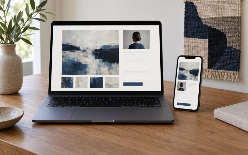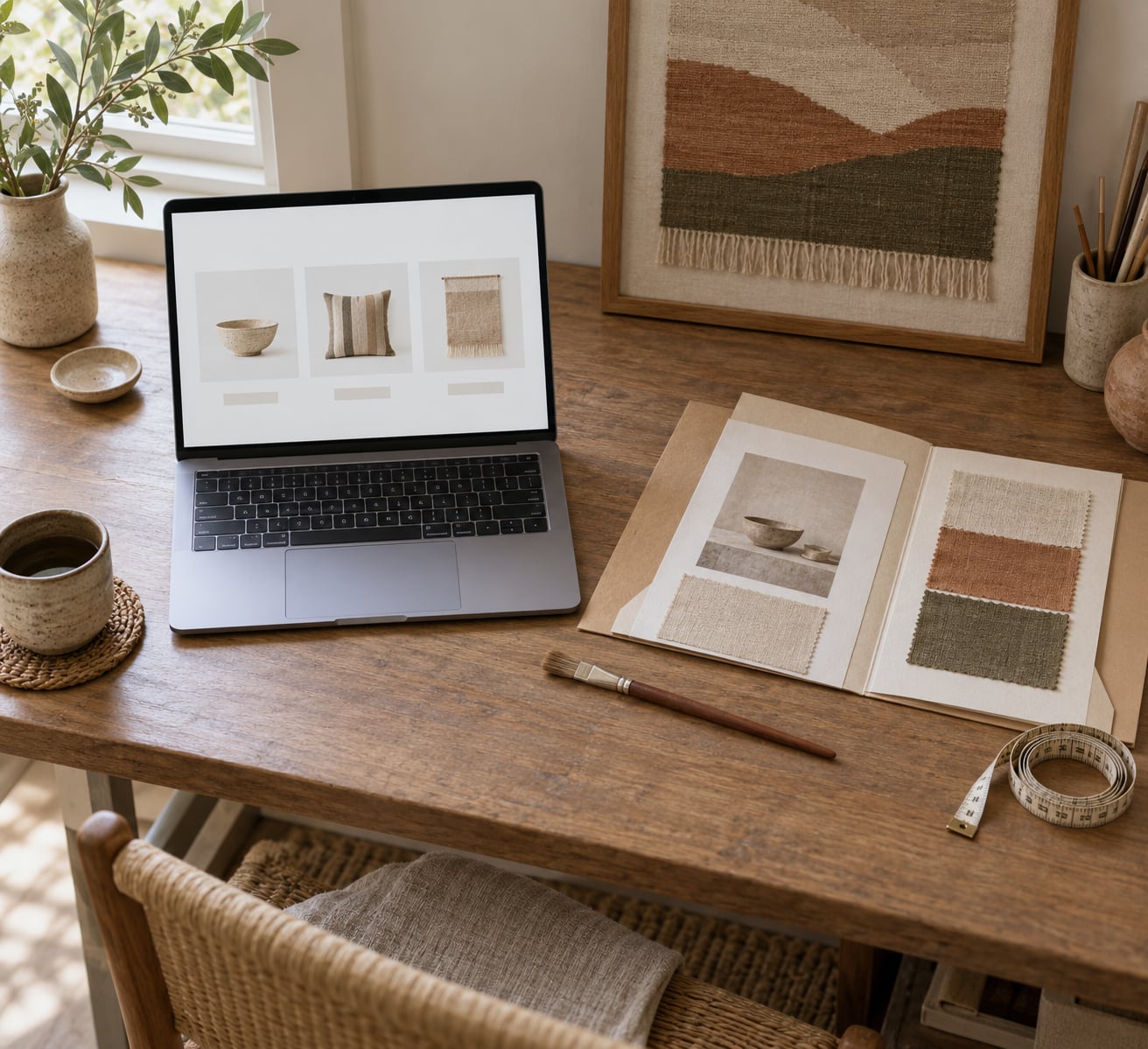
A shop page for original art is a single page that lists your one-of-a-kind pieces with accurate photos, full details and one clear way to buy or enquire. How to set up a shop page for original art is mostly about completeness rather than design skill: collectors want to see the piece true to life, know what it is, how big it is, what it costs and how it arrives. Most first shops fail on missing details, not on an unfashionable template.
A weekend is enough to build a small, honest version that you can improve as real questions arrive from buyers.
Table of Contents
- What You Need
- How to Set Up a Shop Page for Original Art
- Step 1: Define what your shop page for original art is for
- Step 2: Choose the artwork and products
- Step 3: Prepare accurate artwork details
- Step 4: Set prices and sales information
- Step 5: Design the page around the artwork
- Step 6: Add a secure purchase or inquiry path
- Step 7: Publish, test, and improve the page
- Common Mistakes
- Frequently Asked Questions
- Do I need my own website to sell original art?
- Should I use Etsy or my own website for art?
- How should I photograph original artwork for sale?
- Should I show prices on my art shop page?
- How should a shop page handle commissions?
- How long does it take to set up an online art shop?
- Conclusion
What You Need
Gather this before you touch a template, and the build itself gets much faster.
- Photographs of each piece. One flat, square-on shot for accuracy and at least one in-situ shot for scale.
- A spreadsheet of the facts. Title, year, medium, exact dimensions, materials, orientation, and whether the piece is framed, unframed, or sold unframed.
- Clear images at readable size. Export larger than you think you need and let the platform compress.
- Prices and what they include. Say plainly whether framing, hanging hardware, certificates and shipping are part of the number.
- A short story per piece. Three or four sentences is plenty. What inspired it and how you made it.
- Written policies. Shipping, returns, payment terms, commission deposits and how long you expect to take.
- A way to take money. A platform checkout, a bank transfer, or a request-for-quote flow if you ship only within your own region.
- A place for buyers to reach you. A contact form on the page works better than an email address alone.
If you sell mixed media, textile or quilted work, add one extra field per piece: materials and any care instructions, since collectors will ask about both anyway.
How to Set Up a Shop Page for Original Art
Step 1: Define what your shop page for original art is for
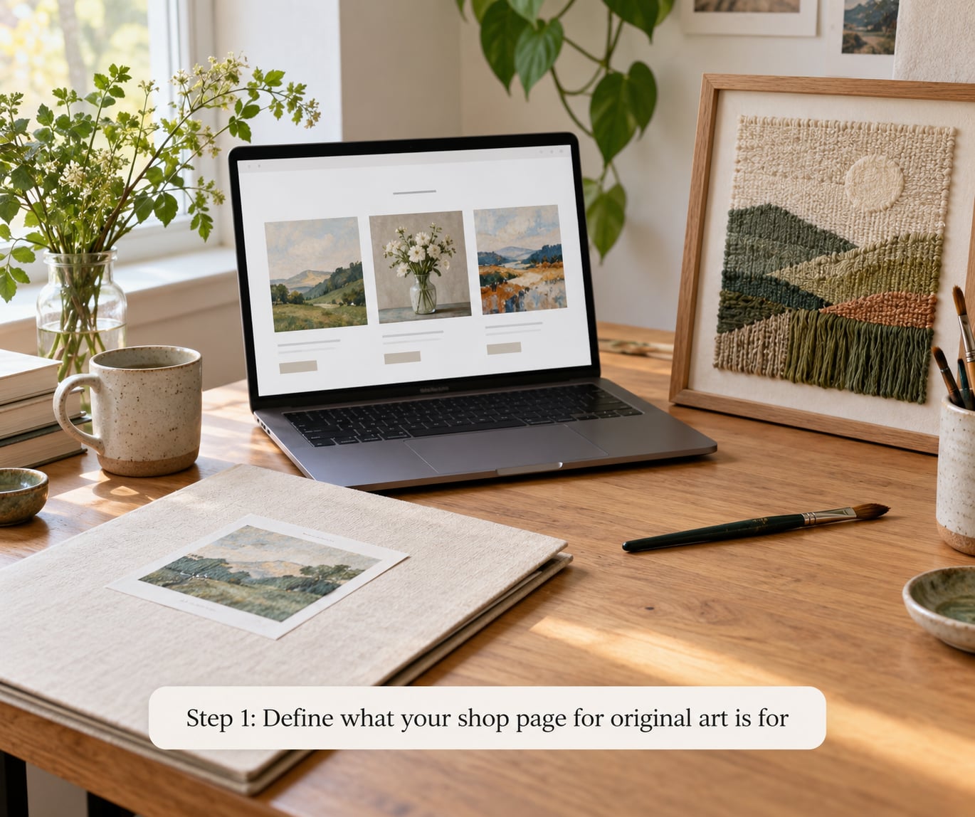
Decide the page’s single job before you design anything. Most pages are doing one of four jobs: selling finished one-of-a-kind pieces directly, taking commissions, showing a curated collection that leads elsewhere, or previewing an archive.
Selling and taking commissions are different pages. A checkout page with a price on every piece assumes a buyer who has already decided. A commission page assumes the opposite, and needs a form and a process instead of an Add to Cart button.
Mixed pages are where shops get muddy. If you take commissions, put the enquiry button high on the page and keep finished work in a separate section below.
Step 2: Choose the artwork and products
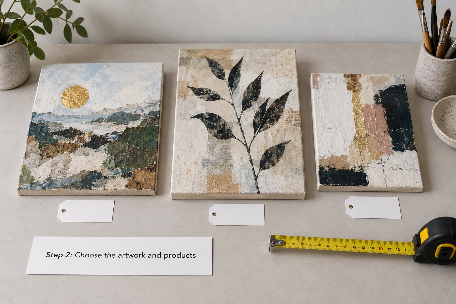
Start small. Twelve to twenty available pieces is a believable collection, and it is enough to show range without leaving weeks of gaps when something sells.
Sort every candidate into one of three states: available, reserved, or archived. Only available work gets an active buying button. This is the step that prevents the most common disaster in original art, which is a piece being bought twice because two pages were both live.
Decide what else belongs on the page. Limited edition prints, digital downloads of your line work, and a gift note option all fit naturally. A piece you made three years ago and will never make again also fits, but only in an archive section, clearly marked sold.
Give every piece a simple internal code such as 24-07. It is not glamorous, but it makes packing, invoicing and your own records painless.
Step 3: Prepare accurate artwork details
Write these fields once in a spreadsheet, then paste them into every listing. Consistency is what makes a shop feel professional.
- Title, exactly as signed on the work.
- Year completed.
- Medium, in the artist’s own words. Acrylic and graphite on cradled panel, for example, not “painting”.
- Dimensions, given as height by width, and depth if the piece has any.
- Materials list for anything mixed media or textile.
- Edition status for originals and prints: unique, or edition of twenty signed and numbered.
- Orientation and where it likes to hang.
- Installation notes: does it come framed, does it hang from a D-ring, does it need two people and a wall free of radiators.
- Signature position and whether the piece is signed on the back.
- One short paragraph on the idea behind the work.
Accuracy here is a trust signal, not admin. A buyer who receives exactly what the page described tells other people.
Step 4: Set prices and sales information
Price the work using a formula you can repeat, not a number you guessed on a good day. Materials, plus time multiplied by an hourly rate you set, plus a share of studio and website overhead, plus the profit you want to keep. Then round to a number that looks deliberate.
Show the total where you can. Buyers compare against pieces that include shipping, so a bare painting price sits next to an all-in price and loses. If you cannot ship to everywhere, state it plainly rather than letting buyers discover it at checkout.
Also state, in the page itself: whether sales tax is added at checkout, what your return window covers and what it does not cover, how long a commission deposit holds a slot in your schedule, and how many revision rounds a commission includes.
The common industry guideline for gallery representation sits around half the sale price, which is the number you are usually trying to beat by selling direct. Keep that in mind when a number feels low, then decide deliberately rather than by habit.
Step 5: Design the page around the artwork
Work down the page in this order, and resist moving things around afterwards.
- A short opening message about who makes the work and what it is about.
- A grid of featured pieces, no more than six, each linking to its own detail page.
- The full catalogue, with available, reserved and sold clearly separated.
- A short section on process or studio life, two or three photographs at most.
- Commission information and an enquiry form if you take them.
- Policies: shipping, returns, commission terms.
- Contact details and a newsletter signup.
Every piece should have its own detail page rather than living only in the grid. That page is where dimensions, the story and the buy button belong.
Keep the palette to your artwork rather than a template’s defaults. If you work in muted linen and clay tones, a black-and-white theme will fight every piece you post.
Step 6: Add a secure purchase or inquiry path
There are three workable routes, and picking the wrong one wastes months.
- Direct checkout on the page. Best when you ship nationally and want sales to close without a reply from you. The page needs an SSL certificate, which every reputable host provides by default.
- Enquiry then quote. Best for large work, commissions or shipping internationally, where a real shipping quote matters. Expect slower closes, because you are now the bottleneck.
- A marketplace such as Etsy or an artist-focused platform. Best when you need an audience today and want to learn what sells. Expect more fees and less control over the page.
Whatever you choose, tell buyers exactly what happens after they click. Do they get an email receipt, a packing photo, a tracking number, an estimated arrival window, and a condition report for a large piece? Saying this on the page removes the anxious inbox messages that eat studio time.
For commissions, write the sequence down: enquiry form, written scope and quote, deposit to confirm, work in progress, final image approval, balance on completion. Collect the deposit through a proper invoice rather than a personal bank request, so both sides have a record.
Step 7: Publish, test, and improve the page
Run this checklist on a phone before you tell anyone the page exists. Most of your traffic will arrive on one.
- Every image loads at full width and is not stretched or cropped oddly.
- Text is readable without pinching to zoom.
- Every buy button works and lands on the right piece.
- Prices match what the checkout charges, including shipping and tax.
- Reserved and sold pieces cannot be bought.
- Forms send to an inbox you actually read.
- Alt text describes each piece for screen readers. Name the medium and subject, not “image”.
- Image file names describe the work rather than
IMG_4021. - The contact details are visible without scrolling to the bottom on a small screen.
- Purchase confirmation and packing notification emails arrive automatically.
- You can see traffic and which pieces get looked at but not bought.
- Your own domain name is used and the address bar shows a secure connection.
Then announce it in the places you already post, and add one sentence to your email signature. Announce the first piece rather than the whole page; a single named work is easier for people to click than a general invitation.
For the first month, watch which pieces get opened and which get ignored. Pieces that get looked at and not bought usually have a pricing or scale problem, not a photography problem.
Common Mistakes
Here is what goes wrong most often, and the fix for each.
- Blurry or colour-shifted images. Photograph in daylight-balanced light, shoot the full piece flat, and check your monitor before uploading. Export at a size where the smallest brushmark is still visible when zoomed.
- No dimensions. Put height by width on the grid view itself, not only on the detail page, because most people judge size without clicking.
- Price surprises at checkout. Either build shipping into the price or state clearly, on the piece page, that shipping is calculated separately. Silence here is the top cause of abandoned carts.
- Vague availability. A piece with no status reads as unavailable. Use explicit wording: available, reserved until a date, or sold.
- Out-of-date listings. Mark the piece sold the moment payment clears, and keep the page live as an archive with a link to similar work. Deleting it wastes a page you already earned.
- No context around the work. A bare image with a title looks mass-produced. Two sentences about the idea or the materials does more for trust than any template choice.
- Competing calls to action. Buy, enquire, follow and subscribe all in one viewport means none of them get clicked. Pick one per section.
- Shipping originals like prints. A rolled poster and a stretched canvas need different packing. Flat mailers for works on paper, tubes for unframed canvases and panels, corner protectors and double-boxing for anything glazed or fragile.
- No stated delivery expectations. Say how long packing takes, separately from carrier transit time. It is the question buyers ask most and the one most often unanswered.
Frequently Asked Questions
Do I need my own website to sell original art?
No. Marketplaces like Etsy give you an audience on day one and handle payment and shipping basics, which suits a first sale. Your own site gives you control of presentation, story and pricing, and it becomes more useful once someone wants a custom piece or a body of work. A common middle path is a simple portfolio site with a shop page attached, so both live in one place.
Should I use Etsy or my own website for art?
Use a marketplace when you need traffic before you have any, and when most of your work is small and ships easily. Use your own site when you sell large pieces, take commissions, want to set your own fee level, or want the buyer relationship to stay with you. Plenty of working artists run both, using the marketplace for discovery and their own page for larger work.
How should I photograph original artwork for sale?
Start with a flat, square-on shot in even daylight so the whole piece is visible and the colour is true, then add a second shot showing the work hanging or leaning against a wall so buyers can judge scale. Include a close-up of texture or marks, and one detail shot of any signature. Shoot in the highest resolution your camera offers and downsize later.
Should I show prices on my art shop page?
For one-of-a-kind originals, yes. Buyers arriving from search are ready to buy and a visible price saves you both time. If you would rather have a conversation first, show a clear starting range or mark the piece as price on request, but make that choice explicit. Hiding every price tends to attract curiosity rather than sales.
How should a shop page handle commissions?
Give commissions their own section and their own button, separate from finished work. Ask for size, medium, subject, deadline, budget range and intended location in the form, then reply with a written scope, a price and a deposit amount before any work starts. State how many revision rounds are included and when the balance is due.
How long does it take to set up an online art shop?
A focused version with ten to twenty pieces, accurate details, clear policies and a working checkout is realistic in a weekend if your photographs already exist. It becomes a month or more once you add a custom domain, photography of the whole collection, packaging samples and the policy writing. Reserving one weekend keeps the scope small enough to finish.
Conclusion
If you have been putting this off, the practical route through how to set up a shop page for original art is narrower than it looks. Start with one page holding a small curated selection, complete details on every piece, policies a buyer can read in thirty seconds, and a single obvious way to buy or enquire. Check it on a phone, mark sold pieces promptly, and let the questions that arrive shape what you add next.