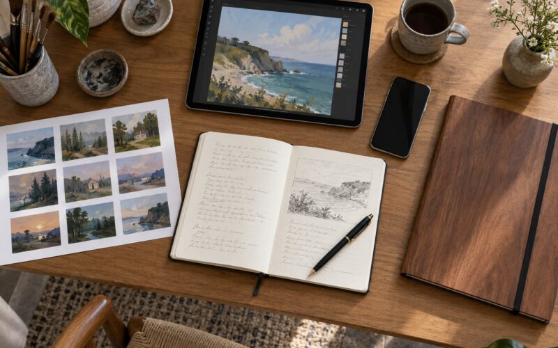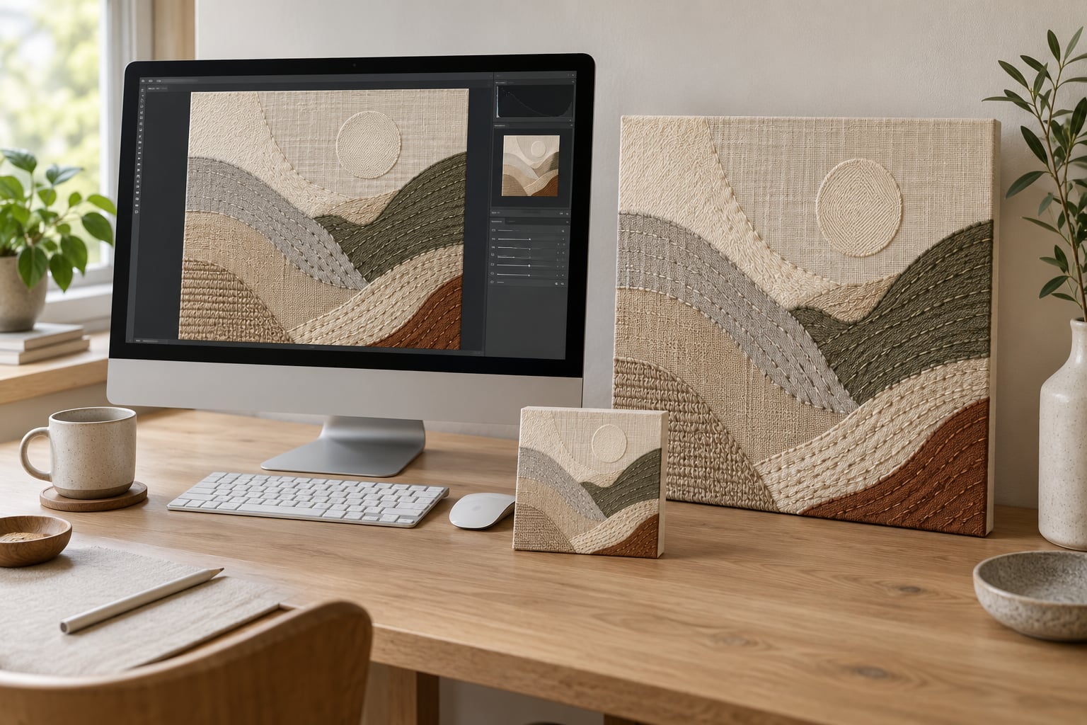
The best way to watermark an image is to work on a duplicate of the file, drop in a simple text or signature layer, set that layer between 30 and 50 percent opacity, park it over a busy area of the composition, then export the copy. Your master stays clean, and the mark stays visible without flattening the color or texture underneath.
I have watermarked hundreds of my own pieces of work, and early on I did it the wrong way more than once. I flattened the layer onto the only copy of a painting scan, then had to redo it from the raw camera file. That is the single mistake worth learning from before you start.
This guide covers textile, mixed media, painting and digital work. Everything below works in Photoshop, GIMP, Procreate, Clip Studio Paint and Canva, with menu names noted where they differ. The whole workflow takes about five minutes per image once the working file is set up.
Table of Contents
- What You Need
- How to Watermark Art Images Without Ruining Them: Step-by-Step
- 1. Prepare a high-resolution copy of the artwork
- 2. Choose a watermark that will not compete with the art
- 3. Place the watermark where it protects the image and preserves the composition
- 4. Adjust opacity, size, and contrast for the artwork
- 5. Export a protected copy and check the result
- Common Mistakes
- Frequently Asked Questions
- What opacity should I use for an art watermark?
- Where should I place a watermark so it cannot be cropped out?
- Can watermarks be removed easily?
- Do watermarks make my art look cheap?
- Should I use a signature or a logo as my watermark?
- How do I stop AI tools from training on my artwork?
- Conclusion
What You Need
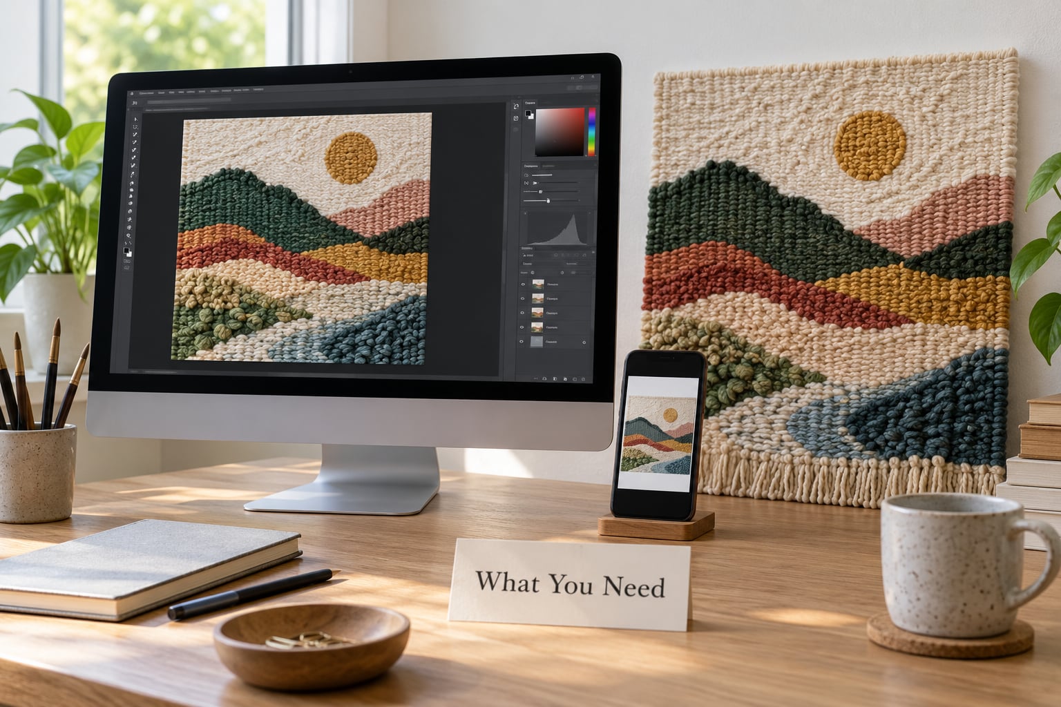
You need five things, and none of them are expensive or hard to find.
An image editor with layers. Photoshop, GIMP, Affinity Photo, Procreate, Clip Studio Paint and Canva all support a separate watermark layer you can turn off and on. Paint 3D and basic phone editors do not, so avoid those for this job.
The original high-resolution file. Find the untouched scan or camera export before you edit anything. A watermarked image you pull off your own website has already been through compression, and building on it is how colors go muddy.
A working copy in sRGB. Convert to sRGB if your file is in Adobe RGB or Display P3, because sRGB is what phones and most browsers show. A watermark tuned in a wide-gamut file often looks heavier on screen than in your editor.
A watermark asset with a transparent background. Save your signature or logo as a PNG with transparency. A white box behind your mark is the fastest way to make artwork look amateur, and it will not sit over texture cleanly.
The target dimensions for each destination. Write down what you need before you start: 1080 by 1350 pixels for a portrait feed post, 1080 by 1920 for a Story, roughly 1600 pixels on the long edge for a portfolio site, and about 600 pixels on the long edge for a print shop preview.
How to Watermark Art Images Without Ruining Them: Step-by-Step
Watermarking art images without ruining them comes down to three habits: duplicate the file, keep the mark on its own layer, and export a separate protected copy instead of overwriting anything. Do those three things and the risk of harming your work drops to almost nothing.
1. Prepare a high-resolution copy of the artwork
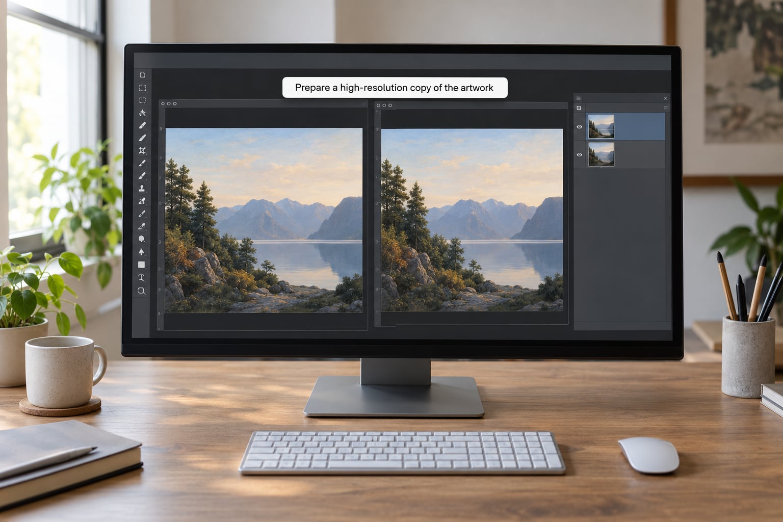
Duplicate the master file and rename the copy. Keep the original in a folder you do not plan to open again while working. This is the safety step that separates artists who lose a clean scan from artists who never do.
Open the duplicate and check three things: the pixel dimensions, the color profile, and the file format. Work in a lossless or high-quality format such as PSD, TIFF, PNG or Procreate’s own format while you are placing the mark. JPEG is fine for the final export only.
If the artwork has an alpha channel or you shot it in 16-bit, leave it alone unless you have a reason to change it. Flattening early is what destroys texture in mixed media work, where the whole point is the surface.
To tell it worked, the layer panel should show your artwork on one layer and nothing else yet. No watermark, no merged layers, no unexplained second background.
2. Choose a watermark that will not compete with the art
A watermark should identify you without becoming the thing people look at. Simple type in one weight, a hand-drawn chop, or a small logo all work. Elaborate script with drop shadows and bevels does not.
| Watermark style | Protection level | How it reads on the work | Best for |
|---|---|---|---|
| Signature chop | Low to medium | Reads like a real signature on a painting | Personal brand, hand-painted work |
| Logo mark | Medium | Clean and businesslike | Consistent sets, shops, studios |
| Repeated text line | Medium to high | Noticeable if run across the whole frame | High-value originals |
| Tiled overlay | Highest | Visible pattern that competes with texture | Previews you rarely control |
Compare the four styles against your own images before committing. The signature is the least obtrusive and the easiest to lift, the tile is the hardest to lift and the worst looking on detailed surfaces.
Give the mark enough contrast for the specific piece. White type vanishes over a pale canvas, black type disappears into a dark mixed media panel. If one color fails on half your portfolio, you need two versions, not one compromise.
The most useful trick I have picked up from other artists: sample a color straight out of the artwork with the eyedropper, then use that color for the mark at low opacity. Because the watermark shares the painting’s own palette, your eye reads it as part of the image rather than an intrusion.
3. Place the watermark where it protects the image and preserves the composition
Placement decides whether the work still looks good, so treat it as a composition problem and not a technical one.
Start with the busy areas: dense texture, a stitched edge, the darkest passage, an area of overlapping shapes. Those are the spots where a mark disappears into detail and never covers anything a viewer came to see.
Avoid faces, hands, focal flowers, a painted signature on the physical work, and the quiet negative space that makes a composition breathe. A watermark crossing a face is the fastest way to lose a scroll.
Corner marks are easy to remove by cropping, and most repost apps crop. If the image is likely to circulate without credit, put the mark nearer the center or run it across the full height of a vertical piece so cropping cannot save the thief.
| Where you post | Suggested treatment | Why |
|---|---|---|
| Instagram feed | Signature or logo, bottom corner, 35% opacity | Feeds get cropped and screenshotted constantly |
| Instagram Story | Larger centered text, 40% opacity | Full-screen display shrinks corner marks |
| Portfolio site | Subtle mark plus right-click disable | Visitors are already there to buy |
| Print shop preview | Small signature near the edge | Buyers expect previews to look cleaner |
| Marketplace listing | Matching logo at listed image size | Consistency reads as professional |
| Open call submission | Signature only, or none at all | Judges often reject visibly marked work |
Resize the canvas and watch what the crop does. If a square crop or a portrait crop eats your mark, move it. That thirty-second check saves the whole protection effort.
4. Adjust opacity, size, and contrast for the artwork
Set the watermark layer to 30 to 50 percent opacity as your starting range, then tune per image. The benchmark is useful, not absolute.
At 30 percent the mark is readable on screen and nearly invisible when the image is printed small. At 50 percent it holds up better on a phone in bright light. Below 20 percent you are wasting your time; the mark is gone the moment someone resizes or screenshots.
Test in four places before you commit: over the lightest area, the darkest area, the busiest texture, and the finest detail. If the mark vanishes in one of them, you have two choices: add a second copy of the watermark layer positioned in that spot, or switch to a color with more contrast.
Photoshop and GIMP also give you layer blending modes. Multiply darkens the mark into shadow areas, Screen lightens it over dark ones, and Soft Light sits somewhere in between and often reads as a natural part of the paint. Canva offers blend modes on paid plans; Procreate uses an alpha setting instead of opacity.
Keep the mark on its own layer and leave it toggleable. You will want it off for print sales and on for previews, and rebuilding it each time is a waste.
Then squint at the image. If you can still see the watermark clearly with your eyes half closed, it is too strong. If you cannot find it at all, it is too weak.
5. Export a protected copy and check the result
Export a new file instead of saving over the working copy. Use JPEG at quality 85 or higher for social and web, PNG when you need transparency or crisp type, and sRGB as the color profile.
For portfolio previews and print shop listings, export at a much smaller size. Most practitioners post at roughly 500 to 600 pixels on the long edge. A small file is awkward to print, cannot fill a large canvas, and the watermark becomes almost pointless to remove, because the thief ends up with a low-resolution copy.
If you work in a multi-piece series, you can batch this. In Photoshop, File, Automate, Batch runs an action across a folder. GIMP has Script-Fu for the same job, and Canva Pro offers bulk create. Save one correct version as the template and let the automation do the rest.
Before you publish, open the exported file on your phone. Not on the monitor, on the phone. A mark that looks balanced on a calibrated screen can vanish in a bright feed.
Then compare the export against the original side by side. Look at the deepest shadow and the brightest highlight for color shifts, and look at your finest line work for detail that has smoothed out. That comparison is the only honest test.
Common Mistakes
Most ruined watermarks come from one of a handful of habits. Each one has a simple fix.
Watermarking the master file. Once you flatten a mark into your only copy, the clean original is gone. Fix: duplicate first, every time, and store the master somewhere you will not open it mid-edit.
Exporting repeatedly from a compressed copy. Saving a JPEG over itself loses a little quality each pass. Fix: always export from the lossless working file, and re-export rather than overwriting.
Placing the mark across a face or focal detail. It kills the composition and viewers scroll past. Fix: zoom out to 25 percent and check the thumbnail, which is roughly how people first see the image.
Going too transparent. Under 20 percent, a mark disappears in any re-compression. Fix: stay at 30 to 50 percent and sample the color from the artwork.
Going too opaque. A hard white stamp over a textile piece reads as a sticker. Fix: use a blend mode, or lower the opacity until you have to look for it.
Flattening the working file before you are done. Fix: keep the watermark on a separate layer and flatten only a duplicate for export.
Testing on one screen. Fix: open the export on the phone you actually post from, plus one older device with a duller panel.
Expecting a watermark to stop everything. Monochrome marks at low opacity can be lifted by color processing and by generative fill tools. Fix: pair the mark with small export sizes, embedded copyright metadata, and multiple marks in different areas.
One last habit that pays off constantly: sign the physical piece with the same mark you use digitally. Then a photo of the artwork carries your chop naturally, and the watermark question mostly answers itself.
Frequently Asked Questions
What opacity should I use for an art watermark?
Start at 30 to 50 percent opacity and adjust per image. At 30 percent the mark reads clearly on screen but nearly disappears in a small print; at 50 percent it survives a phone screen in bright light. Below 20 percent any resizing or re-compression erases it. Sample a color from the artwork itself so the mark blends instead of sitting on top.
Where should I place a watermark so it cannot be cropped out?
Avoid corners, since repost apps and manual edits crop there first. Put the mark near the center, or run it down the full height of a vertical piece so no common crop removes it. Still avoid faces and focal details: the standard is to place the mark over the busiest texture in the composition.
Can watermarks be removed easily?
Plain monochrome text at low opacity can be lifted with color processing, and generative fill tools handle simple stamps. Harder marks use a multi-colored signature, two or three placements in different areas, and a color sampled from the artwork itself. None of this is permanent protection, which is why small export sizes matter more than the mark does.
Do watermarks make my art look cheap?
A badly placed or overly heavy one can. A watermark that matches the artwork’s own palette, sits over texture, and sits between 30 and 50 percent opacity reads as a signature rather than a warning label. Many collectors expect a visible signature on artwork, and buyers generally understand that watermarks never appear on the work they purchase.
Should I use a signature or a logo as my watermark?
Use a signature if your work is hand-painted, stitched or drawn, because it matches the tradition of signing an original. Use a logo if you sell under a studio name or run several series that need to look consistent. Either way, save it as a transparent PNG so it sits over texture instead of on a white block.
How do I stop AI tools from training on my artwork?
No watermark fully prevents scraping, since training pipelines read the raw file. What you can control: post at smaller sizes, embed your name and copyright in the file metadata, keep a dated record of your originals, and consider a light screen-tone or tiled overlay that automated cleaning handles poorly. Keep full-resolution files out of public folders entirely.
Conclusion
Start with one action tonight: duplicate your master file and leave the original untouched. From there, sample a color out of the artwork, drop in a simple signature or logo on its own layer, set it between 30 and 50 percent, and park it over the busiest texture you have.
Then export a separate protected copy at the size that destination needs, open it on your phone, and compare it against the original. Learning how to watermark art images without ruining them is mostly repetition of that sequence, and after a dozen pieces it takes less time than choosing a title.