You can mix screen printing ink colors, and you should. Screen printing ink is a pigment-and-binder ink that sits on top of the fabric or paper and gets cured with heat, so it never air-dries on the palette while you work. Learning how to mix screen printing ink colors by weight, on a scale, is what turns a lucky batch into a color you can repeat on every future run. The whole process takes about 20 minutes per custom color.
The short version: start with the largest-volume color, add the second color in small increments, test print, then write the recipe down. Everything below expands on that.
Table of Contents
- What You Need to Mix Screen Printing Ink Colors
- Step-by-Step: How to Mix Screen Printing Ink Colors
- 1. Choose Your Base Inks
- 2. Understand the Color Mix
- 3. Measure a Test Batch of Screen Printing Ink Colors
- 4. Mix Until the Color Is Even
- 5. Test and Adjust
- 6. Scale Up and Record the Recipe
- Common Mistakes
- What You Can and Cannot Mix
- Troubleshooting a Failed Batch
- Frequently Asked Questions
- Can you mix screen printing ink colors?
- Can you mix water-based and plastisol ink together?
- How much white do you add to make a pastel?
- How long does mixed screen printing ink last?
- Should I use RGB or CMYK values when mixing ink for screen printing?
- Why does my mixed screen printing ink print chalky?
- Conclusion
What You Need to Mix Screen Printing Ink Colors
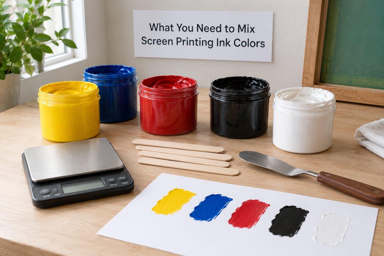
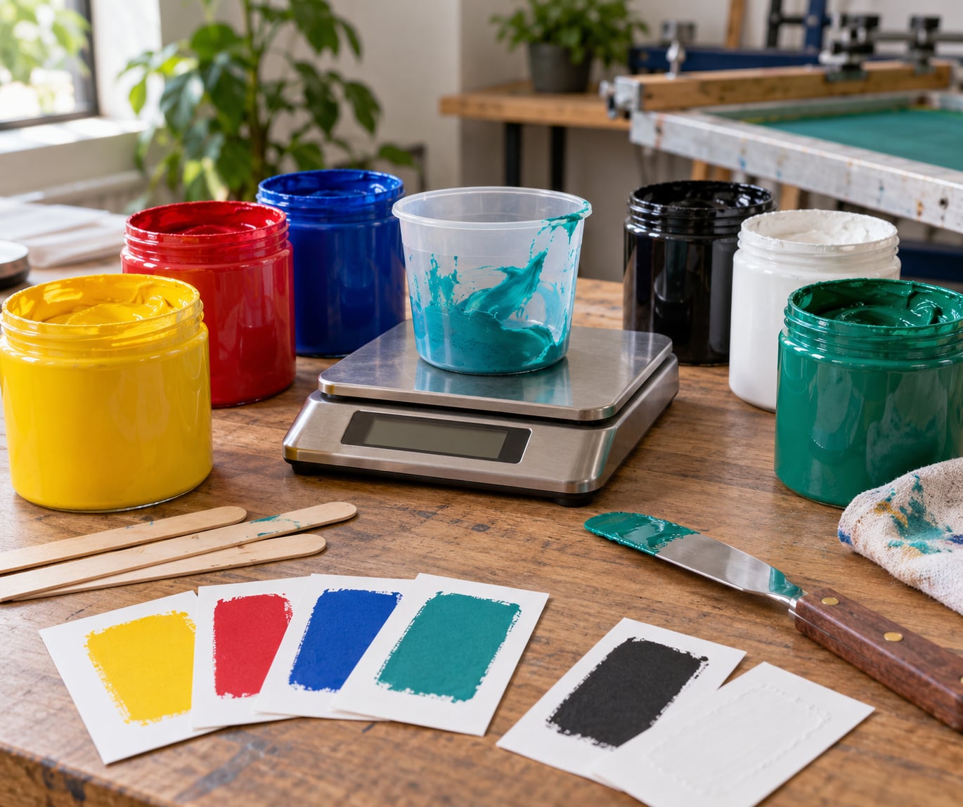
Before anything else, get the measuring right. Printers who mix by eye are the ones whose colors drift from run to run, and the cheapest fix is a pocket digital scale that reads in grams. Weight beats volume here because ink density differs between colors, so two tablespoons of white is not twice the ink of two tablespoons of a dense base.
- Digital gram scale with a 0.1 g resolution, the single biggest upgrade to consistency.
- Mixing surface: a glass or sealed palette board. Paper and untreated cardboard drink oil straight out of the ink.
- Palette knife or rubber spatula for folding ink in without knocking air into it.
- Stir sticks, one per color, so you never cross-contaminate.
- Two or three base inks — a bright primary, high-opacity white, and a dark shade or complementary spot.
- White test paper and the real substrate (a shirt, a tote, a sheet of card) for pull-downs.
- Reducer or thinner if your ink is too thick to pull through the mesh.
- Nitrile gloves and a respirator-rated mask for pigment handling and any solvent-based cleaner.
A small hand mixer works well for larger batches. Printers swear by everything from a spatula to a cake mixer, and the shared point is speed plus consistency — enough shear to fully disperse the pigment.
Step-by-Step: How to Mix Screen Printing Ink Colors
1. Choose Your Base Inks
Keep your ink system small and you will actually use it. Three or four colors cover nearly every custom mix: a transparent bright base, a high-cover opaque white, a dark shade, and one accent.
Transparent inks let the substrate show through, which is what you want on light garments for a soft, dye-sub look. Opaque or high-cover inks, built with titanium dioxide, sit on top and give you solid coverage on dark garments — usually over a white underbase. Fluorescent and specialty inks are the exception; they need their own base and lose the effect once blended heavily.
Only mix within one system. Water-based, plastisol and discharge inks each have their own binder and cure behavior, and they should stay separate.
2. Understand the Color Mix
Before you measure anything, decide what you are tinting toward. Starting with the highest-volume color and tinting down is the consensus method for a reason: you can always add more, but you cannot take pigment back out.
To lighten, add white in small amounts. White also raises opacity, so a tint becomes chalky once you pass the point where the base pigment still reads clearly. To deepen, add a small amount of the complementary color rather than black, which flattens everything it touches. Mix complements in equal parts to make a neutral gray you can tint back toward your target.
| Target | Start with | Tint toward | Watch for |
|---|---|---|---|
| Pastel | Base color | White, 30-70% by weight | Chalky and flat past the tint stage |
| Deep jewel tone | Base color | Complementary, 5-15% | Going muddy with too much |
| Neutral gray | Equal parts of any two complements | White or black to set value | Warm or cool drift between batches |
| Skin tone | White base | Complementary warm, 2-10% | Printing chalky on fabric |
3. Measure a Test Batch of Screen Printing Ink Colors
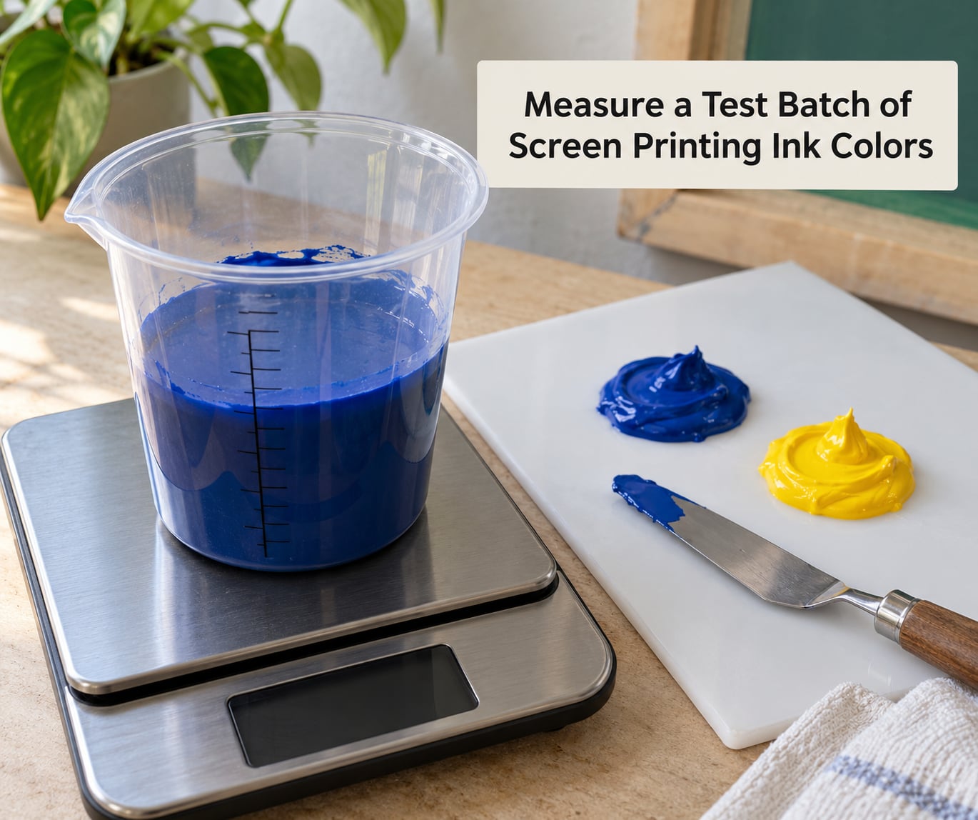
Put the empty cup on the scale and tare it. Add your largest-volume ink first and note the weight — for a small test batch, 30 g of base is plenty. Now add the second color 1 g at a time, weighing and recording after every addition. Small increments are the whole game; a 5 g addition of the wrong color is not recoverable.
Work by parts by weight, so any batch scales up later. If a mix works at 30 g base and 3 g white, that is a 10:1 ratio and it works at 3 kg too.
| Recipe | Base | White | Spot accent | Ratio |
|---|---|---|---|---|
| Pale blue | 90 g cyan | 10 g | – | 9:1 |
| Soft coral | 80 g red | 20 g | – | 4:1 |
| Deep navy | 100 g blue | 40 g | 5 g orange | 20:8:1 |
| Olive | 70 g yellow | 25 g | 15 g blue | 14:5:3 |
| Muted mint | 60 g green | 35 g | 3 g red | 20:12:1 |
| Maroon | 90 g red | – | 10 g green | 9:1 |
Mix the test batch smaller than you think you need. You will make three of them before you print the run, and none of the leftovers are a total loss.
4. Mix Until the Color Is Even
Screen printing ink is thixotropic, meaning it thickens at rest and thins under shear. Fold it with the palette knife from the outer edge toward the center, then scrape the sides clean, and repeat until there are no visible streaks or darker pockets.
Two to three minutes of steady stirring does most of the work. You are looking for an even color with no color separation and no soft lumps of un-dispersed pigment. Avoid whipping in a lot of air; bubbles that survive into the screen print as pinholes, and air makes the ink read lighter than the swatch.
Keep the ink off the surface of the board. A skin that forms on top traps pigment and dries into specks that later gum the mesh.
5. Test and Adjust
A swatch on paper tells you almost nothing. Pull the color on the actual substrate — paper swells differently than a 100% cotton knit, and a color that looks punchy on paper can print chalky on fabric.
Use a consistent mesh count and squeeze pressure for every test, then compare the pull-down with your reference. A reference sample beats a printed swatch book, since paper stock and lighting shift what your eye reports.
Adjust one variable at a time. Too light, add base color 1 g at a time. Too dark or dull, add white or the complementary in fractions of a gram. Too transparent on a dark garment, add high-cover white or switch to printing over an underbase. Too thick to pull through the mesh, add reducer 1-2% at a time and remix.
6. Scale Up and Record the Recipe
Once the pull-down matches, multiply the test formula by the volume you need. Keep the scale running through the whole batch rather than estimating the top-up; water-based ink density shifts as it heats.
Then write it down. This is the step printers complain about most and the one that separates a repeatable studio from a lucky one. Log the ink brand and product line, the batch weights, the ratio, the mesh count and flash settings, the substrate, and the cure settings. Tape a dried swatch to the entry.
A swatch library beats a formula on its own, because the same formula from a different ink lot can shift slightly. Keep a card of every custom color you have made with the formula on the back.
Common Mistakes
Almost every bad mix traces back to one of these, and each has a simple fix.
- Mixing by eye instead of by weight. Eyeballing cannot be repeated. Put the cup on the scale and record every addition.
- Adding too much at once. A single 5 g addition of the wrong accent is unrecoverable. Work in 1 g increments, or 0.5 g once you are close.
- Mixing on paper or cardboard. Absorbent surfaces pull binder out of the ink and dull the color. Use glass, sealed plastic, or a coated board.
- Adding white too early. White raises opacity as well as value, so a tint goes chalky and flat. Add it last, in small steps, and stop before the base pigment stops reading.
- Ignoring viscosity. Color can be perfect and still fail on the press. Add reducer in 1-2% increments and remix fully, then re-test the pull.
- Skipping the substrate test. Always pull the color on the material you are printing.
- Failing to record the recipe. If you do not write it down, the color is gone once the ink dries.
- Throwing separated water-based ink away. A settled tub needs reincorporation, not binning. Stir or mix it back until the solids suspend, then check viscosity and print a pull before returning it to the shelf.
What You Can and Cannot Mix
| Ink type | Mix with | Notes |
|---|---|---|
| Plastisol | Same-brand plastisol, white, and reducers | Heats to a gel, then cures. Adding a thinner trades gloss and soft hand for flow. |
| Water-based | Same-brand water-based, white, water-based reducer | Air-dries on the screen, so keep lids down and clean the mesh daily. |
| Discharge | Same-brand discharge and white | Removes the dye underneath, so the result depends on the garment. |
| Fluorescent, glow, reflective, puff | Usually the same ink plus white, sparingly | Blending heavily dulls the effect. |
| Water-based + plastisol | Nothing | Different binders and cure behavior. Never combine them. |
| Acrylic or India ink and paint | Nothing | Not screen printing ink. It will gum the screen and behave unpredictably. |
Troubleshooting a Failed Batch
| Symptom | Cause | Fix |
|---|---|---|
| Chalky, flat print | Too much white or too much reducer | Add base color 1 g at a time; cut back on the next batch |
| Muddy, dull color | Too much complementary or black | Add base color in small amounts and re-test |
| Will not pull through the mesh | Ink too thick for the mesh count | Add reducer 1-2% and remix fully |
| Color separates in the tub | Pigment settling | Stir back into suspension and re-check viscosity |
| Prints crack or peel after cure | Ink sitting in the film too long | Flash the ink and print immediately |
| Colors shift between runs | No recorded formula, or a different ink lot | Start logging ratios and swatch every batch |
Frequently Asked Questions
Can you mix screen printing ink colors?
Yes. Screen printing ink is designed to be combined, because it does not air-dry while it sits on the screen. Mix only within one system: plastisol with plastisol, water-based with water-based, discharge with discharge. Use a high-cover white to tint light and a small amount of a complementary color to deepen a shade. Measure by weight on a gram scale, test pull the color on your substrate, then record the recipe so you can make it again.
Can you mix water-based and plastisol ink together?
No. Water-based and plastisol have different binders, different cure temperatures, and different behavior on a screen, and combining them can gum the mesh or leave a print that peels or cracks. Keep each ink in its own container, stir sticks, and mixing session. If you want a softer hand than plastisol gives you, look at a soft-hand plastisol or a water-based ink formulated for the same substrate instead of blending the two.
How much white do you add to make a pastel?
Most pastels land between 30 and 70 percent white by weight, added to your base color. Start at 20 percent and work up, because white raises opacity as well as lightness and a tint turns chalky once the base pigment stops reading clearly. Test pull each step on the actual substrate, since fabric and paper show the tint differently. Write down the ratio that matches your reference.
How long does mixed screen printing ink last?
Plastisol keeps for months on the shelf when sealed and stirred before use. Water-based ink has a shorter window and will separate in the tub, so keep the lid down, press the ink down against the lid, and stir it back into suspension before each use. Neither lasts forever, which is another reason to mix only what you need for a run and keep a swatch of the formula you liked.
Should I use RGB or CMYK values when mixing ink for screen printing?
Not for the ink itself. On screen you are looking at light, so RGB numbers describe what a monitor shows, not what cured pigment on cotton looks like. For a custom spot color, work from a physical reference such as a fabric swatch or a drawdown and match by eye against test pull-downs. CMYK matters when you are printing process or halftone work, where the four inks are laid down as dots rather than mixed in the bucket.
Why does my mixed screen printing ink print chalky?
Chalky prints usually mean too much white, too much reducer, or both. White and reducer both raise opacity while lowering color strength, so the color reads pale and flat on fabric. Add base color 1 g at a time and retest, cut the reducer back, and check that you are not printing a light tint over a dark garment without a white underbase. Pull a test on the same substrate before running the full screen.
Conclusion
Start with a small measured test batch: pick your highest-volume color, put 30 g on the scale, add the second color 1 g at a time, and stir until the color is even. Pull it on the material you are actually printing, adjust one variable at a time, then write the weights down with a swatch taped to the page. That five-minute habit at the mixing bench is what makes every run after it come out the same color.