To pick a color palette for textile art, choose three to five colors, give each one a job, and test the real fabric swatches side by side in daylight before you commit to yardage. That takes about an hour the first time, then twenty minutes on every project after it.
Most people stall at this step for a boring reason: too many good options, not a lack of taste. Someone writing about this on r/Embroidery put it plainly, that choosing is hard because they like both options. A palette process gives you a way out of that loop, because you stop asking which fabric you like best and start asking what the piece needs.
Table of Contents
- What You Need
- Step-by-Step
- 1. Start with the project’s mood and purpose
- 2. Choose a limited base palette
- 3. Check the palette’s value and contrast
- 4. Test colors on the actual textile surface
- 5. Balance repetition and variety
- 6. Refine the palette before making the final piece
- Common Mistakes
- Frequently Asked Questions
- How do I determine my best color palette?
- What is the 3 color rule?
- What is the 60-30-10 rule for painting?
- What is the 70/30 rule in painting?
- What is the rule of 7 in quilting?
- What are the best color combinations for embroidery?
- What are some good color combinations for quilting?
What You Need
Gather these before you start choosing anything. Everything on the list is cheap, and several items you almost certainly own.
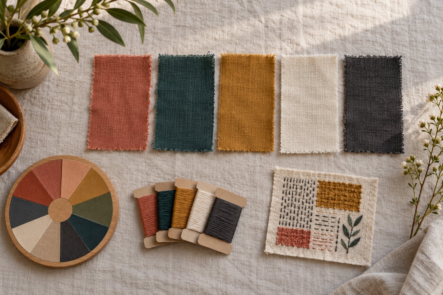
- Fabric swatches in candidate colors, cut roughly 2 inch squares from the actual bolts. Not photos, not screen shots.
- A neutral base fabric in cream, oatmeal, grey or charcoal. Most palettes behave themselves against neutral and argue with each other against a busy print.
- A color wheel, the physical RYB kind from an art supply shelf, plus a digital one for generating options faster.
- Grayscale check. Any photo app that converts an image to black and white tells you in seconds whether your values will separate once stitched.
- Thread cards if embroidery is part of the project, so you can see how a floss color sits against its cloth.
- An eyedropper tool, the kind in any free design app, for pulling colors out of a print you already like.
- A north-facing window and a notebook. Daylight and a written record are what separate a palette that works from one that only looked good at night under a warm bulb.
One warning before you gather: resist buying anything until step six. Color commitment is the one decision in textile art you cannot undo without redoing the piece.
Step-by-Step
1. Start with the project’s mood and purpose
Decide what the piece is before you decide what color it is. Write down where it will hang, how far away most people will stand when they see it, and what you want a viewer to feel in the first two seconds.
Viewing distance changes everything. A wall hanging read from across a room needs large blocks of value contrast, because fine hue differences vanish at ten feet. A small needlework piece held in the hand can carry subtlety that would disappear across a room.
Pick one emotional direction and write it in plain words, something like cool and quiet, or warm and loud. If you can describe the mood in three words, you can find fabric that matches. If you cannot, keep going; this is the step people skip and then wonder about later.
2. Choose a limited base palette
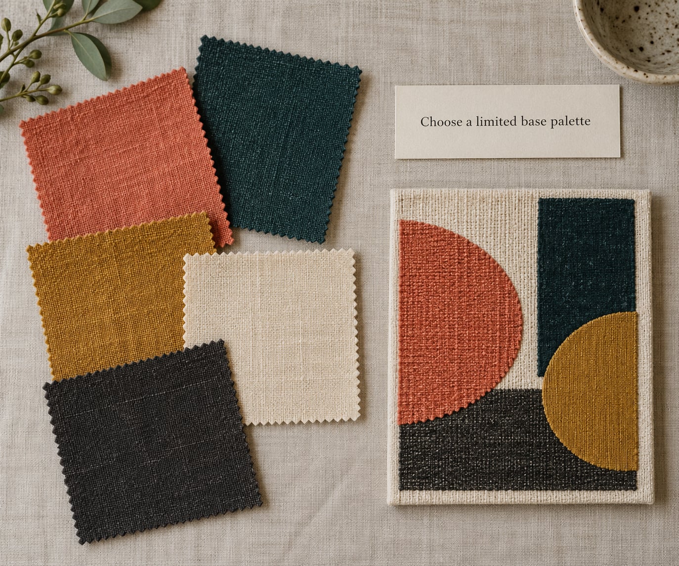
Stay between three and six colors to start. That range sounds restrictive, and it is exactly the constraint that makes the choices legible. Working makers land on the same number from the other direction, starting with four and adding two more only when a piece genuinely needs depth.
Give each color a job rather than just a slot in the row. The dominant color covers roughly half the surface, usually the background or the largest shape. The secondary color builds the main pattern. The accent appears in small amounts and carries the focus, in binding, a stem, an outline, a few stitches.
Neutrals do not count against your limit. Cream, oatmeal, soft grey and near-black sit underneath almost anything, so spend your color budget on the hues that carry the meaning.
For a small project, two colors is often the strongest answer: one ground, one figure, maximum clarity. For anything larger than a cushion cover, three to five gives you room for shape without chaos.
3. Check the palette’s value and contrast
Value means how light or dark a color is, independent of its hue. It does more work in textile art than hue does, because your eye reads contrast before it reads color.
Line your swatches up and squint, or photograph them and run the shot through a grayscale filter. You want at least three distinct values across the palette, and one pairing that is far apart on the value scale to act as your focal point. That pairing is where the eye should land first.
Then check the small stuff. Take a photo of the swatches from arm’s length, the distance a viewer sees them at. If stitching detail, a thin outline or a small applique shape disappears at that distance, the value contrast is too low and the work will look unfinished from across the room.
4. Test colors on the actual textile surface
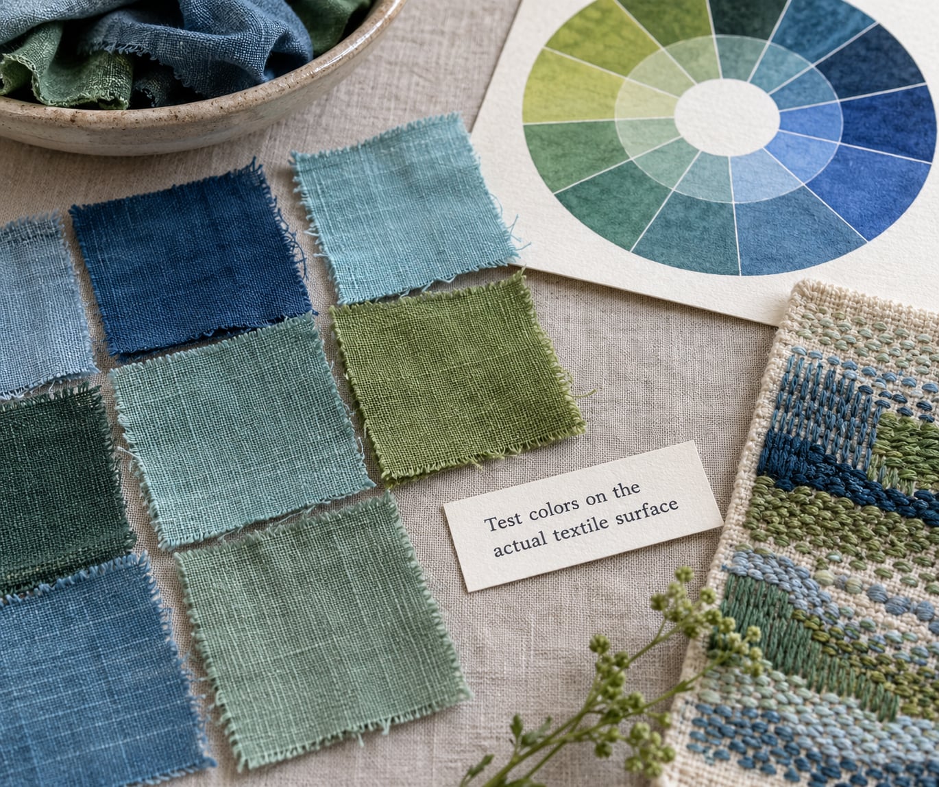
This is where most online color advice stops being useful. A color that hums on screen can go dull on a cotton, and a fiber with a slight texture scatters light in a way that lightens everything a shade.
Cotton, linen and silk each shift color differently. A glaze on a ceramic button or a shot-cotton surface will swallow light. A fuzzy brushed fleece turns every hue a half-step muddier than you expected. Test on the fiber you will actually use.
Cut 2 inch squares from each candidate bolt and sew or pin them side by side on a scrap of your base fabric. Look at them in daylight, then again in the evening light of the room where the piece will live. A palette that survives both is finished; one that fails evening light usually has two colors sitting at the same value.
Buy everything from a single dye lot where you can. Two bolts of the same shade from different dye lots can sit noticeably apart, and a visible seam between them reads as a mistake even when the colors are nominally identical. If a store cannot confirm the lot, buy the yardage together.
5. Balance repetition and variety
Repetition is what turns loose fabric into a composition. Once the jobs are assigned, use each color more than once, and vary how it appears: the same teal as a large shape, then as a small shape, then as a line in stitching.
Change one variable at a time when you repeat a color. Same hue, different value. Same value, different texture. Same color, different scale. That gives variety without adding a single new hue to the palette.
Check the proportions as fabric area rather than as swatch count. One accent fabric cut into six small pieces covers far less of the finished piece than one background fabric covering two thirds of it, and your eye counts area, not variety.
Aim for the dominant color to appear in roughly half to two thirds of the piece, the secondary in most of the rest, and the accent in a small but unmissable share. Once the proportions are set, new colors stop being additions and start being problems.
6. Refine the palette before making the final piece
Photograph your swatch row in neutral daylight with no color-correcting filter. The photo is your record, and it also shows you what the palette looks like when memory and intention are removed.
Step back across the room, then come close. Then hold the swatches against the base fabric and against a piece of your intended accent thread. Take out the weakest color. Most finished palettes are the fourth draft of a six-color idea, and cutting one is usually the biggest single improvement available.
When two options both win, break the tie with the piece rather than with taste. Which one has the stronger value contrast against the ground? Which one repeats more naturally in the areas you have least room in? Which one you can buy in enough yardage right now? The fabric you can actually get is a legitimate answer.
For embroidery, match floss to fabric by pulling a real stitch before you commit. A color that looks right in the skein can vanish into the cloth once the thread lies flat. Cross stitchers tend to name colors by thread number rather than color name, so a stitched sample of the exact code is worth more than any description.
If your stash has gaps, say no yellow, no purple, no pale pink, work with what you have. Most strong palettes are built from one dominant, one accent and a range of neutrals, so a missing hue usually means substituting a value rather than a color family.
Common Mistakes
Choosing from a screen. Screens shift color, and so does every monitor. Treat any digital palette as a shortlist, never a decision.
Equal strength everywhere. Four colors at full volume produce no focal point. Fix it by cutting one color back to roughly a tenth of the surface area.
Everything in the middle. Mid-tone against mid-tone is the classic mud. Push one color lighter or darker than the rest and the whole palette snaps into focus.
Neutral grounds that are not neutral. Cream reads as yellow next to warm ochre, and grey-green reads as cool beside a warm palette. Check your background against the color it sits beside, not on its own.
Buying yardage first. Commit to fabric after the swatch test, never before. A wrong bolt is money and time you cannot get back from a finished piece.
Forgetting the small scale. A palette that reads beautifully at arm’s length can turn to noise across a wall. Check both distances before you start.
Asking strangers instead of testing. Posting a photo of two options and asking which is better gets you opinions, not evidence. Crowds are good for spotting the option you keep overlooking, and bad at judging value contrast on a photo you shot in bad light.
Frequently Asked Questions
How do I determine my best color palette?
Your best palette is the smallest set of colors that covers the whole piece, holds one clear focal point, and still repeats. Start from the fabric or subject you already love, decide warm or cool, pick one harmony scheme, cap the count at three to five, then test the real swatches side by side in daylight before you buy yardage.
What is the 3 color rule?
The three-color rule says a piece should use no more than three: one background, one main, one accent. In textile art that usually means one background fabric, one pattern fabric, and one accent for binding or detail. Three colors force strong contrast and make weak choices obvious, which makes it the safest starting point if you have no design training.
What is the 60-30-10 rule for painting?
It divides a piece by area rather than by color count. Roughly 60 percent of the surface is one dominant color, 30 percent a supporting color, and 10 percent an accent. The rule travels neatly into textile art where the area is fabric: about 60 percent background, 30 percent main pattern, 10 percent binding and small detail. Use it to stop adding colors once the proportions are set.
What is the 70/30 rule in painting?
The 70/30 rule is the stripped-back version of the same idea, splitting a piece into one dominant color at roughly 70 percent and everything else at 30. In textile art it becomes one background fabric against one accent, which makes it a good rule for a first project, a small bag or a simple wall piece where the shapes need to read clearly.
What is the rule of 7 in quilting?
The rule of seven refers to using seven different fabrics in a quilt, which keeps a patchwork varied without tipping into chaos. If you are thinking in colors rather than fabrics, treat seven as a ceiling rather than a target. Seven colors only works when neighboring shapes differ strongly in value, so test the whole set in grayscale before you start sewing.
What are the best color combinations for embroidery?
Reliable embroidery combinations start with analogous tones for depth, a complementary accent on a neutral ground, or monochromatic in three values where texture does the work instead of hue. For a bold sampler, one dominant with two supporting accents works well. At small scale, keep it to a neutral plus one bright color, and stitch a real sample before buying the floss.
What are some good color combinations for quilting?
Two-color high contrast is the most reliable, so patchwork reads as shape rather than texture. One print plus one matching solid gives pattern variety with control. A tonal palette in three values adds depth without extra hues, and a neutral background carrying a single saturated accent keeps a large quilt calm. Whatever you choose, check neighboring shapes in grayscale first.
Start smaller than feels satisfying. Pick one fabric you already love, pull two or three candidates from the same color family, and audition them against it on your base cloth in daylight. That single hour does more for your finished piece than a week of browsing color theory, and it is the fastest way to learn how to pick a color palette for textile art on your own terms.