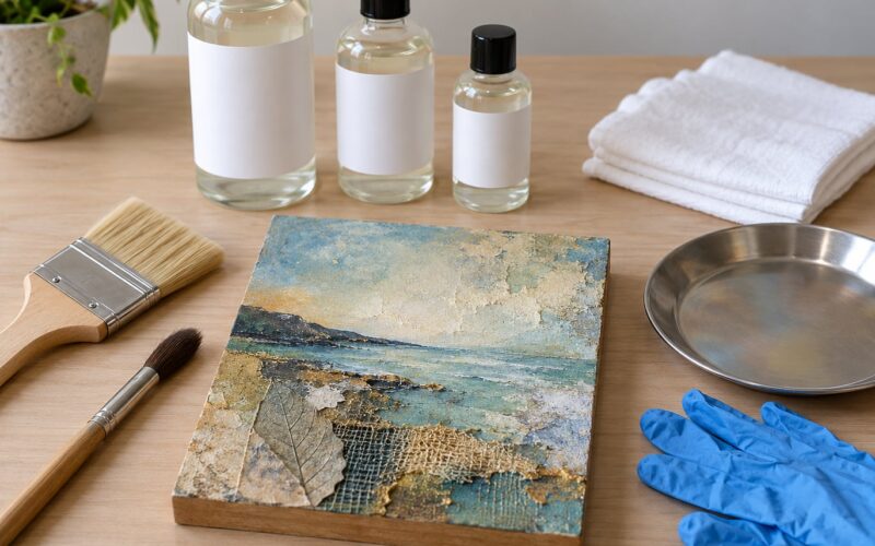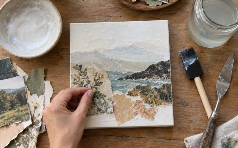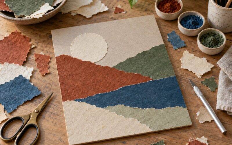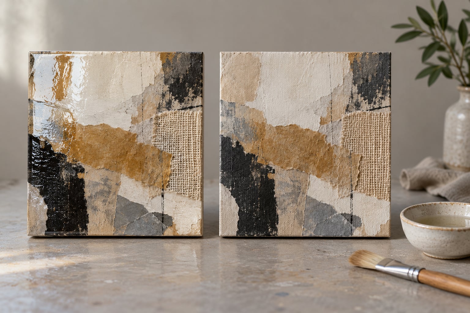
There is no universal winner when it comes to gloss vs matte varnish for mixed media, and anyone who tells you otherwise has not made a piece with a torn paper edge and a fabric scrap glued under paint. Gloss gives you saturated color and depth but turns every ridge into a highlight. Matte keeps the surface true but flattens deep tones. For layered work, the finish decides how your piece reads for the rest of its life.
I spend a lot of time in a studio where half the wall work is collage, textile and found-object pieces on panel, and the sheen question comes up on every one of them. What follows is the decision I actually use, built around surface and goal rather than around a brand.
Table of Contents
- Gloss vs Matte Varnish for Mixed Media at a Glance
- How Gloss and Matte Varnish Change the Appearance of Mixed Media
- Where Gloss Varnish Works Best
- Where gloss goes wrong
- Where Matte Varnish Works Best
- Where matte goes wrong
- How to Choose a Finish for Different Mixed-Media Surfaces
- What to Look for in a Mixed-Media-Safe Varnish
- How Gloss vs Matte Varnish for Mixed Media Performs Over Time
- How to Test Varnish Before Finishing the Whole Artwork
- Which Should You Choose?
- Frequently Asked Questions
- Can I use varnish over collage and fabric in a mixed-media artwork?
- What should I look for in a varnish that will not damage or discolor mixed media materials?
- Should I choose gloss, matte, or satin varnish if I want the artwork to look rich?
- Will gloss or matte varnish yellow over time, and how do I reduce that risk?
- Can I change varnish from gloss to matte, or do I need to remove the original finish first?
- Conclusion
Gloss vs Matte Varnish for Mixed Media at a Glance
| Criterion | Gloss varnish | Matte varnish |
|---|---|---|
| Sheen level | High, mirror-like reflection | Low, scattered and near-flat |
| Effect on color | Deepens and saturates, restores richness to darks | Holds color as painted, can mute deep tones and blacks |
| Visible texture | Emphasizes every ridge, edge and brush mark | Softens texture, can fill fine grain |
| Perceived depth | Reads as a layer of glass over the work | Reads as one flat painted surface |
| Maintenance | Fingerprints and dust show clearly; wipe with care | Hides dust well; harder to scrub without shinier patches |
| Durability | Hard, self-leveling film, more scuff resistant | Softer film, marks more easily but hides them |
| Best suited surfaces | Smooth hard panels, thin paint, metal leaf, glossy inks | Textured paint, collage, fabric, fiber, charcoal and pastel |
| Common drawbacks | Glare in rooms and in listing photos | Loss of vibrancy, patchy application on texture |
Nothing in that table makes one finish wrong. It makes one finish wrong for a specific surface, and mixed media rarely gives you a single surface to please.
How Gloss and Matte Varnish Change the Appearance of Mixed Media
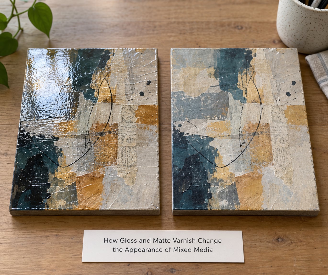
A gloss film is smooth enough that light bounces off it in one direction, so your eye reads a bright spot and a darker edge next to it. That single contrast is what makes paint look thick and wet, and it works on any material underneath: gessoed board, birch panel, gallery-wrapped canvas, even a layer of aluminum leaf.
Matte varnish contains particles or additives that scatter that light in many directions instead. Nothing is lost, but nothing pops either. The surface becomes a matte wall that reflects a little light across the whole area, and colors read exactly as opaque as they are.
The gap is widest on a dark, deep color. Gloss pushes saturation up because the reflected light carries a specular highlight across the pigment. Matte has no highlight to add, so a deep ultramarine or a mixed black can look chalky once the varnish goes on. This is the single most common complaint I hear from painters who choose matte, and it is the reason dark work usually ends up glossy.
Texture divides the two finishes in opposite directions. Gloss pools in the valleys between impasto ridges and dries shiny in the peaks, so a palette-knife area looks deeper and rougher than it is. Matte settles into the peaks and dulls them, smoothing the whole surface. If your texture is the point of the piece, gloss keeps it loud; if texture is a supporting element, matte lets it whisper.
Paper and fabric react differently again. Gloss over collage tends to bridge the edges of torn paper, which can look intentional and luxurious, and it also seals paper fibers that drink up paint unevenly. Matte over fabric keeps the soft, dry hand of the textile, though it can lodge in the weave and read uneven under raking light.
Metallic leaf behaves as an extreme case. Gold leaf under gloss reads as molten metal, with a bright moving highlight. Under matte it reads as flat, antique foil, closer to the look of a burnished panel. Neither is a mistake, but they are very different pieces.
Where Gloss Varnish Works Best
Gloss wins on smooth, hard, nonporous surfaces, and it wins big there. A sealed birch panel, a thin even layer of acrylic on canvas, a piece with alcohol ink or glass-like resin elements, and a piece headed for a spot-lit wall all benefit from the depth a high-sheen film adds.
It is also the practical choice for work that gets handled, shipped, or rubbed by sleeves. The gloss layer fills minor surface irregularities into a level film, and scratches show as hairlines rather than white scuffs. For a small piece going to an outdoor market stall or a craft fair, that durability is worth a lot.
Gloss is the finish for deep saturated color. Reds, purples, deep blues and mixed blacks all look heavier and more expensive under it. If your palette is the point and your texture is restrained, gloss is usually the right call.
Where gloss goes wrong
Gloss exaggerates every unevenness you were hoping nobody would notice. Brush marks, palette-knife tracks, dust nibs, a slightly lifted collage corner, a fingerprint in the gesso, a raised tape line. Under matte those disappear. Under gloss each one becomes a bright line and a shadow.
Glare is the other problem, and it is a lighting problem more than a medium problem. A glossy panel in a room with a window opposite the wall produces a sheet of reflected light that hides a third of the piece. Artists selling work online hit this constantly, because a gloss surface throws hotspots into listing photographs and buyers message you asking why the painting looks damaged. Many sellers now photograph the work before varnishing for exactly that reason.
Miniature painters have solved glare with a two-stage system that works just as well on flat work: gloss first as a durable base, matte or satin over the top to kill the shine, then gloss selectively on chosen areas to bring them forward. On a mixed media panel, that selective gloss can land on one color field, a metallic accent, or a single found object.
Where Matte Varnish Works Best
Matte wins on tactile, textured, and light-toned work. Anything built on surface, whether heavy-body paint, sanded gesso, embedded fiber, fabric, sand, or a found object with its own grain, looks more coherent under a low sheen. The finish stops competing with the texture and lets the texture do the talking.
It is also the calm answer for gallery and home display. Matte produces almost no reflection, so the piece reads the same from every angle and from every seat in the room. In a hallway lit by a window, a matte piece is far calmer than a glossy one, and a busy collage does not turn into a mirror.
For light, tonal, and pastel palettes, matte keeps colors exactly where you put them. A pale ochre does not turn creamy, a soft gray does not go chalky-white, and a monochrome work keeps its restraint. That is why matte is the default choice for many collage and paper works, and why it is often the wrong choice for a dark one.
Where matte goes wrong
Matte can look dull simply because it is, and there is no way around it. A deep, glossy-looking color choice such as a rich forest green or a near-black will lighten under matte, and artists often mistake the shift for a defect in the painting rather than a property of the finish.
Application is trickier too. Matte varnish does not level the way gloss does, and on heavily textured surfaces it can patch, where a thick coat sits in a hollow and a thin coat sits on a ridge. A matte varnish containing a solvent also re-wets the paint underneath slightly, which can lift pastel or graphite and drag a smudge across the surface. The remedy is a thinner coat, a wider brush, and patience between passes.
Matte also cannot be scrubbed. Gloss can take a damp cloth if the film is fully cured. Wipe matte and you take shine off the surface with the cloth, which leaves a permanent glossy smear where you cleaned.
How to Choose a Finish for Different Mixed-Media Surfaces
Match the finish to what the surface is made of, then adjust for where the piece will live.
- Smooth board or sealed panel: gloss, if you want depth and maximum color. Satin if the color is already rich and you want less glare.
- Heavy-body or palette-knife paint: gloss, since the texture is the subject. Satin is a reasonable middle if the impasto is very high and you want less shine.
- Collage with paper, tickets, and printed pieces: satin usually serves best, gloss if you want a resin-like sealed look, matte only if the paper is the point and the colors are light.
- Fabric, fiber, thread, or fiber inclusions: matte, so the textile keeps its dry soft hand. Gloss on fabric is an effect choice, not a default.
- Bare or stained wood: satin, because it softens the sheen of the grain without flattening it. Matte muddies wood grain more than most people expect.
- Charcoal, graphite, or pastel: matte, and go carefully. Prefer a spray fixative first and a light hand, because solvent-based matte varnish can re-dissolve and smear the dry medium.
- Photographs or printed imagery: gloss to protect and deepen the blacks, satin for a photograph mounted in a busy mixed media piece, matte if the photograph must not fight the surrounding work.
- Metallic leaf or mica: gloss for a bright, moving metal. Matte for an antiqued, burnished look.
- Pieces that will be framed under glass: varnish is still worth it, since glass alone does not seal the surface from dust, and acrylic medium can keep off-gassing off the back of the frame. Satin is the safe middle.
- Pieces that get handled, shipped, or sold at fairs: gloss or satin, for the harder film and easier wipe-down.
- Online sale with photographs: matte or satin. Gloss and a camera on a tripod will give you a reflection of the light source across the image.
One more variable: how far away the piece hangs. Gloss on a large piece viewed from several feet away is a glare problem. Gloss on a small piece in a vitrine, viewed from close up under a spot, is a jewel.
What to Look for in a Mixed-Media-Safe Varnish
Not every varnish is safe to put over a collage. Here is the checklist I run before buying a bottle for anything with mixed materials in it.
- Compatibility with every material in the piece. Water-based acrylic varnishes are the safest over paper, fabric, and acrylic, because they carry no solvent that can re-dissolve ink, pastel, or tape adhesive. Solvent-based mineral spirit varnish is harder and deeper but can move dry media.
- Water-based or solvent-based chemistry. Water-based dries clear and low odor, and is easy in a small indoor studio. Solvent-based needs ventilation and, in some regions, a respirator for extended sessions.
- UV protection and light stabilizers. Worth having for anything in daylight or for a piece you want to still look right in ten years.
- Nonyellowing formulation and acid-free status. Ask directly, and check the technical data sheet rather than the front of the bottle.
- Removable or permanent. Removable varnish can be taken off with the right solvent, which keeps future options open. Permanent varnish cannot. For mixed media with a long life ahead of it, removable is the safer default.
- Application method. A self-leveling varnish flows out evenly and is far more forgiving over texture. A non-leveling one rewards a very thin coat and a good brush.
- Safety and ventilation instructions on the label. Follow them rather than what the forum said.
One thing worth separating clearly: a fixative is not a varnish. Fixative is for securing loose dry media mid-process, it sits inside the work, and it is not a protective film. Gloss medium is not a varnish either, it is a paint additive that changes sheen inside the paint layer. Varnish goes last, on top, as a clear protective film.
How Gloss vs Matte Varnish for Mixed Media Performs Over Time
Long-term performance depends far less on the sheen label than on the chemistry, the number of coats, and how the piece is stored. A well-cured water-based polymer varnish in either sheen will outlast a badly applied solvent varnish many times over. Still, there are real differences to plan for.
- Dust and fingerprints: gloss shows both immediately, because a smooth reflective surface shows anything that interrupts it. Matte hides dust well, since scattered light has no edge to catch, but a fingerprint on matte leaves a shiny mark that does not buff out.
- Cleaning: gloss can take a soft damp cloth once cured, wiped and dried flat. Matte should be dusted, not wiped.
- Scuffs: a gloss film is harder and levels minor damage, so scratches read as fine lines. Matte absorbs the impact instead, but then the scuff stays there.
- Yellowing: this is a chemistry question, not a sheen question. Modern water-based acrylic varnishes are formulated not to yellow, and some solvent-based ones do over decades, especially in warm, dark storage. A varnish labeled matte can yellow exactly as a gloss one does.
- Full cure: most varnishes touch dry within a few hours and need considerably longer to cure hard. Give a piece 24 hours minimum before handling and much longer before wiping, stacking, or shipping.
If a finish goes wrong, the cause is usually recoverable. Cloudy or frosted gloss means moisture or humidity hit the wet film, and it often clears as the varnish dries. Streaky gloss means too much product or too little spreading. Still tacky after two days usually means humidity, a thick coat, or a cold room. Patchy matte means the coat is uneven, and another thin pass fixes it.
How to Test Varnish Before Finishing the Whole Artwork
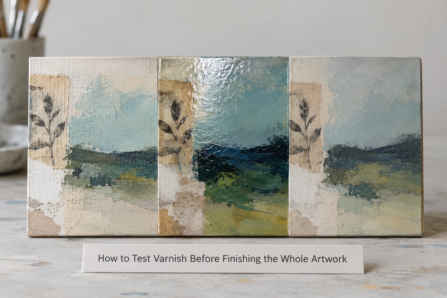
Make the sample from the same materials as the real piece, not from a spare canvas. A square of the same board, the same gesso, one painted passage, one paper edge, one scrap of fabric. Paint it in the same palette.
Divide it into three sections and leave one of them unvarnished. That control is the only honest comparison you will get, because varnish shifts color and you need to see the shift, not guess at it.
Apply gloss to one section and matte to the other in the thinnest coat you can manage. Use the same brush technique you would use on the full piece, because a heavy coat is exactly the variable you are testing.
Wait the full drying time on the label before judging anything, then evaluate under three lighting conditions: direct light from the front, angled light from the side that rakes across the surface, and diffuse light from a window or a north-facing room.
Direct light shows glare. Angled light shows texture and brush marks, which is where gloss is most revealing. Diffuse light shows the color the piece will read as in a gallery or on a screen.
Take photos under all three, because if the piece is going to be sold online, the camera sees what the direct light sees. Decide from the sample, not from the bottle, and from the sample, not from a memory of how the paint looked before varnish.
Which Should You Choose?
Choose gloss when the surface is smooth and hard, the palette is deep and saturated, the piece will be viewed from close up, and you want color that looks thick and protected.
Choose matte when the surface is tactile and textured, the palette is light, tonal, or restrained, the piece will hang in a bright room, or the texture itself is the subject and you do not want the sheen competing with it.
Choose satin or semi-gloss for most mixed media work. It splits the difference: it deepens color noticeably, it keeps glare controllable, it holds a harder film than matte, and it is far more forgiving over collage. If you are undecided, this is where to start.
You can also mix your own. Blending a small amount of matte into gloss, roughly seven parts matte to one part gloss, gives a soft satin that many artists prefer to anything off the shelf. And on a single piece, gloss over selected areas only, on top of a satin or matte base, is the most useful tool in this whole conversation. It lets one artwork have two finishes and gives the eye somewhere to land.
Frequently Asked Questions
Can I use varnish over collage and fabric in a mixed-media artwork?
Yes, but pick a water-based acrylic varnish rather than a solvent-based one, and cure every material in the piece first. A water-based varnish carries no solvent to re-dissolve printed paper, tape adhesive, ink, or pastel, so it will not lift or smear them. Apply it in thin coats, because a heavy coat pools in collage edges and bridges fabric weave. Let each coat dry fully before the next.
What should I look for in a varnish that will not damage or discolor mixed media materials?
Look for a water-based acrylic or polymer varnish that is labeled non-yellowing and acid-free, and that lists compatibility with paper, fabric, and acrylic. Removable varnish is worth preferring, because it keeps future options open and can be taken off later with the correct solvent. Check the technical data sheet rather than the front label, and follow the ventilation instructions if you choose a mineral spirit based varnish.
Should I choose gloss, matte, or satin varnish if I want the artwork to look rich?
For deep saturated color, gloss gives you the richest result because the smooth film reflects a specular highlight across the pigment. For light or tonal palettes, gloss is unnecessary and can make things look wet, so matte serves better there. Satin is the usual answer for most mixed media work that wants to look rich without a glare problem, and it deepens color more than matte while staying far more forgiving over collage edges.
Will gloss or matte varnish yellow over time, and how do I reduce that risk?
Yellowing is a chemistry question, not a sheen question, so gloss and matte yellow for the same reasons. Older natural resin varnishes and some solvent-based varnishes shift yellow over decades, especially stored warm and dark, while modern water-based acrylic varnishes are formulated not to yellow. Choose a varnish labeled non-yellowing, keep the piece out of direct sunlight, store it face-out in a cool dry room, and avoid dark enclosed storage.
Can I change varnish from gloss to matte, or do I need to remove the original finish first?
You can put matte or satin over gloss, and artists do it deliberately to kill shine while keeping the harder base film, though the result is slightly less even than a single coat. If you want a true matte result or a color change, remove the old varnish first with the solvent the manufacturer recommends, then apply the new finish. Use a removable varnish if you want to keep the option of changing your mind again.
Conclusion
Test both finishes on a sample built from the same materials as the real piece, leave one section unvarnished as a control, and compare them under direct, angled, and diffuse light. Photograph all three. Then pick the varnish that supports the color and texture you built instead of the one that emphasizes the bumps you were hoping to hide.