The fastest way to teach color theory to beginners is to teach it in a fixed order and make learners mix, sort and compare colors at every step: first the twelve colors on the wheel, then value, then warm and cool, then palettes. One 45-minute lesson built around a hand-mixed wheel will carry you further than an hour of definitions, and the whole sequence fits into six sessions of 30 to 50 minutes each.
Most beginners do not struggle with color theory because the concepts are hard. They struggle because the terms arrive before the hands know what they mean, and because value gets skipped. On r/ArtistLounge the repeat complaint is that memorizing a wheel does nothing on its own, and the repeat advice is that value matters more than hue. So this guide puts value early, keeps every session short, and ends with one finished piece rather than a worksheet.
It works for a classroom, a homeschool table, or a studio workshop. If you are teaching yourself, run the same sequence and swap “students” for “you,” then say out loud why you made each choice.
Table of Contents
- What You Need to Teach Color Theory to Beginners
- How to Teach Color Theory to Beginners Step by Step
- 1. Introduce Color as a Visual Language
- 2. Teach the Color Wheel and Basic Terms
- 3. Show Warm, Cool, and Temperature Relationships
- 4. Teach Value and Contrast
- 5. Practice Color Mixing and Palettes
- 6. Finish with a Mixed-Media Color Study
- Common Mistakes That Stall Beginners (and How to Fix Them)
- Frequently Asked Questions
- What are the primary and secondary colors on the color wheel?
- What three colors cannot be mixed together?
- How do I teach color theory to kids of different ages in one class period?
- How long does it take a beginner to learn color theory?
- What is the 60-30-10 rule for painting?
- Where can I learn color theory for free?
- Conclusion: Where to Start This Afternoon
What You Need to Teach Color Theory to Beginners
You can run this sequence with far less than most art rooms assume. The only real requirement is a surface learners can mix on and the willingness to let a first attempt be ugly.
- A printed or hand-drawn color wheel. Twelve parts works for most ages. Six parts for very young children, twelve for anyone who will mix paint.
- One warm primary and one cool primary set. A basic set of red, yellow and blue is enough; add green, orange and violet once beginners can name them without help.
- A white palette or plate per learner. Mixing on white paper shows the true value of a color, which is the point.
- Two brushes and a jar of water. One clean, one for mixing, so nobody stirs grey into their yellow.
- Value tools: a black marker, a pencil, and a grayscale printed photo. The marker is for the un-project on a mixing circle. The grayscale photo is the best value assignment you can hand out.
- Swatch cards. Small squares of paper or card, roughly postcard size, for tints, tones and shades. They stack into a study later.
- One finished project to aim at. A simple one: a color wheel painted by hand, a three-value still life, or a six-square quilt block. Beginners commit better when the endpoint is visible.
- Reference images. Three to five artworks or photographs, chosen to show one idea each — a warm-and-cool receding vista, a high-contrast portrait, a two-color abstract.
Skip anything fancy until the second round. A wall chart of a color wheel matters more than a projector, and a folder of saved swatches matters more than a textbook.
How to Teach Color Theory to Beginners Step by Step
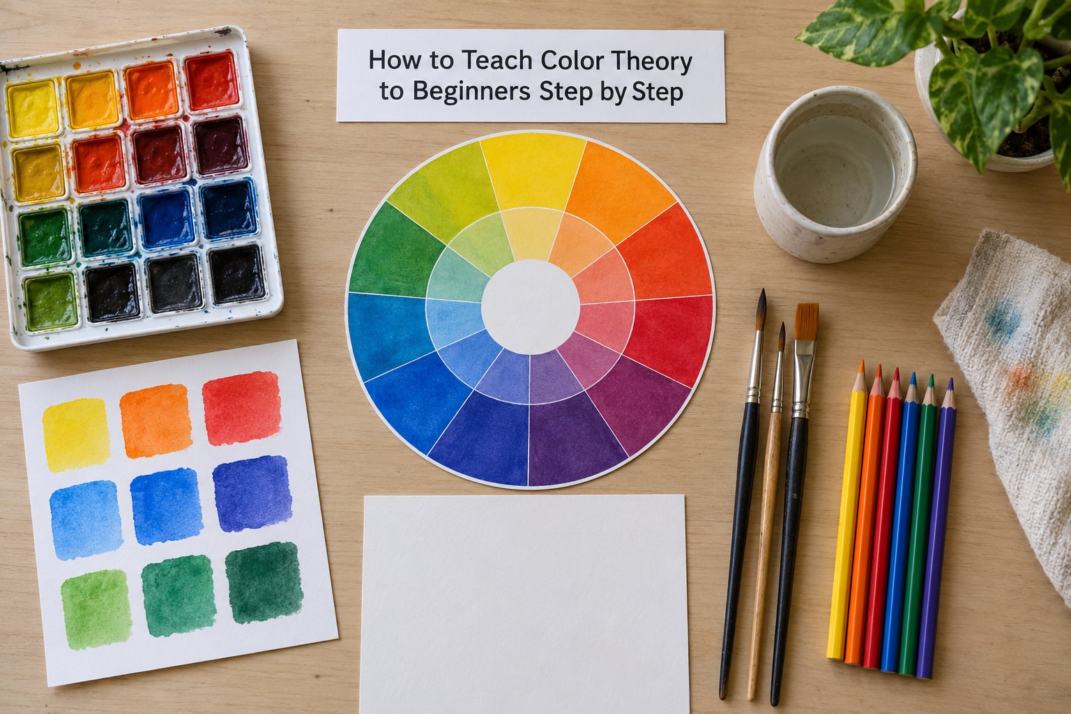
Six steps, in this order. Each one ends with a small finished thing a learner made, because beginners trust what they can point at more than what they were told.
1. Introduce Color as a Visual Language
Start with what color already does, before naming any wheel position. Show two versions of the same simple shape, one in high contrast and one in low contrast, and ask which one you looked at first. Then ask why. Most classes land on focus, mood and grouping within five minutes, and those answers are the reason the rest of the sequence is worth learning.
Demonstration: a two-value version and a many-value version of the same simple scene, side by side. Learner task: sort a handful of everyday objects or screenshots into groups that feel alike. Evidence it landed: each learner names one thing color changed, in their own words, before any vocabulary is introduced. Carry the same idea into other media — a quilt block with one dominant color and one accent is a color decision too, not just a fabric decision.
2. Teach the Color Wheel and Basic Terms
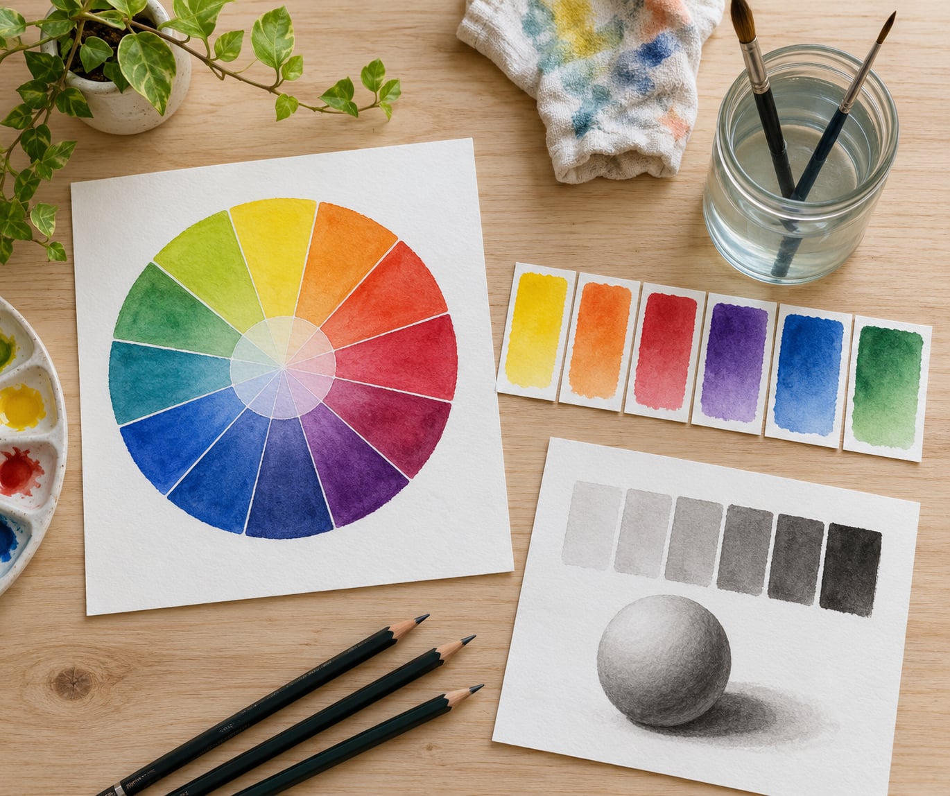
Label the wheel, then make it. Put primaries at equal points — red, yellow, blue — and mix the secondaries in front of them: red plus yellow makes orange, yellow plus blue makes green, blue plus red makes violet. Say out loud that these three cannot be made from anything else, and that the six mix cleanly only when the amounts are equal. Beginners who see the muddy result of an uneven mix learn the rule faster than any sentence about it.
Then attach the three working words. Hue is the color’s family name, red or blue-green. Saturation, sometimes called chroma or intensity, is how pure it is, so a vivid tomato red is high and a dusty rose is low. Value is how light or dark it is. Keep those three pinned to the swatch card; they are the words beginners actually use later.
Learner task: hand each person a blank twelve-part wheel and have them mix their own, labeling as they go. Tertiaries come last, a primary plus the secondary sitting next to it, and you can name them with the neighbor rule: red plus orange gives red-orange. Evidence it landed: a learner points to a color on the wheel and gives its family, its level of purity, and whether it is light or dark.
3. Show Warm, Cool, and Temperature Relationships
Put a warm and a cool version of the same subject on the board. Reds, oranges and yellows read as advancing; blues, violets and greens read as receding. That single comparison does more for beginners than the word temperature, so demonstrate the picture before the term. Then push one step further: a cool color placed next to a warm color of the same value makes the warm one glow, which is the same idea as a focal point in step 1.
Learner task: take one small object, a mug or an apple, and paint it twice, once with warm colors and once with cool. Evidence it landed: they can say which version seems closer and why, using depth or focus rather than a color name. This is also the step that travels best into interior design, quilting and photography, so it earns its time even in a beginners-only class.
4. Teach Value and Contrast
This is the step most lessons skip, and skipping it is why so many beginners quit early. Value is the range from white to black, and it is what makes a form look round. Teach the three-step scale of light, middle and dark first, then introduce tints, tones and shades by what you add: white gives a tint, gray or black gives a tone, and black gives a shade. Correct one common myth while you are there — adding white makes a color paler, not brighter, and a real highlight is usually the lightest part of the original hue.
Do it with a black marker un-project. Draw a circle and its shadow, hand out markers, and have learners fill the shapes in blended value. Then add a different hatch pattern to the shadow. It is a classic classroom warm-up because there is no drawing skill involved, only control. Follow it with a grayscale copy of a photograph and a prompt to match the value shapes, not the subject. Evidence it landed: a learner can identify the darkest, lightest and midtone areas in a photograph they have never seen before, and can produce each one on request with paint.
5. Practice Color Mixing and Palettes
Start small. A mixing test of four equal parts, done once and dried, teaches more than an hour of palette discussion. Test a complementary pair, an analogous trio, a split-complementary set, and one group of neutrals, then let learners look at all four dried side by side. Neutrals deserve an early slot because they are the colors beginners actually live in, and because they are what keeps a scheme from getting loud.
Show the working patterns below, then have each learner copy one pattern with four equal parts. When the pattern looks muddy, that is the lesson: a complementary pair at full strength fights itself, and a little gray or white settles it.
| Pattern | How it sits on the wheel | What it feels like |
|---|---|---|
| Complementary | Straight across, two colors | Energetic, high contrast, needs a third color to rest the eye |
| Analogous | Neighbors, three colors | Calm and unified, low risk for a first project |
| Split-complementary | One color plus the two beside its opposite | Contrast with less tension than a straight pair |
| Monochromatic | One hue, several values | Quiet and strong, and the best value practice on the page |
| Neutral | Off the wheel, with gray added | Supports any scheme, useful for backgrounds |
Then set the proportion. A simple rule is 60 percent of one dominant color, 30 percent of a supporting color and 10 percent of an accent, and it holds for painting, collage and quilts alike. Evidence it landed: each learner mixes one target color on demand and can name which pattern it came from.
6. Finish with a Mixed-Media Color Study
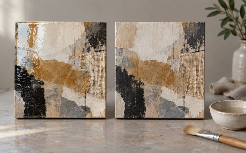
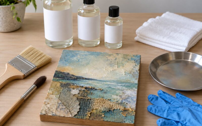
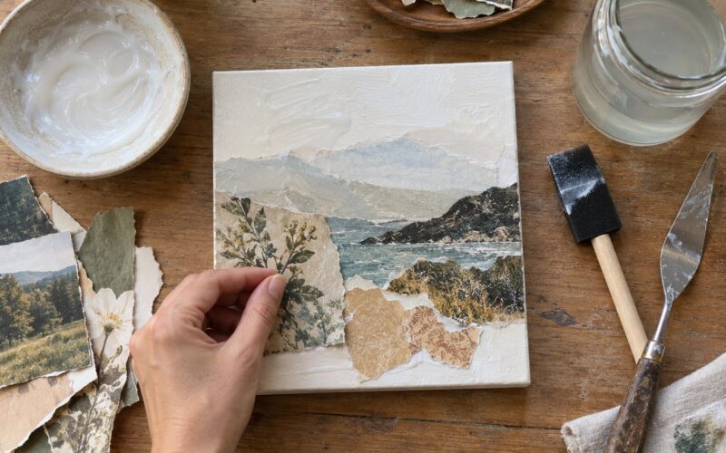
Close the sequence with one piece that uses everything: a limited palette of three to four colors, one extra material such as fabric, thread, tissue paper or printed paper, and one deliberate choice about value. Give a prompt with constraints, not subjects, for example a grid of six squares where one square must hold the strongest contrast and the background must be a tint.
Then do the part most lessons skip. Ask each learner to explain their choices in two sentences, naming where their darkest value sits and whether the palette is warm or cool. Saying it out loud is what turns a pleasant accident into a decision they can repeat. Evidence it landed: a learner can describe why the piece works and could rebuild the palette from memory, and that is the whole goal of the six sessions.
Common Mistakes That Stall Beginners (and How to Fix Them)
Overloading the first session with vocabulary. Hue, saturation, chroma, intensity, value and temperature in one hour is a lot to hold. Teach hue and value first, add the rest of the words on later sessions, and expect full fluency somewhere around session four rather than session one.
Stopping at color names. A learner who can name twelve colors but has never mixed them has learned nothing usable. Every new term needs a mixing or sorting task attached to it in the same period, even if that task takes only five minutes.
Skipping value because hue is more fun. This is the mistake that produces confident beginners who still cannot make anything look three-dimensional. Treat value as the backbone, and put it before schemes in the sequence. A limited-palette monochromatic study is the fastest way to fix it for someone who is stuck.
Correcting taste too quickly. A student who picked lime green for a sky is not making a mistake about color, they are making a choice. Ask what they were after, then ask what would happen if they added a warm tint. Teach the reasoning, not the verdict.
Diagnosing muddy mixes as bad paint. The usual causes are mixing complements, pushing a brush back and forth too long until the pigment separates, or adding white and expecting brightness. Show the cause by re-mixing the same two colors cleanly in equal parts, and let them dry the next attempt before judging it. Wet paint always looks duller than it will be.
Letting older students derail the simplified model. Someone will point out that pigment mixing is subtractive and physics is more complicated. That is worth hearing, and it is not a reason to abandon the simple version. Agree openly, say that the simple model is a working tool rather than a law, and move on. Teachers who handle it that way keep the room with them.
Never returning to the concepts. Six sessions in a row and then nothing leaves the wheel in a drawer. Five minutes of color naming at the start of each later class, or one thumbnail test before a finished piece, keeps the vocabulary alive and answers the theory-to-practice gap that r/Artadvice users describe, where people learn schemes and still freeze when choosing colors for their own work.
Frequently Asked Questions
What are the primary and secondary colors on the color wheel?
The primary colors are red, yellow and blue. The secondary colors are orange, green and violet, each made by mixing two primaries in equal parts. The primary pair red and yellow gives orange, yellow and blue gives green, and blue and red gives violet. That is the whole starting structure of a painter’s color wheel.
What three colors cannot be mixed together?
Red, yellow and blue are the three colors that cannot be mixed from other pigments. Every other hue a painter uses comes from combining them. That is why they sit evenly spaced on the wheel, and why the six colors that do mix cleanly depend on getting the proportions right.
How do I teach color theory to kids of different ages in one class period?
Teach the shared idea, not the shared vocabulary. Give the whole group one concept, such as warm and cool, then vary the task: youngest learners sort swatches, middle grades mix pairs, older students apply the same idea to a finished small piece. One demonstration, three versions of the follow-up, and nobody waits at the same speed.
How long does it take a beginner to learn color theory?
Most beginners can mix a target color and explain a palette after six sessions of 30 to 50 minutes. Feeling fluent, rather than knowing facts, usually arrives somewhere in the third or fourth round of practice. The concepts take one term; the confident eye takes a full season of painting, because it grows through repetition rather than explanation.
What is the 60-30-10 rule for painting?
The 60-30-10 rule is a proportion guide: about 60 percent of the surface takes one dominant color, roughly 30 percent takes a supporting color, and about 10 percent takes an accent. Beginners use it to stop overusing every color they like. It works in painting, quilting, interior design and graphic work alike.
Where can I learn color theory for free?
Museum collections, color-theory chapters on open course platforms, and one-piece books such as Josef Albers’ Homage to the Square cover the material at no cost. For teaching, a hand-drawn wheel and a printed grayscale photo are enough to run the full sequence. Print your own mixing grid rather than hunting for a workbook.
Conclusion: Where to Start This Afternoon
Teach the wheel first, then value, then temperature, then palettes, and prove each one with something the learner mixed or sorted that same afternoon. Six short sessions will do it.
If you only have time for one thing today, hand out blank wheels and a palette of red, yellow and blue, and let beginners mix their own. Everything else in this sequence hangs off that first hour. Updated for 2026.